42. Vintage Victory puzzles – Part 2
Assembly, analysis, and research inspired by the Victory Artistic series puzzle Caxton’s Workshop, and a Super-Cut series one called Drawing the Covert. (about 6100 words; 32 pictures)
This is Part 2 of a three-part series. If you want to begin at the beginning, go here. Part 1 gave an overview of the history of the G.J. Hayter company, which made Victory Puzzles for over 65 years. It also presented two examples of puzzles that were made circa 1930 before the company became a major puzzle manufacturer, and analyzed how their cutting design incorporated whimsy pieces into an efficient-to-cut but very attractive cutting design.
This Part presents two more examples of Victory puzzles, both made in the 1930s, from the new manufacturer’s two high-end series and presents information gleaned from research abut the subject matter of their images. It also continues the analysis of Hayter’s house cutting style.
Caxton’s Workshops; Artistic series, made in early 1930s
factory hand-cut puzzle, made in the early to mid-1930s
maker – G.J. Hayter & Company Artistic series
artist – not identified
about 400 pieces 14” x 16½” (35.7 x 42 cm) 3.7 cm²/piece 5+mm 3ply
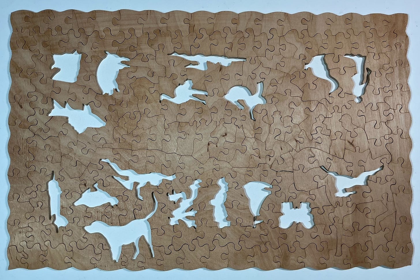
24 figural pieces; some continuous vertical cut-lines, no glides; fully interlocking except for figural pieces
This 400 piece puzzle is from Victory’s “Artistic” series, which were promoted as the company’s top-of-the-line puzzles when the company first became a factory-style manufacturing operation in about 1932. That premier status was later superseded when the Jigsaw Craze of the early 1930s faded somewhat and Hayter launched the Super-Cut series to be their new top-end product. You can read a short version of the history of the company and the evolution of its products lines at the beginning of Part 1, or a more complete account of that history here. Other examples of vintage Victory puzzles that I have assembled are here and here.
Victory’s Artistic series puzzles in the 1930s were 5mm thick, slightly thinner than the earlier “The Victory” puzzles had been. They continued to include whimsies that were unrelated to the image and the non-figural background pieces were cut in Hayter’s strip-cut grid pattern in which pieces interlock with their neighbours (except for with the whimsy pieces) using rounded knobs and sockets. Their main differences from “The Victory” puzzles from the pre-factory days was that less attempt was made to disguise the grid-like nature of the non-whimsy pieces. Also, because so many newly-trained cutters were making puzzles at that time the silhouette figure pieces were sometimes not as recognizable as they had previously been (although in this particular puzzle they are all pretty good compared to those in some other Artistic series puzzles from that era that I have assembled.)
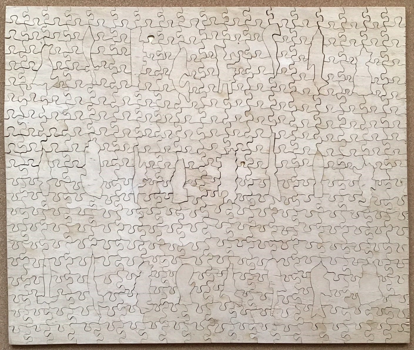
Here is the cutting design of this puzzle:
Note that it has nine continuous vertical cut-lines and two horizontal ones that presumably cut the blank into six manageable size units. The placement of pieces and cutting is nearly identical to the style that I found in Hayter’s earlier puzzles, except that there are no glides, and the interconnecting knobs come out from the middle of each non-figural piece instead of at an angle forming wave-like cut-lines. The result is that the non-figural pieces here appear much like the ones commonly seen in die-cut cardboard puzzles, and these background pieces do not have as interesting of shapes as were found in earlier “The Victory” puzzles.
Based on the label on the end of the the box this must be a very early Artistic series puzzle: It does not have the explanation as to why a guide picture is not provided which I think Hayter began including on all Artistic puzzles sometime in the mid-1930s.
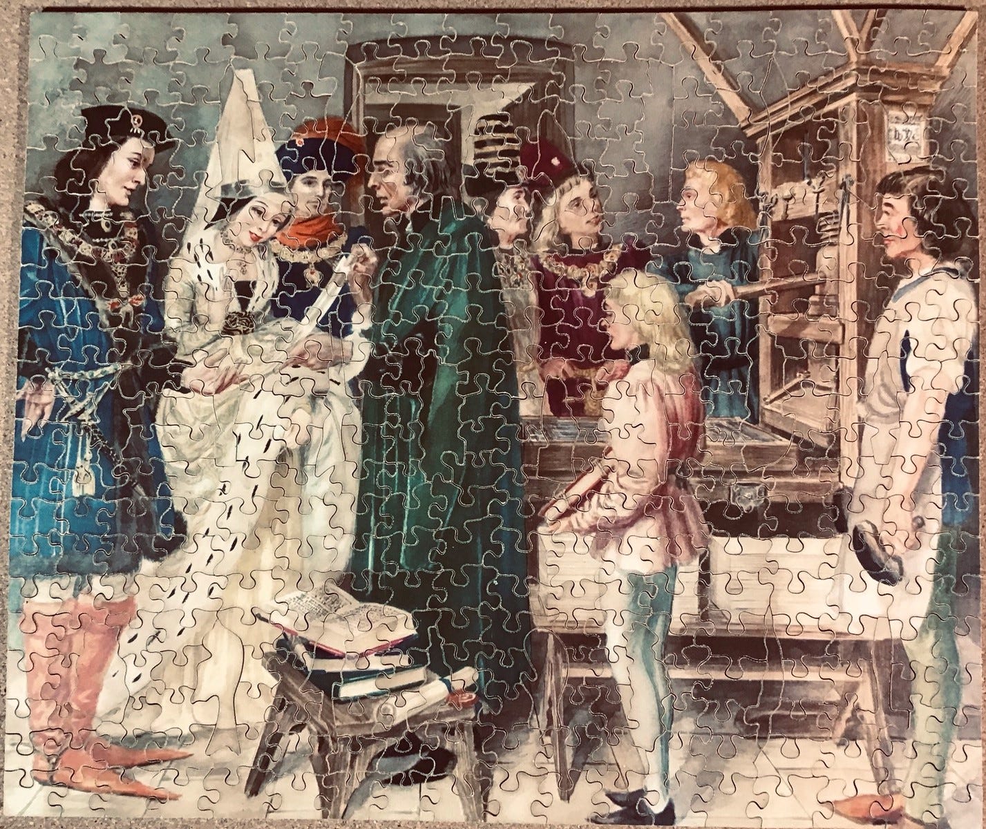
The image of the puzzle is an event that actually took place in one of Englishman William Caxton’s (c.1422-1492) printing shops. I had never heard of Caxton before. That, of course, led me into a research rabbit hole to learn who he was.
Nothing seems to be known about William Caxton’s origins except that he does not seem to have been from a wealthy merchant or craftsman family. That makes it notable that he was able to secure an apprenticeship and serve as a journeyman to the prominent London-based mercer (fine fabric and luxury goods merchant) Robert Large. Large died while Caxton was still indentured to him and some scholars speculate that he may have given a substantial inheritance to his young acolyte.
It is not clear under whose guidance young William completed his training, but after his indentures were complete the new master mercer moved to the wealthy and prosperous city of Bruges. Bruges is now in Belgium but at the time it was ruled by Burgundy and the port city on the Channel was home to an active English merchant community. There he prospered, and by about 1470 he had sufficient leisure time for his interests to turn to literature and the translation of French works into English.

His literary endeavors were aided by the fact that as a side-gig to his trade he had taken on a diplomatic role for England and had been instrumental in the negotiations for Margaret of York, King Edward IV’s sister, to marry the Duke of Burgundy. (That was a very important alliance for the King during those Wars of the Roses years during which the houses of York and Lancaster vied for the Crown.)
Margaret and the prosperous merchant became friends and she invited him to become part of her courtly retinue (possibly as her economic advisor.) She was a bibliophile whose personal library included many manuscript copies on vellum of religious and historical texts. It is possible that he agreed to this time-consuming role because of the aristocratic contacts he could make in her court, but also perhaps because it would give him access to her and the Duke’s sizeable libraries. (The time-line isn’t clear. Alternatively, perhaps it was that rare access that got the merchant interested in literature and translation.)

Caxton’s first significant literary translation was a collection of stories about the adventures of Hercules, based on stories in Homer's Iliad, that had been written for the Duke’s father by the French author Raoul Lefèvre. Besides those stories from Homer, the text proposed that the dukes of Burgundy were descended from Hercules, who it said, married a Burgundian woman after his Trojan adventures. Caxton’s translation of the book into middle English, called Recuyell de Histories de Troye (Collection of Stories about Troy), proved to be in high demand, I suspect especially from English merchants and diplomats who had dealings with the Duke.
At first Caxton made hand-written manuscripts of his translation, but his “pen became worn, his hand weary, his eye dimmed” from copying, so he “practised and learnt at great personal cost” how to print it. I don’t know if it was from his courtly or merchant contacts that Caxton had learned that the moveable type printing process, which had been invented by goldsmith Johannes Gutenberg only 15 years earlier, had spread to the relatively-nearby city of Cologne.
When Caxton went to Cologne to check it out his entrepreneurial spirit made him eager to get in on what he immediately recognized would become a very profitable new technology. At the time, printing know-how was highly secretive and it is not clear how Caxton was able to learn the trade secrets, but perhaps that is where the “great personal cost” comes in. (There probably is also an interesting story behind how the trade secrets had gotten from Guttenberg’s print-shop in Mainz, Germany to Cologne, but I didn’t go down that branch of the rabbit hole.)
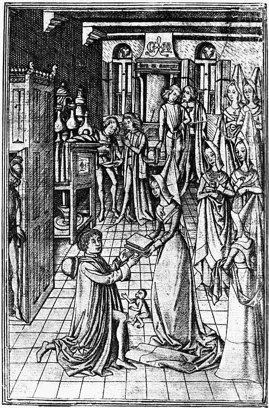
In Bruges, and with the Dutchess’ support, Caxton began printing English translations of European literature beginning with the Recuyell. To handle the actual type-making and printing side of the enterprise Caxton partnered with the renowned artisan Colard Mansion. Margaret was the patron who in effect was the sponsor of that publication, as indicated by the above frontispiece illustration that was included in the two presentation copies she was given of the book (and also, I believe, which is illustrated in the image of this puzzle.) The book proved to be very popular in England where the vernacular language now called middle English was beginning to vie with Latin and French as an acceptable language for erudite communication.
Caxton soon recognized that London, not Bruges, would be the ideal location for his new enterprise because of its close proximity to the royal court of King Edward IV and to that City’s large nouveau riche merchant class who could afford luxury products. (Early printed books were less expensive than manuscript books but they were still incredibly costly at that time.) In 1476 he decided to return to England and set up a new printery in a Westminster Abbey outbuilding, making him the first printer in England. As you might guess, because the new technology expanded rapidly he didn’t have a monopoly for long. Another printer/publisher established in London in 1480.
Before his death about 15 years later Caxton is credited with having published at least 87 books, of which 26 were his own translations. His publications included many “best-sellers” including English translations of Aesop’s Fables, Homer’s Aeneid, English and Roman histories, and Thomas Malory's Le Morte d'Arthur (which was thought of as factual history at the time.) When he died in 1491 he was working on Chaucer’s The Canterbury Tales. That work was continued by Wynkyn de Worde who had come to England with him from Bruges as Caxton’s journeyman and had become his chief assistant.
De Worde inherited the business after Caxton’s death and developed his own reputation as both an important figure in the history of British publishing (including the invention of italic typeface) and as an astute businessman. But he was not a translator or editor, nor did he have Caxton’s knack for hobnobbing with aristocrats. De Worde was purely a commercial printer who shifted the company’s business strategy from publishing books for the nobility’s tastes to making ones tailored more to the interests of prosperous merchants. These included “almanacks” and volumes on household management, contemporary literature, and especially religious works. He was also the one who moved the print-shop from Westminster to Fleet Street, becoming instrumental in making that location synonymous with English printing and publishing to this very day.
The language in both Caxton and de Worde’s time was evolving rapidly and greatly-different dialects were in use around England. As a translator and publisher Caxton faced many decisions with no standards to guide him. (This was about 300 years before the invention of the first dictionaries and grammar textbooks!) As a translator Caxton’s abilities were only mediocre; when he encountered a foreign word for which he knew of no English counterpart he often needed to incorporate that foreign word into the text.
De Worde and other printers followed Caxton’s self-imposed policies, and therefore besides having introduced the printing press to England he is also credited with having had a major influence on how the English language developed during the late medieval period. According to his Wikipedia entry:
Caxton was a technician, rather than a writer, and he often faced dilemmas concerning language standardisation in the books that he printed. … Caxton is credited with standardising the English language through printing by homogenising regional dialects and largely adopting the London dialect. That facilitated the expansion of English vocabulary, the regularization of inflection and syntax and a widening gap between the spoken and the written words.
It is not entirely clear to me whether the unidentified painter of this image, called Caxton’s Workshops, intended to depict Caxton’s London workshop or Caxton’s original one in Bruges. The painting was made long after the events depicted and the puzzle is titled Caxton’s Workshops (so perhaps it is doesn’t matter anyway) but the painting depicts Caxton giving a tour of the workshop to aristocratic customers.
The conical hennin headdress worn by the lady was indeed fashionable in Burgundy during the late 15th century and is known to have been worn by Margaret of York, Caxton’s first major patron. The nobles in the painting look fairly young and are possibly Margaret and her husband the Duke of Burgundy, and in addition to the book that she is admiring a page is hold another one that Caxton is presumably intending to give her.
That tends to support my speculation that this painting was originally intended to depict the presentation of Caxton’s Recuyell de Histories de Troye to Margaret which took place at the original Bruges workshop and is the event shown in the book’s wood-cut as the one in the frontispiece. (At the time, anticipating such a presentation to a patron and including an illustration of it as a frontispiece in a manuscript was a common practice - a forerunner to including a dedication in the beginning of modern books.)
This summary only scratches the surface of what I learned about William Caxton in what proved to be fairly deep dive research. Caxton’s career was fascinating. If you want to learn more about him there are many, many sources online because academic study of him has burgeoned in the past forty years or so. A good starting point, besides his Wikipedia entry, is the Encyclopedia Britannica, or better yet this 23 minute video by Prof. Katarina Marchant.
But it is now time for me to get to the puzzle: As it turns out, my superpower of forgetfulness served me very well – I remembered almost nothing about the overall composition of this image when I began assembly. I couldn’t even remember whether it was in portrait or landscape orientation. I just recalled that it was an indoor scene that included several people who appeared to be nobility in colourful vintage garb. That made the challenge before me quite similar to how people would have experienced this puzzle back when it was first made, packaged in its plain gold box with no reference picture to aide in assembly.
One feature that I have been learning is common to almost all vintage Victory puzzles is that they are amenable to doing the outside edges early in the assembly process, as well as building islands around the whimsies or based on colours. To maintain a higher degree of challenge I thought I would crowd all 400 pieces onto just my main puzzle-board.
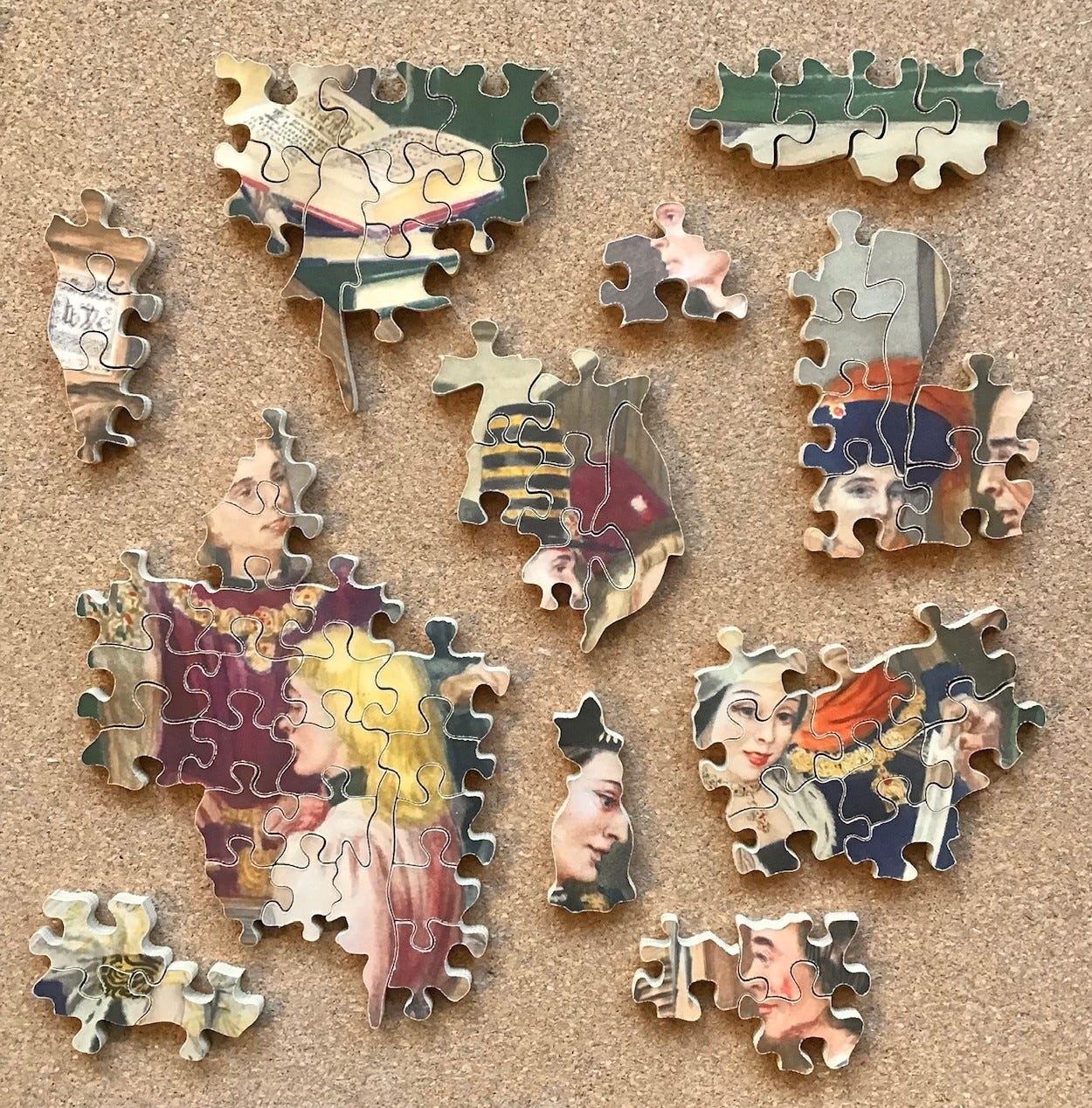
I separated out the figural pieces on the top right mainly for picture-taking, and put the apparent edge pieces along the bottom. The initial colour-sorting (above) was basically quick-and-dirty, with the darker and more colourful pieces on the right. I was struck by how drab the colours were compared to modern printing. Just like in Caxton’s time the technology of printing has sure come a long way in the past 90 years since this puzzle was made. I later figured out that the reason the image of this puzzle had struck me as being colourful when I bought it was due to the fact that the bright costumes are set in a rather drab context and that makes them stand out.
After taking the above photo I chickened out about doing my assembly on such a crowded board and moved the figural pieces to a side-board to give myself some working space.
As Victory Artistic series whimsy pieces go these are high quality – I can recognize what all of these figural pieces are intended to represent. I began to question my dating of this puzzle based on the box when I saw the mono-plane whimsy (on the top-left) but research confirmed that such aircraft did exist in the early 1930s as racing and prototype military aeroplanes.
I began by putting together lines of apparent edge pieces along the bottom of my puzzle-board. Pieces with reddish-brown and green turned out to be boots and were located on the two bottom corners of the puzzle. Next to the brown boots were some black dashes against a white background that I thought looked like ermine tails. There were other ermine-like pieces so I clustered them together and assembled them, but I could not link them to the pieces next to the boots at that stage.
Meanwhile, at the top of my puzzle-board I grouped together all of the pieces that I could recognize as being faces and did colour- and shape-matching assembly around them and a few other targets of opportunity. But at this stage all of my sub-assemblies were still just islands. I had no idea of how they would relate to each other.
Progress was going pretty slow but every so often I was able to link islands together. I worked on the ermine cape for a while and then put all of the pieces with dark green together on one area of the board and worked on that colour. Occasionally I went back to the unfinished business with the faces. Still slow going, but fairly typical for my expected pace for a 400 piece puzzle.
Eventually I decided to do a major reorganization on my puzzle-board. I had been able to connect my green assemblies to one of the face islands that I had been assembling near the top of the board. They had been upside-down relative to the feet on the bottom which was the part of the puzzle where I had been making the most progress. One of my face islands was getting rather tall and I thought that I could possibly see a connection to one notch on the bottom edge assembly. So I re-oriented the islands and moved them around (pushing all of the loose pieces to the side to get them out of the way.)
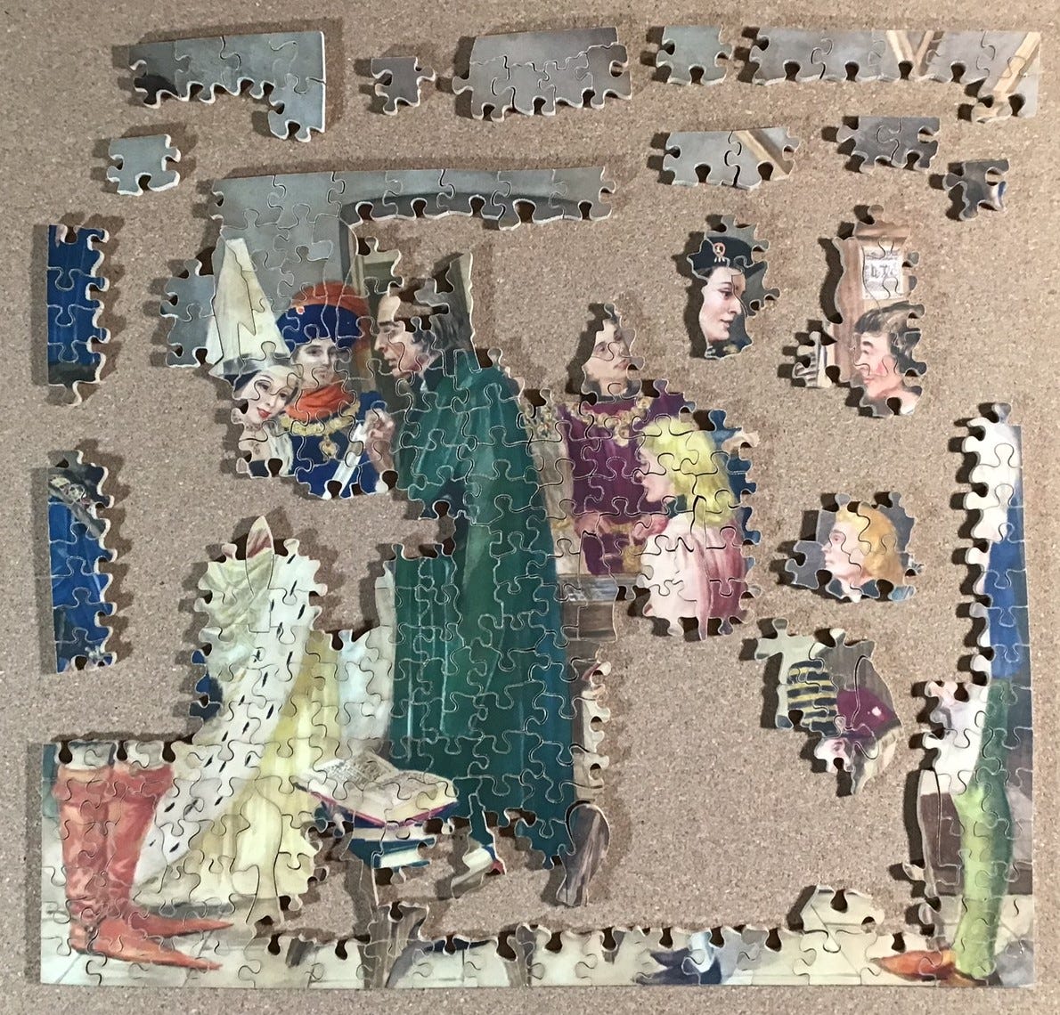
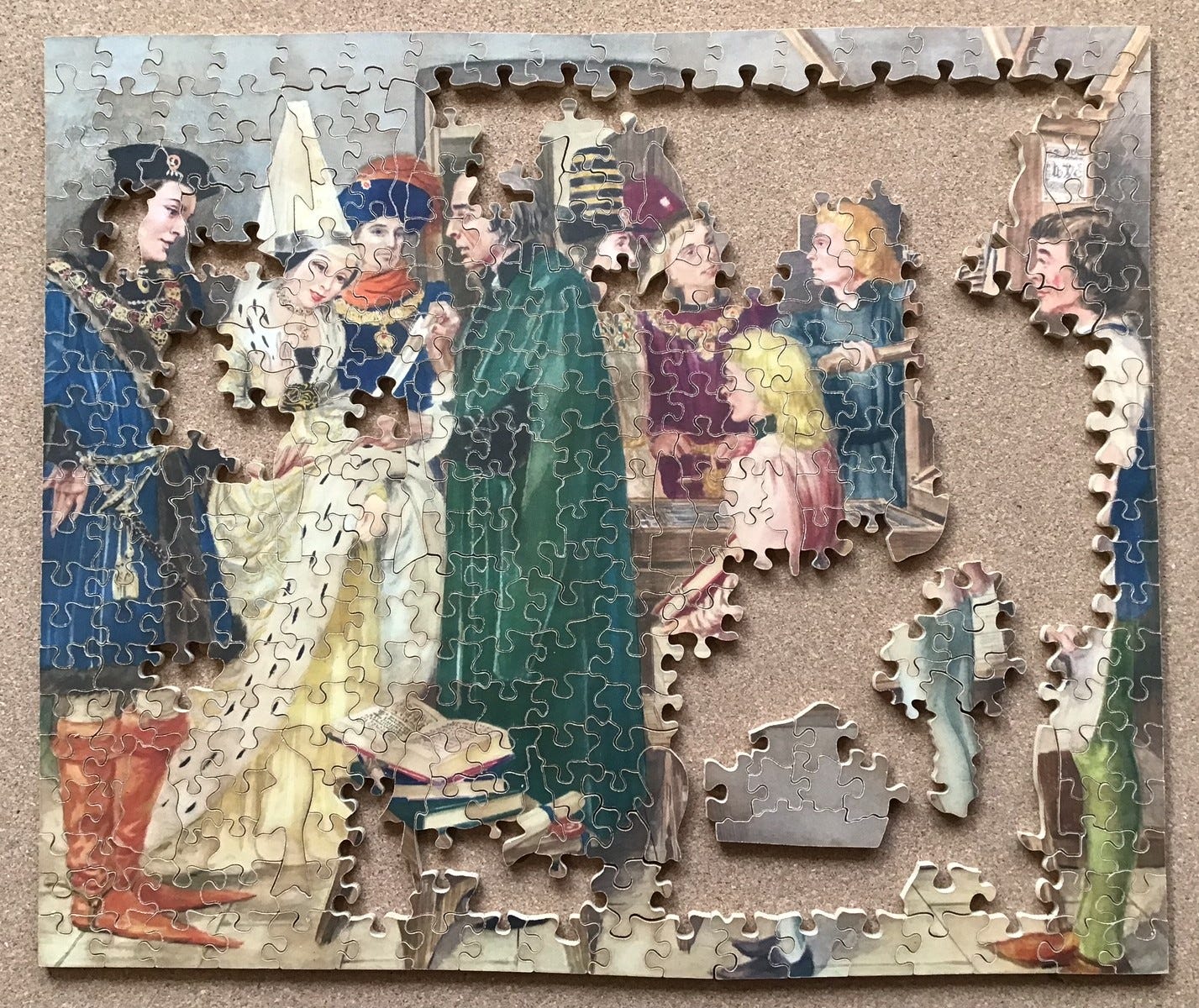
Doing the reorganization helped me to find other places where I could connect things. I forgot to take photos while all this was going on. But in the end, as you can see below, I had not only put enough islands together to make a continent but also the puzzle was finally starting to come together as an image. I still had four disembodied heads and a lot of missing places on the outer edge, but I at least had strips of edge pieces in place on all four sides of the puzzle.
I continued with the same approach of working on one area until I felt too stuck, than changing to a different area of the puzzle, or creating new islands based on ever-more subtle changes in colour tones or textures. Eventually I was able to complete the outside edge:
One factor that made assembly more difficult was that this puzzle had been made using a method called stack-cutting in which up to six puzzles could be cut at the same time by one cutter by temporarily pinning the blanks together. (They don’t even need to have the same image as long as they are the same size and dimensions.) Cutters were paid by the piece so they were motivated to make as many puzzles as possible each day. Strip grid-cutting was one way to cut puzzles efficiently, but it was really stack-cutting that enabled experienced Hayter workers to maximize their income.
I recognized quite early on that this puzzle was stack-cut by tell-tale “pin holes” next to cut lines near the corner of the puzzle. But this is the first puzzle in which I found variability in the shades of the colours, possibly from different print runs of the image, getting mixed together at the factory: Note the colour difference on the wall in this close-up and in the woman’s conical headdress. But another possible explanation for this decolourization might be that the paper-side of some of the puzzle pieces may have been in contact for a long time with the box. Cardboard foxes with age due to acidity.

As expected, assembly sped up considerably when there were fewer loose pieces left to look through:
This was the largest Victory puzzle that I had assembled to date. There is an undeniable appeal to assembling hand-cut puzzles that were made nearly 100 years ago, with subject matter selected to suit the tastes and interests of people in my grandparents’ generation. That balances the fact that the printing cannot be expected to match the quality of that in recently-made jigsaw puzzles. In this case, the interesting backstory was an added bonus.
Drawing the Covert; Super-Cut series made ca. 1938(?)
hand-cut factory puzzle; made ca. 1938(?)
maker – G.J. Hayter & Company Super-Cut series
artist – not identified
about 250 pieces scant 10” x 15½” 3.8 cm²/pc 5mm 3ply
17 figural pieces; small-wave vertical cut-lines with glides; partial colour-line cutting
As discussed in Part 1, the Super-Cut series were the Hayter company’s top-of-the-line series. There is some question as to when they were first made, and possibly they were initially ones that had been specially commissioned to be cut to the buyer’s specifications. I am dating this puzzle as 1938 because that is the date that the vendor gave based on unpublished research compiled by the late noted puzzle collector Brian Price. Also, Tom Tyler’s book British Jigsaw Puzzles of the 20th Century seems to indicate that such puzzles first appear in Hayter’s 1938/39 catalog.
But I do have reservations about basing a date attribution based on when Super-Cuts first appeared in Hayter’s catalog, which was intended to sell puzzles wholesale to merchants. The puzzle has an early style end label, and as far as I can tell stating the price prominently on the label was only done by Hayter for their early puzzles after beginning factory-style manufacturing in 1932.
David Shearer’s The Jigasaurus has this to say about Super-Cuts:
The history of these superior quality puzzles is still a little uncertain, but their quality and popularity amongst collectors is undeniable. Produced in significantly smaller numbers than their Artistic series cousins, they featured various cutting techniques, some of which are fairly consistent throughout, whilst others are less uniform.
These variations give credence to a belief that they were available as special order items. Certainly some of the images used are seldom seen on other puzzles, whether from Victory or any other manufacturers for that matter. Other examples used prints widely available throughout the ranges which Victory produced and were clearly produced for general sale, probably at a somewhat higher price for the more discerning customer …
Remember that when Gerald Hayter was operating his puzzle business as a craftsman workshop he sold puzzles both through merchants and to customers as special orders, incorporating whatever features those customers wanted and charging a higher prices for that customization. That is a business model that is often still used today by hand-cutters. Presumably Gerald Hayter either cut those special puzzles himself or he assigned them to his most talented and creative cutters.
I find it hard to believe that he began to turned down special orders from his established customers, whether they came from individuals or from high-end retailers like Harrods or Selfridges, during the Great Depression when he changed his business to a factory format. It seems to me more likely that that he would have continued to make ultra-premium puzzles for such special customers at special prices even if he was not yet ready to make them in sufficient quantities for other merchants through his catalog. So perhaps this puzzle was made earlier as early as 1932.
This is the fourth puzzle I have assembled with an image related to fox hunting. Before the Hunt and After the Hunt both depicted riders getting ale from barmaids outside of village pubs, and I reported about Jolly Good Old Ale in Part 1 of this 3-part series. This is the first one I have assembled in which the image is of a hunt itself, and as with all of the puzzles with fox hunting images that I have seen online, there is no fox in the picture.
Fortunately for me, images related to fox hunting are now very out of fashion in Britain because of continuing high sensitivity about fox hunting despite the fact that hunting with hounds has been banned there since 2005, so puzzles with such images tend to sell for lower prices. That is how I have been able to buy four such puzzles from auctions. In this case, despite the fact that Super-Cut puzzles are highly collectable and tend to sell for high prices, I bought this 250 piece one from a British vendor for less than £20. A very good deal indeed!
Growing up in Minnesota and living most of my life on the west coast of Canada, where killing foxes is done by farmers and ranchers for economic reasons expeditiously with a varmint rifle instead of being considered a sport, sensitivity about such a topic has not been part of my personal heritage (although I do not sympathize with the idea of killing animals for fun!) I understand that hunting with hounds is still sometimes done in Eastern Canada and in the US, but my own subconscious reaction to seeing the scarlet red coats in such puzzles is probably more rooted in images of the Royal Canadian Mounted Police.
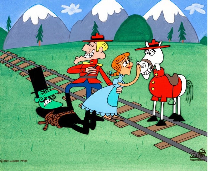
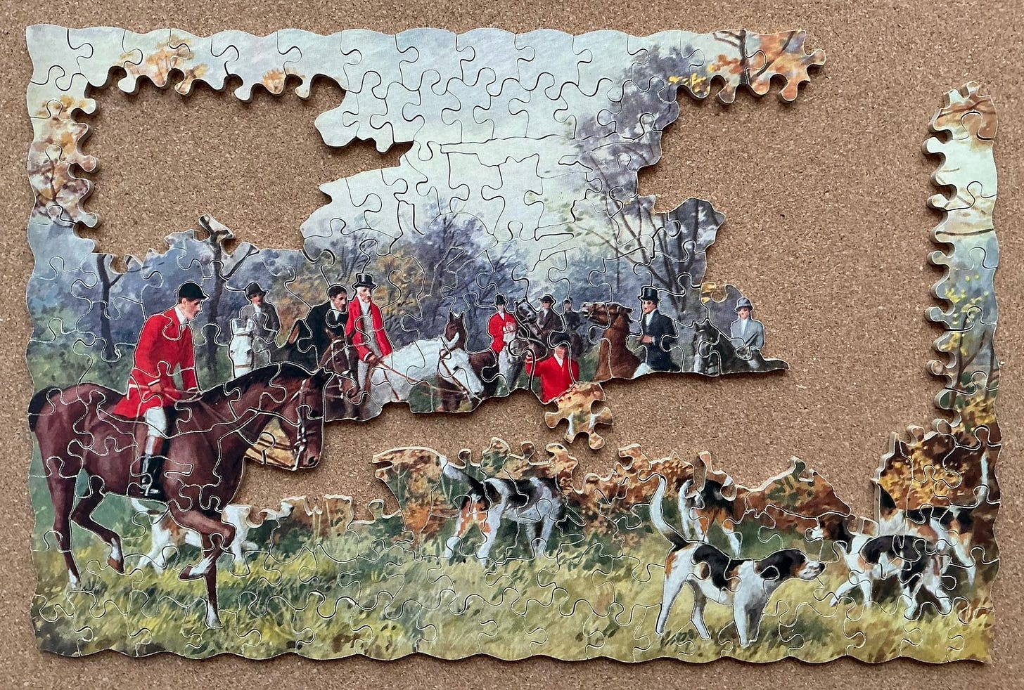
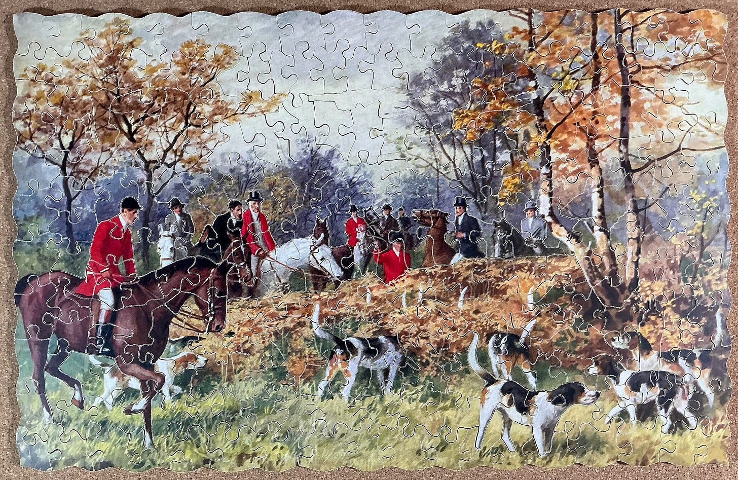
In this painting four of the hunt participants are wearing the red coats that we tend to think of as being emblematic of the attire for this historical activity, and seven other hunt participants are dressed in a more subdued fashion but they still have coats with a similar style of cut. Since the artist of this painting is not identified, the only research that this image inspired came from curiosity about fox hunting and its standardized attire.
This type of hunting did not occur in medieval times. It only dates back to the early 18th century when dogs began to be bred and trained in France for this specialized form of hunting, but it is descended from medieval hunts held by the aristocracy and land-owning gentry.
The distinctive scarlet coats (huntsmen never call them jackets!) also date back to the early 18th century when that was the colour of French and English military uniforms. The reason for red as a hunting colour is thought to initially have been so that fallen riders, or their bodies, could more easily be found. I wonder if the para-military uniformity in riders’ apparel might stem from the fact that organization of hunting parties may originally have been seen as a recreational counterpart to a military campaign, just as the game of chess is a stylized recreational counterpart to war.
Formal customs developed with regard to the style and cut of the proper attire for participating in fox hunts – not just the coats, but also the rest of the garb comprised of protective bowler or top hats (now helmets), glossy high boots, a mandatory stock tie, a “show” shirt, jodhpur breeches, and an optional vest. Over time the wearing of red coats came to be an indicator of status, and the colour became reserved for only hunt officials and people who had earned the honour to wear red.
Strict rules evolved, and continue to evolve, governing who could wear scarlet coats, and regarding which occasions it was appropriate to wear “pinks”. (There is a legend/myth that they are called that because a prestigious London tailor named Pink bought a large quantity of scarlet serge military fabric in the early 18th century and he became the principle outfitter of hunting attire for gentry and the aristocracy.) Besides the main colour of the coat there were, and still are, rules steeped in tradition regarding the colour of the collar, the cut of the tails, the number and material of the buttons, and other features about the coat. These indicate the status of the wearer and it is a serious faux pas to be considered to have dressed inappropriately.
As this article from the Horse & Hound website puts it:
Gentlemen are traditionally granted the right to wear a red coat once awarded the hunt button, although discretion and humility along with a particular hunt’s conventions may dictate when or even if the sartorial leap is made. Better to wear the hunt button on a well-fitting black coat than fall at the first in your gleaming new red coat.
Hunting attire for women was even more complicated. It was considered unseemly for a gentlewoman to wear red under any circumstances even if they were entitled to the privilege in this context. And according to this website:
Until the 1930s, women were expected to ride sidesaddle while sporting a riding habit during a hunt. A three-piece ensemble consisting of a fitted jacket, long skirt, and breeches, the riding habit allowed women to participate in riding sports while still maintaining their modesty and virtue. However, both the sidesaddle and the riding habit limited the rider’s range of motion. The excessively long skirt was known to get caught up in the reins or on the saddle, and in instances of a fall could cause injury and even, occasionally, death.
In the 1890s, “safety skirts” were introduced to prevent these types of injuries. The skirt featured an apron front with snap closures in the back that would break away in the event of a fall, exposing the rider’s breeches, sullying her dignity, but maintaining her modesty. As women’s fashion restrictions lessened in the 1920s, more women chose to ride astride while sporting breeches or jodhpurs with their tailored hacking jackets and bowler hats.
Now here is where it gets complicated: The rules for fox hunting, including attire, are not set by an overriding coordinating organization but by individual autonomous hunts and hunt clubs, some of which have now been in existence for over 300 years. Each entity has its own dress code, which parallel each other but differ somewhat. In some cases wearing scarlet was reserved only for hunt masters and other hunt officials, while others continued an older tradition that the privilege could be given to anyone who had won a hunt button (a first-place prize.)
One rule is standard: People other than a hunt’s members must be invited to participate by the Master of the Hunt: Members must make a request for an invitation if they want to bring a guest, and any guest must be a trained and experienced member from another hunt. Members dress in accordance with their own club’s dress code, which often constituted a hunt uniform with role and seniority being indicated by specific elements, but invited guests can wear the proper attire of their own home hunt. However, I can imagine that it might be seen as pretentious for a visitor to wear a prestigious red coat if at a hunt whose dress code would not afford the person that honour.
The various dress codes have evolved a lot in recent years in the context of increasing public revulsion at the idea of hunting foxes to exhaustion and a gruesome death. Britain banned hunting foxes with hounds in 2005, but “following the hounds” continues there with the dogs pursuing a scent trail through the countryside along a route that is set in secret by the hunt organizers. Such events are, as they have always been, a specialized type of cross-country horse racing, but now without the need for any foxes to be harassed and killed.
Even so, strong opposition to such events remains, but now rooted in the dangers that it inherently poses to the horses, and the fact that because participation is available only for wealthy members of society it is seen as being a public flaunting of their elite status. Wearing the distinctive red coats and other iconic garb of the various traditional hunts and clubs, is now recognized by the participants as stirring up the opposition, and in some cases it even makes the wearers subject to danger from anti-hunting activists.
Therefore, over the past few years the various hunts have changed their dress codes to be more like normal country gentlemen’s and ladies’ attire, with subdued tweed hacking jackets in forest colours replacing the traditional distinctive apparel. It is now much less evident that a person is participating in a hunt just by looking at how they are dressed, and the iconic scarlet coats are now rarely seen.
My research into the history of fox hunting and its attire led me into quite a research rabbit hole, deep enough for a fox to hide in. If you want to follow me down it I suggest beginning here, or here, or here. That would prepare you for the hunt jargon in this article on the Horse & Hound magazine website which is oriented to fox hunting participants. That article outlines the history of the attire, and expresses regret but resignation about the recent evolution in fox hunting customs.
Now, back to the puzzle. As is my usual approach for puzzles with whimsies I separated out the figural pieces. A number of the pieces were recognizable as potential edge pieces but I decided not to separate them out for this small 250 piece puzzle. My sorting was mainly by colour.
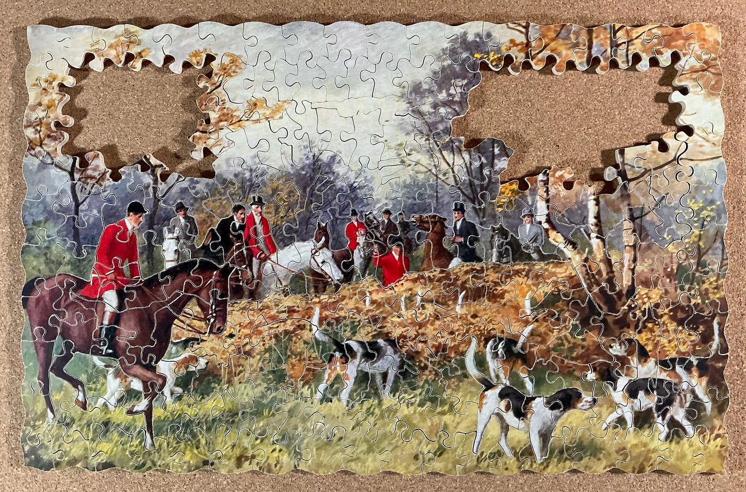
Those scarlet pieces were the obvious place to begin a “focus of attention” strategy for beginning assembly, as were the distinctive chestnut-brown pieces that were obviously going to become a horse. The fact that there was colour-line cutting around the main rider and mount was a bonus, making this an example of the focus-of-attention strategy for beginning assembly working at its very best. I also separated out the pieces that had recognizable people’s or dogs heads. I could see that they too had colour-line cutting around them ...
… which introduced me to two major colour-cut cut-lines:
The colour-line cutting wasn’t unexpected; its inclusion is one of the most well-known and attractive features of the high-end Super-Cut series of Victory puzzles.
Next I tried to focus on the dogs but that didn’t work out very well. Other than the black patches on their coats the dogs’ colours did not stand out among the many loose pieces that had forest foliage in autumn. So instead I turned to assembly above the top colour line cut of the people. At first I didn’t know what colour of pieces to look for; I just looked for the distinctive shapes. It turned out the first colour was dark gray, and then some autumn foliage, which led up to less-dark tree foliage and the overcast sky.
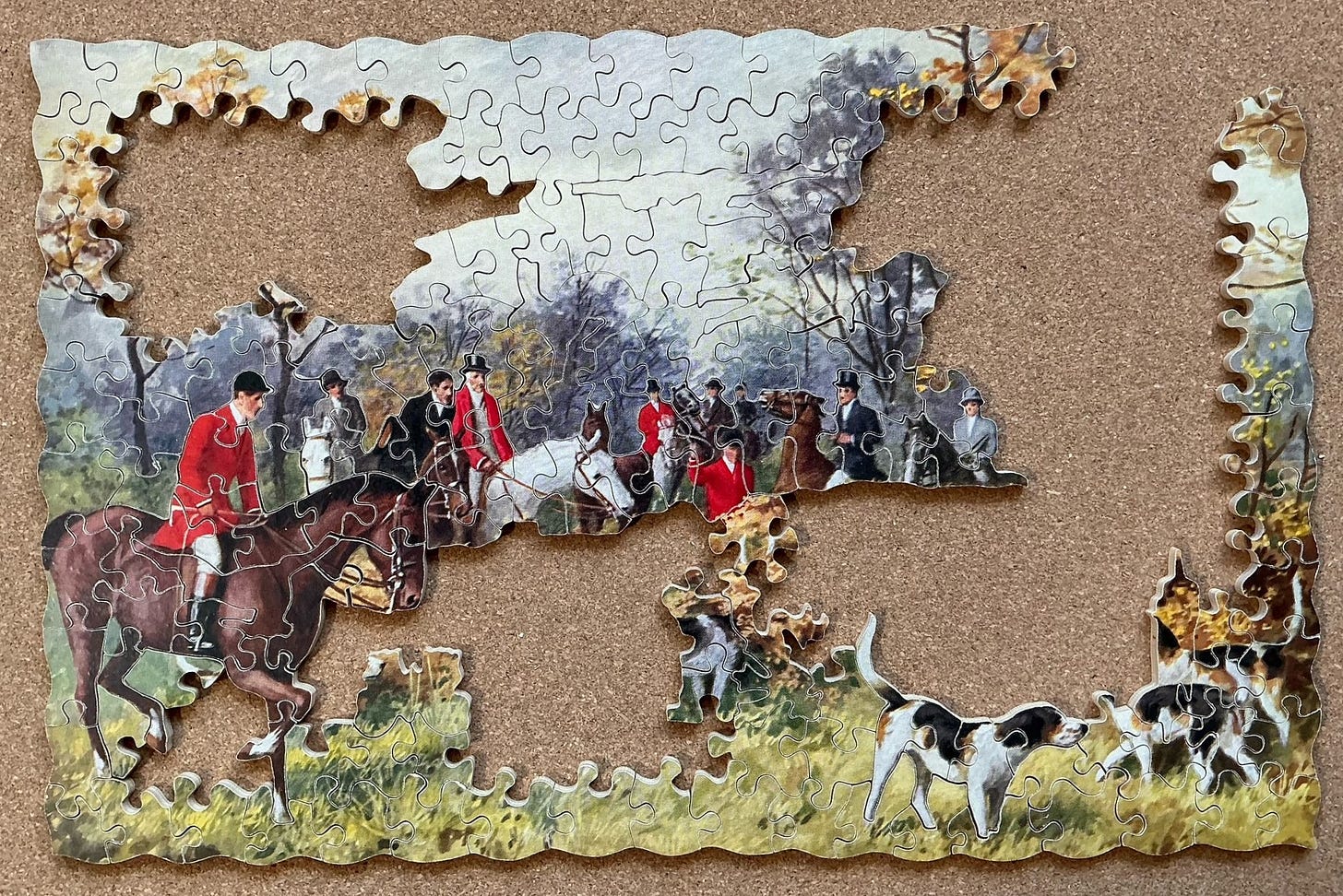
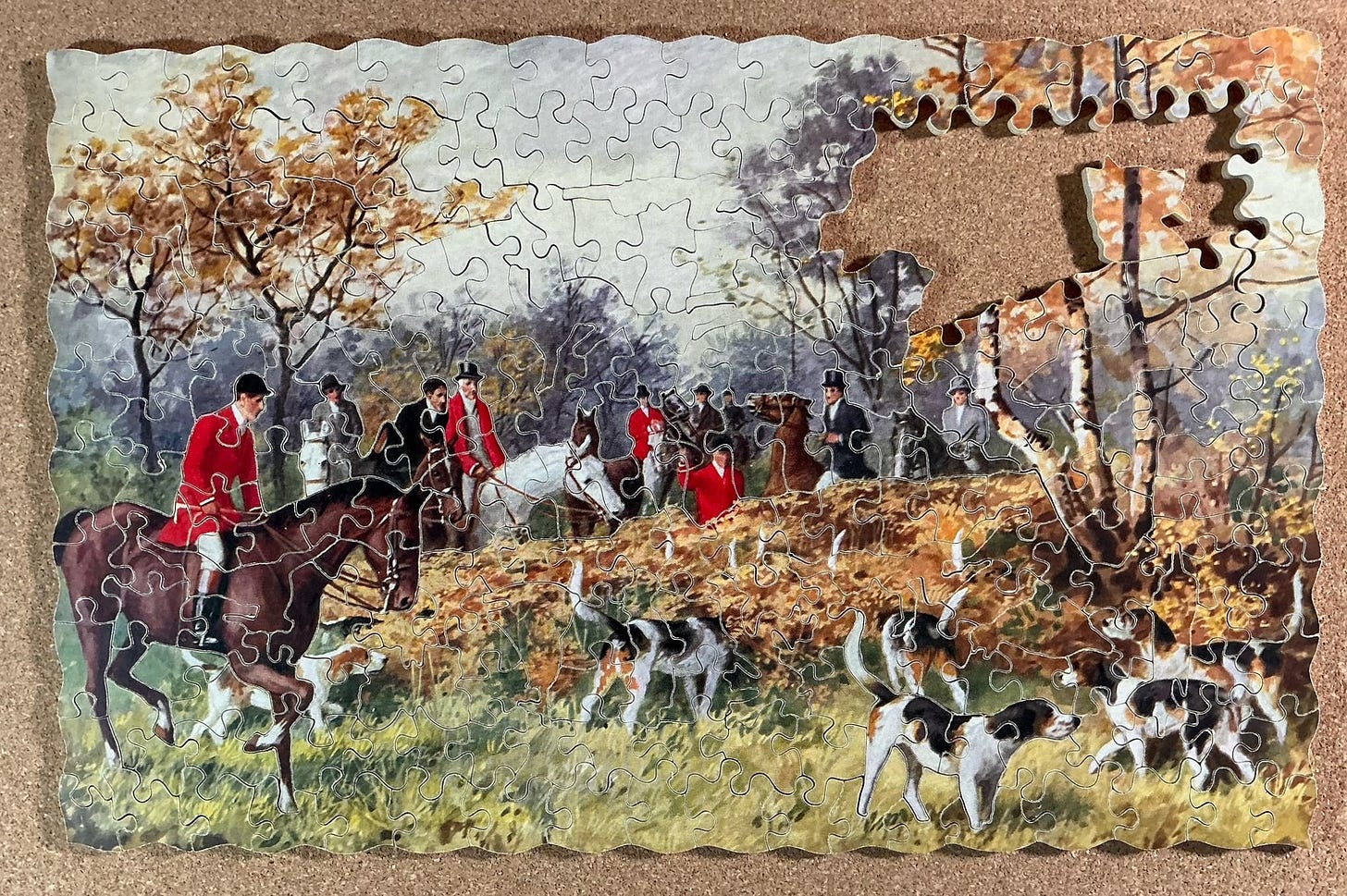
Just by luck I stumbled upon the piece to complete one of the dogs, and shape-matched to find the grass it was standing on:
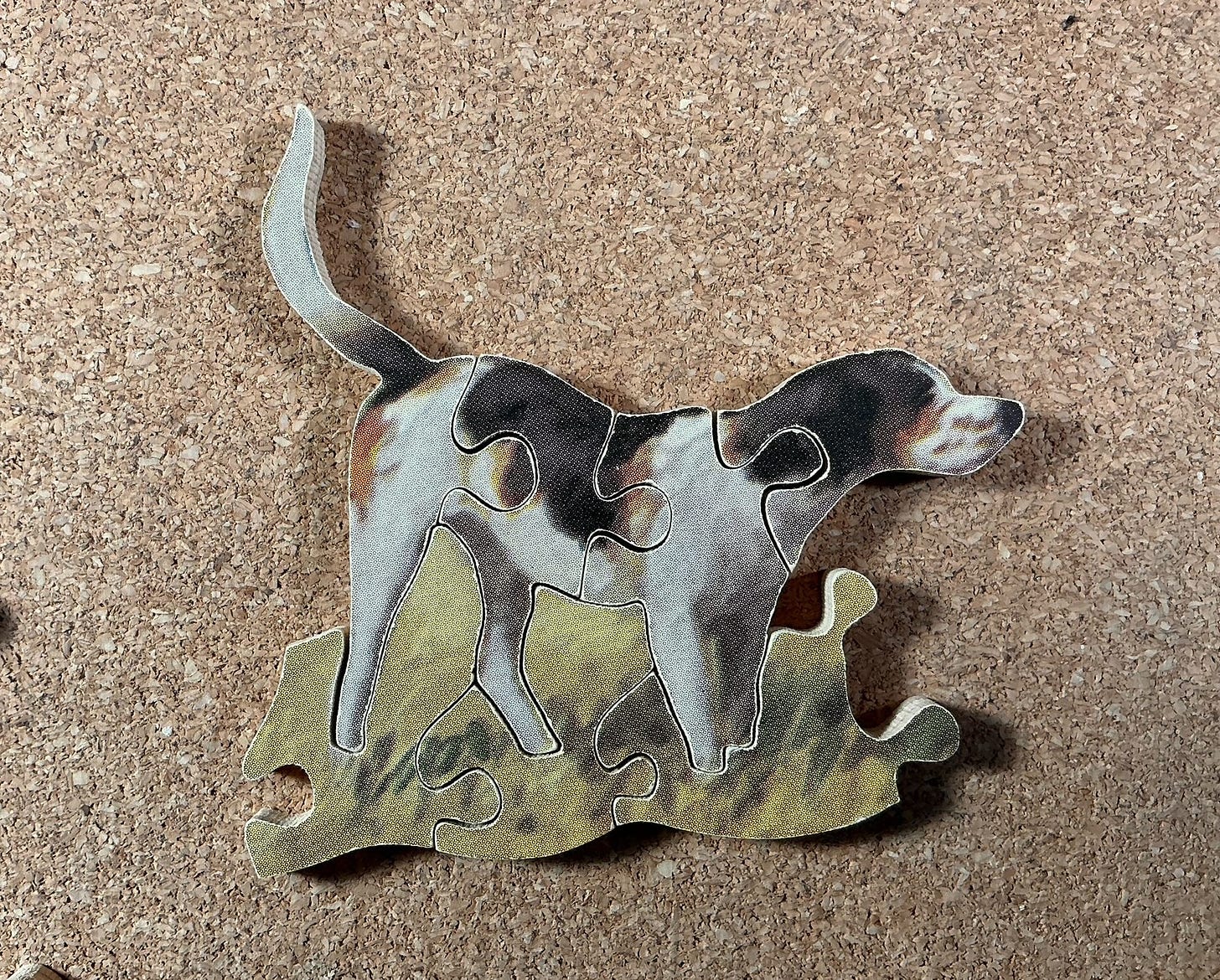
I extended the overcast sky up to the top of the puzzle, filled in the forest on the left side, and added to my dog islands.
After this there were not a lot of white sky pieces left, and most of those were edge pieces. That enabled me to complete most of the top edge and upper left side. That left colour-line cutting frontiers in the sky that I knew would probably define the outskirts of tree foliage. (The phrase “colour-line cutting” is broader than the word “line” suggests.)
All along I had been constantly reorganizing my loose pieces, putting ones with similar colours near each other, and separating out potential edge pieces. I had a lot of grassy green pieces including several edge ones, so it was back to the bottom of the puzzle and along the right edge. Which also brought me back to the dogs:
As you can see, this puzzle has a wavy outside edge instead of straight edges. That is another standard characteristic of the Super-Cut series. It is intended to make assembly more challenging, but frankly it only makes a small bit of difference because the rhythm of the waves is quite uniform and recognizable. It is the colour-line cutting, which is only found in Victory’s Super-Cuts, that really adds to the challenge and the cleverness of these puzzles.
From there on I made steady progress, pretty much completing the dogs and moving on to the golden pieces above them. From there on it was just colour- and shape-matching until the puzzle was complete.
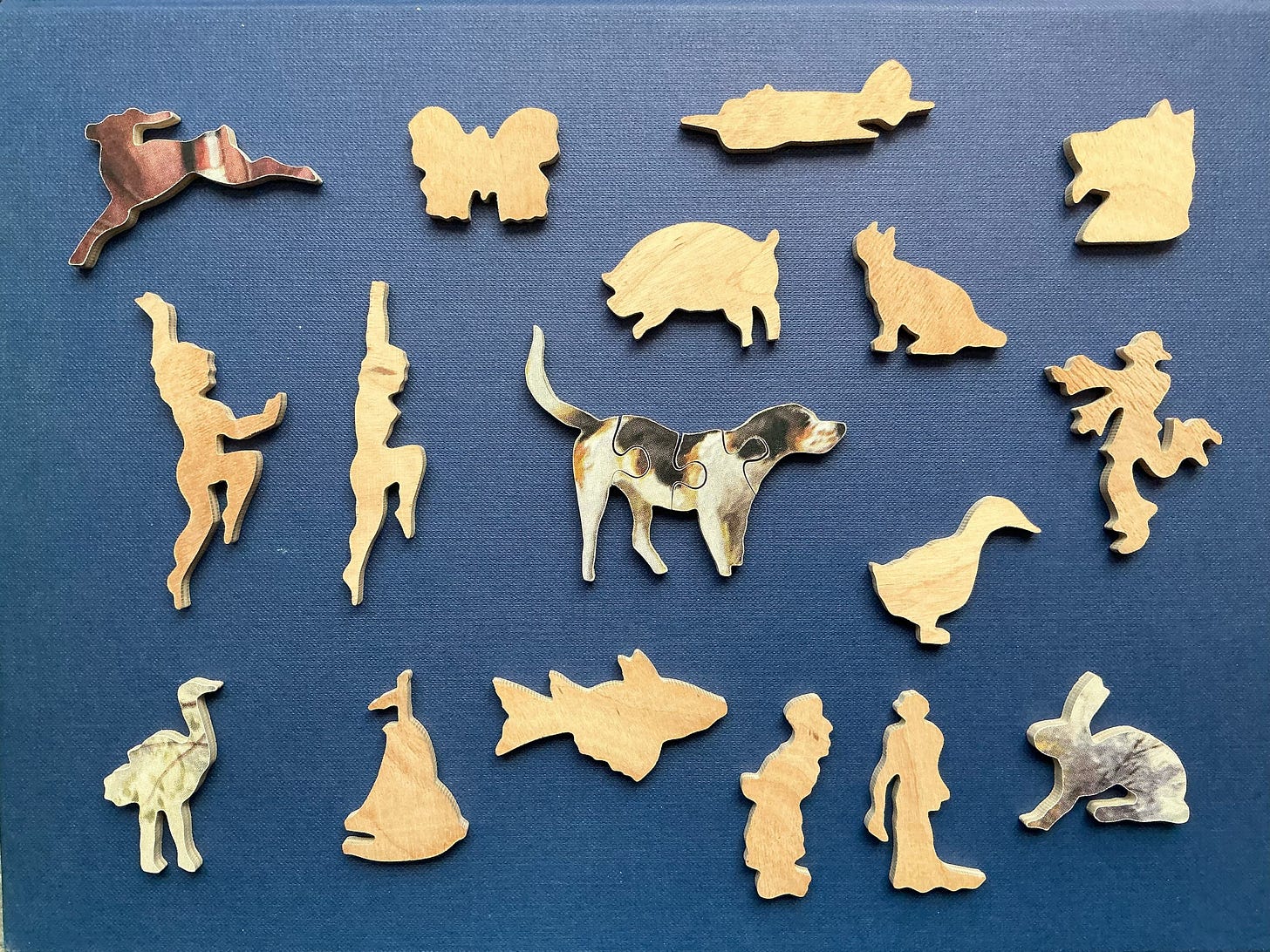
As you can see, the quality of the figural pieces in Super-Cuts is vastly superior to those in the Victory’s Artistic series. And it is not that this particularly puzzle is an exceptionally well made Super-Cut. I had the opportunity to study quite a few of them them carefully when a hoard of such puzzles from this same time period was recently put up for sale in some recent eBay auctions. I was the successful bidder for five of them (so you’ll be hearing more about Super-Cut puzzles in later postings) and all of them had comparably well-cut figural pieces.
The secret, I know, is that Gerald Hayter assigned only his best cutters to make Super-Cuts, and he paid them a higher piece rate to motivate them to keep that status. Wealthy industrialists and members of the Royal Family are known to have been among his customers, and I think that it is safe to assume that this was the series of Victory Puzzles that they chose to buy.
My only quibble about the whimsies would be that I prefer when they have the same orientation as the puzzle’s image, or if at least one of them is located in such a way as to use colour changes from the image to enhance the appearance of the figural piece. The fact that the skillful cutters did not use Hayter’s efficient strip cutting for Super-Cut puzzles would have made this possible for G.J. Hayter’s premier line.
In fact, placing figures so that they are enhanced by the image’s colours was done with one of the whimsies in A Good Catch, my only previous Super-Cut (reported here.) I will keep watching for this as I assemble other puzzles from this series.

Coming up: Part 3 will have another Super-Cut puzzle, another Artistic, and one from the Gold Box series (which was really just a rebranding of the Artistic series after Gerald Hayter retired and sold the company to J.W. Spear & Sons.)








Thanks for this, Bill. Even to my less-experienced-than-yours eye form things wooden puzzle related, i think I can detect some degree of difference between the early Hayter puzzles you discussed in your last posting and the ones I’m seeing and reading about today. I guess Hayter had more sophisticated equipment at his disposal.
It is a coincidence that I just finished reading “The Truth” which was the 25th fantasy novel in Terry Pratchett’s Discworld series. As I believe you will know, the Discworld books tend to make satirical allusion to actual human society and history. Well, “The Truth” was full of such allusions to the invention of the printing press and the rise of news journalism. In any case, one of the fantasy characters who is a key inventor in the medium of movable type and presses is a dwarf named Mr. Goodmountain. The German name Gutenberg means “Good Mountain.” Other key characters in the novel are William de Worde and his father Lord de Worde. I had known that Johannes Gutenberg was the real-life printing-press pioneer, but I hadn’t realized that de Worde was a true name associated with the history of early European printing.
On a different tack, another something I’ve been wondering about is when wooden-puzzle makers may have started to coordinate the themes of figural pieces with the themes of the the pictures on their puzzles. I’ve seen figurals in some of your many postings that seemed to be so coordinated, but if you’ve even reported on who pioneered that “resonance,” I have forgotten.
The whole story of Caxton’s workshops is interesting; but, in terms of the Caxton picture and the one used for the other puzzle featured today, I do prefer the picture used for “Drawing the Covert.”
I like seeing the way red coats “pop” in that puzzle. I also remember Dudley Do-Right, and was surprised to see him make an appearance in your posting.
Cheers,
Greg