


33. Balalaika Part 1; assembly and review
Illustrated in-depth review and assembly journal of a hand-cut puzzle made by Canadian cutter Mary Lee Smyth with an image by cubist painter Thorvald Hellesen (about 3800 words; 21 photos)

[Note: I apologize for the long gap since my last puzzle newsletter. I was busy with my other seasonal newsletter project: Bill’s Midwinter Music. It is similar to this project except that it includes Christmas and other seasonal music that is sent like an email musical advent calendar during the holiday season. Like this newsletter it includes rambling accounts of my research and musings, is a free service, and I do not sell or use the mailing list for any other purpose.]

Introduction, index and puzzle data
This posting is the first part of a three part essay about a puzzle that was made for me by Canadian hand-cutter Mary Lee Smyth. The puzzle and its image inspired so much research that I could not keep it any shorter. The series features an image that was painted over 100 years ago by the rather obscure Norwegian cubist artist Thorvald Hellesen, and the puzzle was cut by a person with an interesting history that few people know about. Part 1 is a detailed puzzle review and assembly journal; Part 2 is about the puzzle-maker; and Part 3 is about the artist and his painting.
As always, other than as a paying customer (and the appreciative beneficiary of interviews that I requested from Mary Lee) I have no relationship to Smyth Puzzles.
I bought this puzzle just over a year ago as my 2022 Christmas present for myself. Commissioning hand-cut puzzles are extravagant purchases for me and this was my biggest splurge to date. So instead of assembling it right away I gave it a year of anticipation. I began assembling on Christmas 2023.
I had chosen this image from Mary Lee Smyth’s online catalog instead of my original intention of commissioning a custom order. I was not very familiar with cubism but there was something about it that called to me – perhaps it was the predominantly warm colour tones in the catalogue image as well as the interesting composition of this cubist painting. It looked like would be a fun puzzle to assemble and it would also give me an opportunity to learn more about that early 20th century art movement.
Index for the three newsletter/blog entries:
Balalaika Part 1; an orphic cubist puzzle
Introduction, index and puzzle data
The puzzle review
Puzzle assembly journal
Balalaika Part 2: Mary Lee Smyth – puzzle-maker
Introduction to Part 2
A surprise revelation
The early years
“The big time”
The hobby years
Smyth Puzzles
Balalaika Part 3: The artist and the artwork
Introduction to Part 3
Young Thorvald Hellesen
Thorvald in Paris
Private and later life, and mysteries
A few more of his paintings
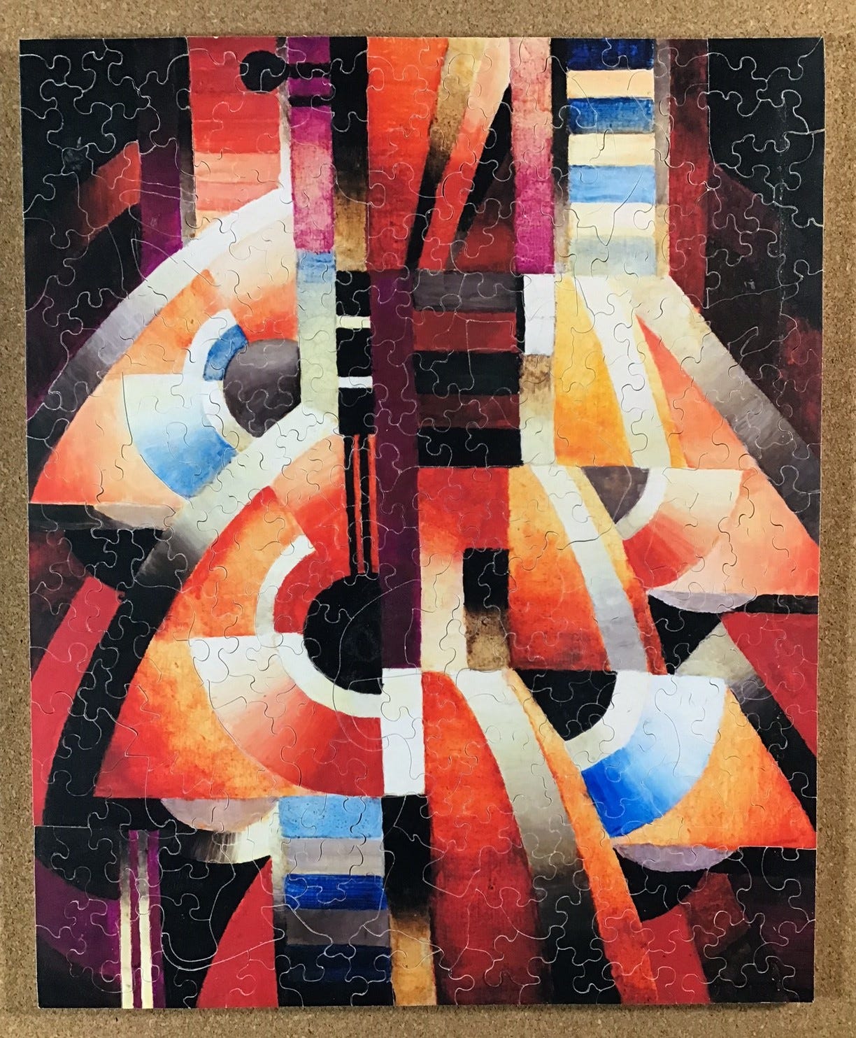
Balalaika, painted in 1916
The balalaika as an instrument
My attempts to understand the painting
Puzzle data:
Image - Balalaika, painted in 1916 by Thorvald Hellesen
Puzzle designed and made by Mary Lee Smyth; 2022
253 pieces 12½” x 10¼” (32 x 26 cm) about 3.3 cm²/pc
Printed on photographic paper heat-affixed to 7mm 5-ply beech
Current puzzle price - $310 CDN ($234 USD) shipping free to Canada and the US
.
The puzzle review
This was a very pleasing puzzle, with both a great cutting design and (once I got used to its cubism) perhaps the most stately composition and colour harmony of any puzzle image I have ever seen. It was a real joy to assemble and it has been lingering on one of my side-trays since then because it is so beautiful to look at. There were two minor technical problems that I will tell you about in the review below but they have since been resolved and they did not significantly detract from my experience of this wonderful puzzle.
I chose it from the catalog on Mary Lee Smyth’s attractive and informative website. My initial intention had been to arrange for a custom-made puzzle of an out-of-fashion beaux-arts style painting by William-Adolphe Bouguereau, but while looking through her on-line catalog I fell in love with this one and decided to order it instead. I suspect it was the intriguing composition of the painting combined with Mary Lee’s obviously-fond description of it:
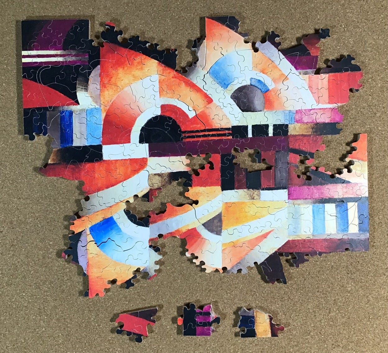
Part of the allure of this abstract image by Thorvald Hellesen is the intriguing colours and brushwork. This early Orphic Cubist style readily conveys the warm wood tones of the Balalaika instrument. These tones are repeated over and over in a mesmerizing mix. In addition to the sepia browns there are Prussian blue, black, warm gold, orange, cream and even a delicate violet. Once cut into a puzzle these tones will pop right from the moment you open your puzzle box.
I would have to say that description was 100% accurate, although it better describes the colours of the printed image on the puzzle than those of the original painting (which are also the colours shown on Mary Lee’s website.)
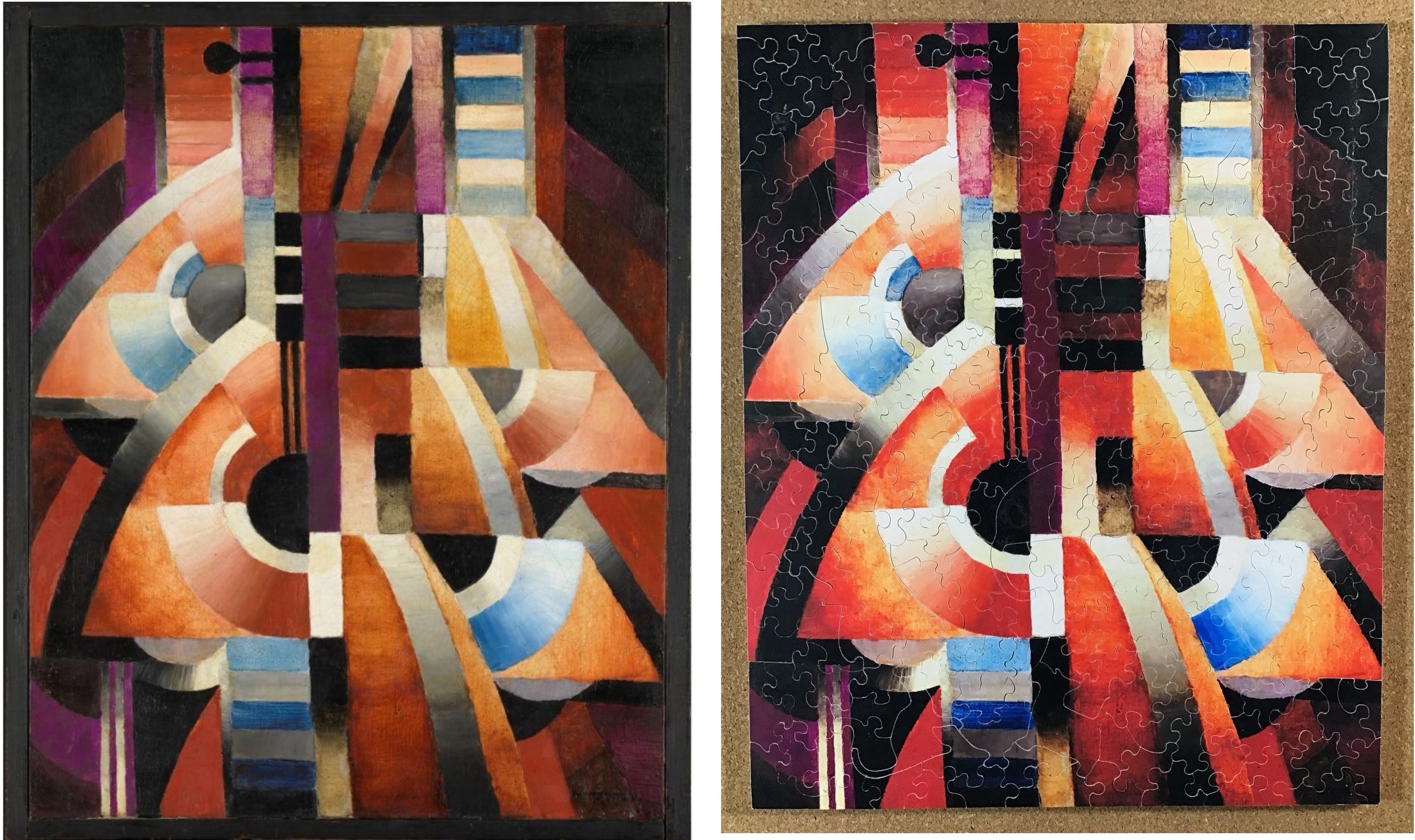
This colour difference is not a complaint about the puzzle (as I will soon explain) but it is one of the minor technical issues that I mentioned above. As you can see in the above photos, the actual colours of the puzzle’s image are more vibrant than in the photo of the painting. On the puzzle the reds and orange tend to pop out more and somewhat overwhelm the muted tones of the browns. In the National Museum’s and Mary Lee’s online images the painting is comprised mainly of warm and muted colours, with brown being predominate. [Note: The colours in my photo of the puzzle are not exactly what my eyes see because they are affected by the ambient lighting when I took the photo with my tiny iPad camera, but they are a very close approximation.]
The colour difference is sufficiently subtle that I was not aware of it when I was assembling the puzzle, or even at first when I downloaded the photo of the original painting from Norway’s National Museum. It was only when I was trying to carefully analyse the colours in the context of their meaning in the Orphic Cubism philosophy (as will be discussed in Part 3) that the differences from the Museum’s presumably-accurate image caught my attention.
I have noticed that there are often differences in shading and tones in the different digital file images of fine art paintings that I see online. Sometimes I suspect that someone has juiced up the colours to make the colour palette of the image better conform to our modern tastes. But the same software can be used to restore a painting to its original appearance, digitally colour-correcting to “clean” the painting of darkening of its protective varnish from age and/or buildup of years of smoke and grime. Colour shifts can also happen accidently due to the type of light on the subject during the photographing process or quirks in people’s computer software.
This painting is over 100 years old and darkening from varnish may well have occurred. If digital processing was used to correct for that this puzzle’s more vibrant image actually is a better representation of how Thorvald Hellesen intended it to look than is the painting is in its current in the National Gallery.
Again, don’t get me wrong: I am not complaining about the puzzle. With its more vibrant colours it was a joy to assemble, and I didn’t even notice the difference until long after I had completed it. But on balance I think I prefer the warm and muted tones that appear in the National Museum’s image of the painting.
Mary-Lee only learned about this colour difference issue from me as an offshoot of my interviews with her and this is already a resolved problem. She had a technician come to check her printer but he quickly recognized that the problem was with her computer software, not the printer itself. He replaced it with a free open-source image editing app called GIMP (GNU Image Manipulation Program.) According to its website: “GIMP provides top-notch color management features to ensure high-fidelity color reproduction across digital and printed media.” Problem solved - anyone who buys this puzzle now will get accurate colours that match the ones shown on Mary Lee’s website.
The pieces are a full 7 mm thick; this is the most luxurious puzzle I have ever assembled. It is made from 5 ply Canadian beech plywood that is made in Quebec with maple veneer on what for puzzle-making purposes is the back side. She gets it from a specialty wood-crafting store in Ottawa called KJP Select Hardwoods. Maple is a particularly dense hardwood: it gives puzzle pieces a particularly satisfying clicking sound when they drop into place.
The sides of the pieces are sanded very smooth, and they fit together very tightly. Mary Lee must use the very fine-toothed 0.008” thick saw blades. That is a nice change from the course, aggressive blades that were used to make most of the vintage hand-cut puzzles that I am more used to assembling. Also, unlike old vintage puzzles Mary Lee sprays the puzzle with an invisible archival fixative that protects it from water-damage and dirty fingerprints and acts as a ultra-violet light-block to minimize fading with time.
The image is printed on a dense low-gloss photographic paper using Mary Lee’s large-format Epson ETS 8550 photographic printer and is then heat-pressed onto the wood. As far as I know, using paper is how all hand-cutters get their images onto their wood substrates. Sometimes that results in “fuzzies” as the fibers of the soft paper fray during repeated assembly. But the photographic paper that Mary Lee uses is especially thin and dense - no fuzzies.
It would be very interesting to see what this image would be like if it had been UV printed directly onto the wood by a skilled printing technician. I think that the textures and colours of this image are especially suited for that approach, but that printing technology is not suitable for being done in a home workshop. The equipment is very expensive and the learning curve is very steep. Even the laser-cut companies whose puzzles feature UV printing directly onto wood need to leave that part of the puzzle-making process to experts in that specialized branch of printing.
The size of the puzzle is 12½” x 10¼” (32 x 26 cm.) That size was quite adequate to appreciate the image when the puzzle was completed since Hallesen’s painting itself is only 61 x 50 cm. As far as I am concerned, bigger is better for appreciating the image of a completed puzzle, but on the other hand, during assembly I like it when all of the pieces can be flipped and sorted on my 23” x 34” cork bulletin board. In this case the pieces fit on it with plenty of working room to spare. In retrospect, I wish that I had asked Mary Lee to make it as large as the image resolution and her printer could handle.
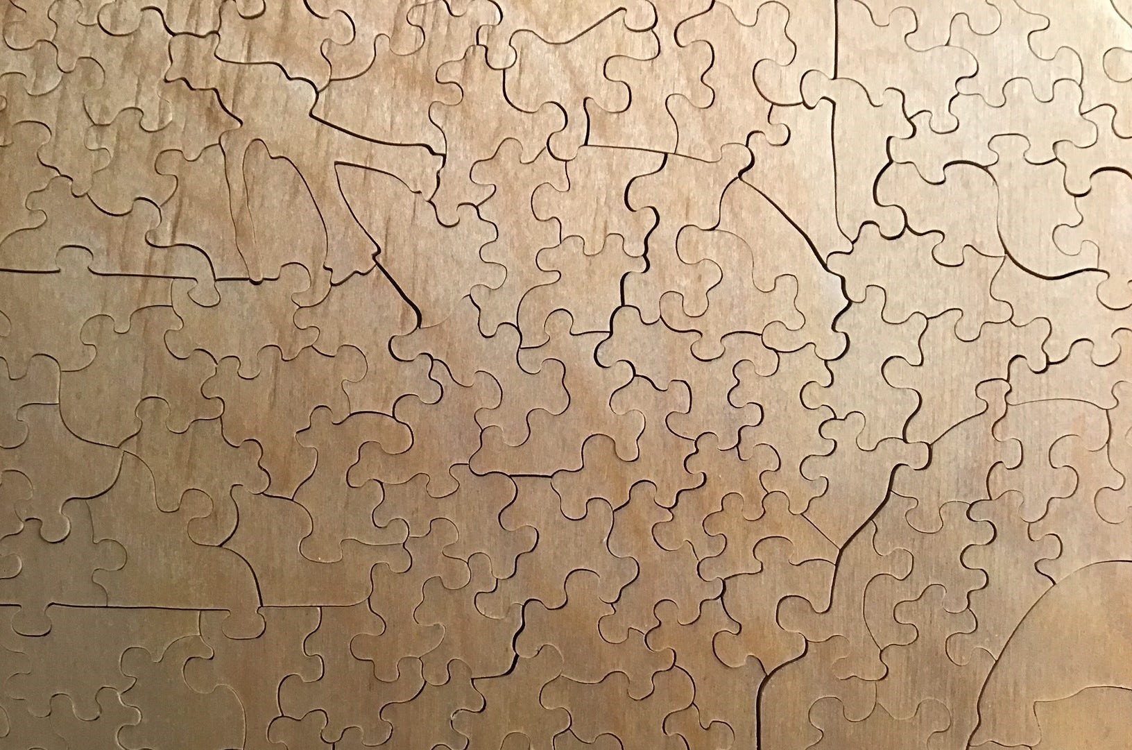
As for the cutting design, it lived up to my high expectations. It is very classic and elegant. I knew from photos of Mary Lee’s puzzles that I had seen online that her cutting style would be what I think of as baroque. By that I mean the non-whimsy non-line-cut pieces are all interlocking curves with knobs and sockets swerving around in a lyrical way. You can see in the above photo that the cut-lines never cross each other. This is a very time-consuming way to cut puzzles but I love this style. It is reminiscent of some of the higher-quality companies’ cutting in the 1930s when interlocking was still a new thing for jigsaw puzzles.
The image of the painting and the variety of colours suggested that islands of pieces might come together quite easily. I was a bit worried that it might be too easy of a puzzle for me so I had told Mary Lee that I would like to have her use some colour-line and other cutting tricks to make the approximately 250 piece puzzle more challenging. It did indeed prove to be more challenging than one would expect from a puzzle of this size. There will be more about this below under the heading Puzzle assembly journal.
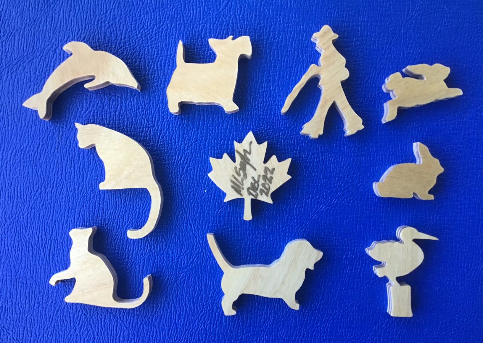
I very much appreciate that the whimsies are simple straightforward silhouettes, without the accent lines that many of the laser-cut companies need to put on their detailed figural pieces to make them recognizable. Every one of these shapes is instantly identifiable without any need for additional adornment. They are not thematic but they are more interesting than if they had just been musical notes and a balalaika or two, which are about the only figural shapes that I can think of for the theme of this painting. And as will be discussed in Part 3 of this report, the artist’s intended theme of the painting would likely have been the abstract concepts of cubist decomposition, and using colours, tones and textures to depict the voice and music made by the balalaika, not the physical form of the instrument itself.
But the second minor technical issue relates to the cutting. Hand-cut puzzles are supposed to be tight fitting – that is a sign of quality. But in this case I found that some of the pieces would only fit in one direction. I could not slide them in from the top but if I lifted the adjoining piece(s) I could slide them in from the bottom. I immediately recognized the cause of this problem because I “lurk” in an online group intended for puzzle-cutters. Mary Lee’s scroll saw blade had not been absolutely, perfectly vertical. The tolerances for being out-of-vertical for puzzle-making are much finer than for other uses of scroll saws, and even finer still when particularly thin blades are used and the plywood is thicker, as is the case for Mary Lee’s puzzles.
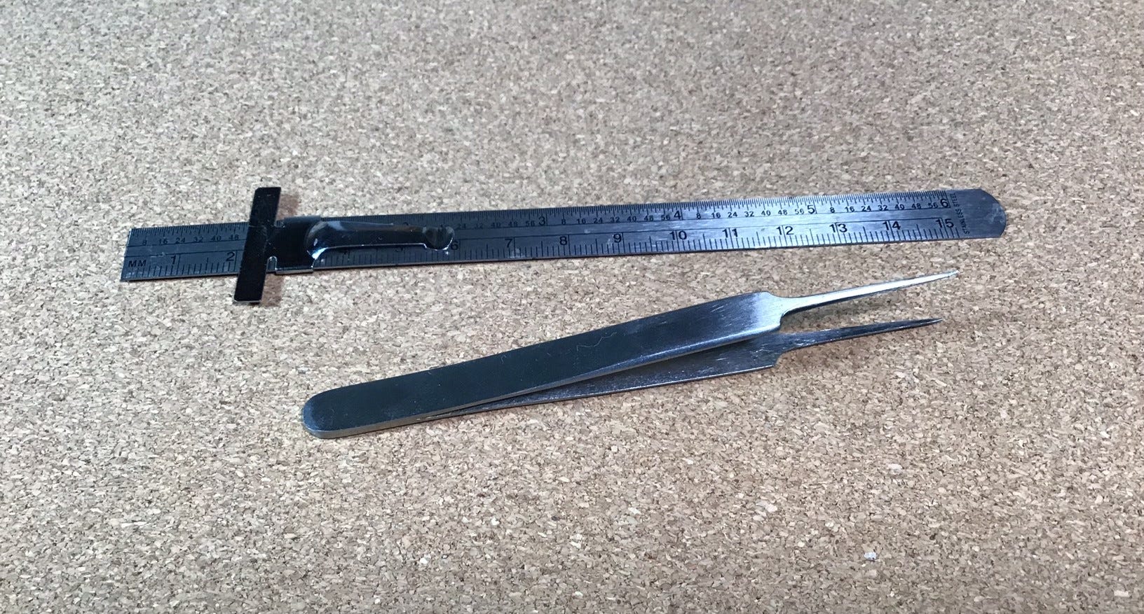
Now, I don’t want to exaggerate the extent of this problem. Most of the pieces, perhaps 95% of them, slid readily into place from the top. When they didn’t it was a bit of a bother, and I sometimes I had to do a bit of deconstruction of places that I had already assembled to slide in the new piece from underneath. But it was not really all that difficult and it did not slow down my assembly all that much. My thin stainless-steel 6” ruler and a pair of pointy-nose tweezers became handy tools.
It never occurred to me to complain about this problem to Mary Lee. Because I knew its cause, if I had assembled this puzzle as soon as I received it I would have contacted her to give her a heads-up about it. After all, she probably did not know about this because her job involves disassembling puzzles but not necessarily assembling them. But since the puzzle was made over a year ago I assumed (correctly as it turns out) that someone had already given her that feedback.
During my first phone interview with Mary Lee I told her about this and asked if it was a resolved issue. She told me that someone had indeed alerted her about it last year shortly after my puzzle was made and she had brought in a scroll-saw technician to correct the source problem: The chuck-head that holds the blades in place in her 25 year-old DeWalt scroll saw had become worn with time. She had the part replaced but later felt that she no longer had confidence in it. She also knew that although her saw was cutting edge technology (Sorry about the pun!) when it was new there have been improvements in scroll saw technology since then. (She explained it to me, but frankly most of that technical stuff about the mechanics of the saw went right over my head.)
Mary Lee is now the proud owner of a new top-of-the-line Excelsior XL-21/100 scroll saw that can more reliably be kept perfectly adjusted, and also updates her to a scroll saw that uses parallel arms to minimize breakage of the fragile fine blades. She estimates that she probably went through 15-20 blades making my 253 piece puzzle (a fairly standard rate for hand-cutting and one of the reasons that making puzzles this way is so labour-intensive.) Making puzzles for her now will still require fairly frequent blade replacement but it is because they get dull rather than because they break.
Mary Lee apologized for this problem with my puzzle and said that it does not live up to the quality standards she holds for her puzzles. She offered to cut me a new one. I told her that I appreciated the offer but declined. Even this “flawed” puzzle gave me full value for what I paid for it.
So, even though my role in writing reviews like this is to identify shortcomings as well as things I like, I was only able to identify two minor technical ones with this puzzle and both are now resolved issue that would not show in people’s future purposes. The easiest way to summarize how satisfied I am with this puzzle is to tell you that I am splurging again and am commissioning Mary Lee to make me the custom-made puzzle with an image by William-Adolphe Bouguereau that I told you had been my original plan before I got side-tracked by this cubist puzzle.
.
Puzzle assembly journal
[Note: This section of the essay records my responses while I was opening and assembling the puzzle and was mainly written at that time. After assembly I lightly edited it, moved some of my reactions from here to the preceding puzzle review, and changed it from the present tense to the past.
Since every puzzle that Mary Lee cuts is unique there is no need to put this under a Spoiler Alert as I do with laser-cut puzzles.]
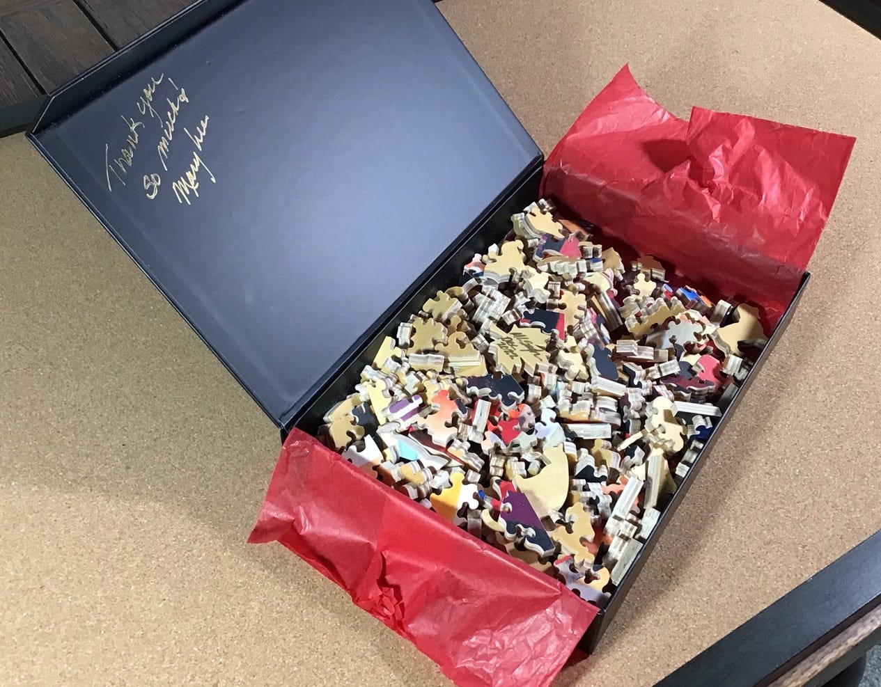
Upon opening the magnetic-closure box, after admiring the elegance of the packaging I unfolded the bright red tissue paper. Right on the top was Mary Lee’s signed maple-leaf signature piece. I had snuck peeks of the pieces several times over the past year but was reminded of how thick they are – a full 7 mm. I had just finished doing three laser-cut puzzles that were all 3.5 mm thick. They looked and felt OK but these thick pieces seemed downright luxurious. The beautiful rich colours and the sharp printing signaled that this was going to be a treat for my eyes as well as my fingertips.
Also notable was that the cutting is the baroque style that I know I like, all knobs and sockets, foretelling that a tricky assembly was ahead of me. This cutting style is not often found in laser-cut puzzles but I have always enjoyed it in vintage hand-cut Chad Valley and Salmon Academy ones (even though that latter company thwarted me with one of theirs), and from a contemporary hand-cut puzzle made by Raúl Barrera (Sr.B Puzzles.)
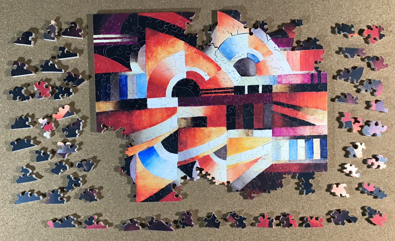
Because this puzzle is only 253 pieces I decided not to do an initial organizing of pieces by colour, and did not separate out the potential edge pieces. I did separate out the eight figural pieces (upper left) for picture-taking. I wanted this assembly experience to take some time to complete so I planned to work outward to the edges. Also, I figured (correctly, as it turns out) that Mary Lee would have included disguised edge pieces and false edge pieces in her cutting design anyway. I would colour sort as part of ongoing assembly rather than before it. Actually, it would have been difficult to organize by colour anyway because many of the pieces had approximately equal amounts of two colours. I thought that perhaps it was one of Mary Lee’s cutting tricks. (She later confirmed that to be the case.)
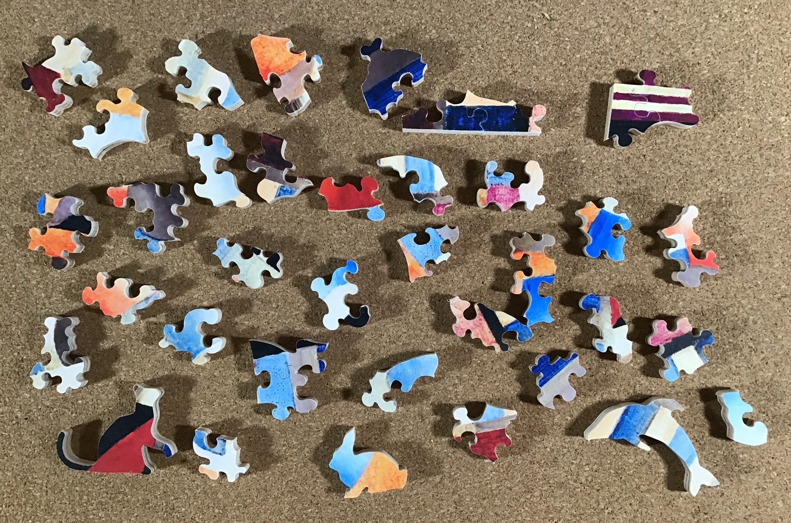
The above photo is my first colour-sorting, to separate out all of the relatively few pieces I that had blue in them, and in the upper right, two pairs of pieces that came together while I was looking for blue.
As is usual for me I did not want to use a reference picture for my assembly. My memory of the image was rather scanty – basically, as a close-up of something recognizable as a balalaika that had been dismembered by a cubist artist, so I knew that I could not count on logic with regard to the relationship of the components in the image. I also recalled that I had asked Mary Lee to use colour-line cutting and other techniques from her bag of tricks to make it more challenging.
I began with those pieces that had blue in them. That part went pretty quickly. Then I built outward from those small island clusters and also put together a few more targets of opportunity from pieces that had parallel stripes.
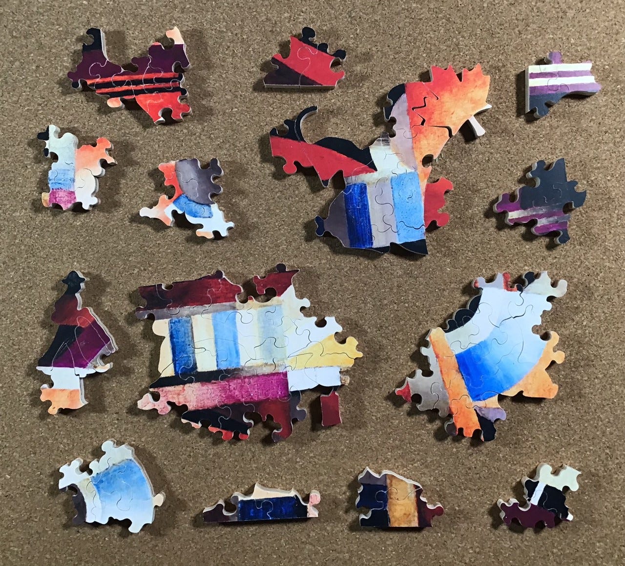
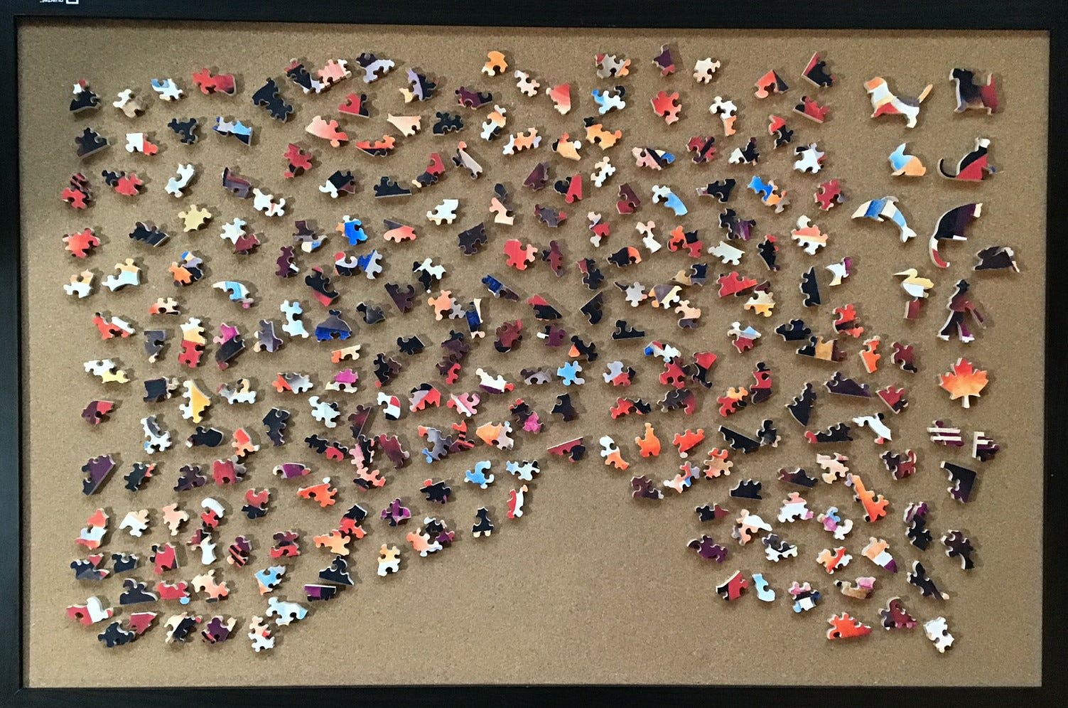
It slowed down quite a bit after that. Mostly I was expanding the islands of pieces that I had begun, and looked for colour or shape matches to begin new islands. Part of that involved building outward from some of the whimsies. I was able to merge a few of the islands but I still had no cohesive sense of the image, and of course I could not tell which sides of the islands were up, down or sideways.
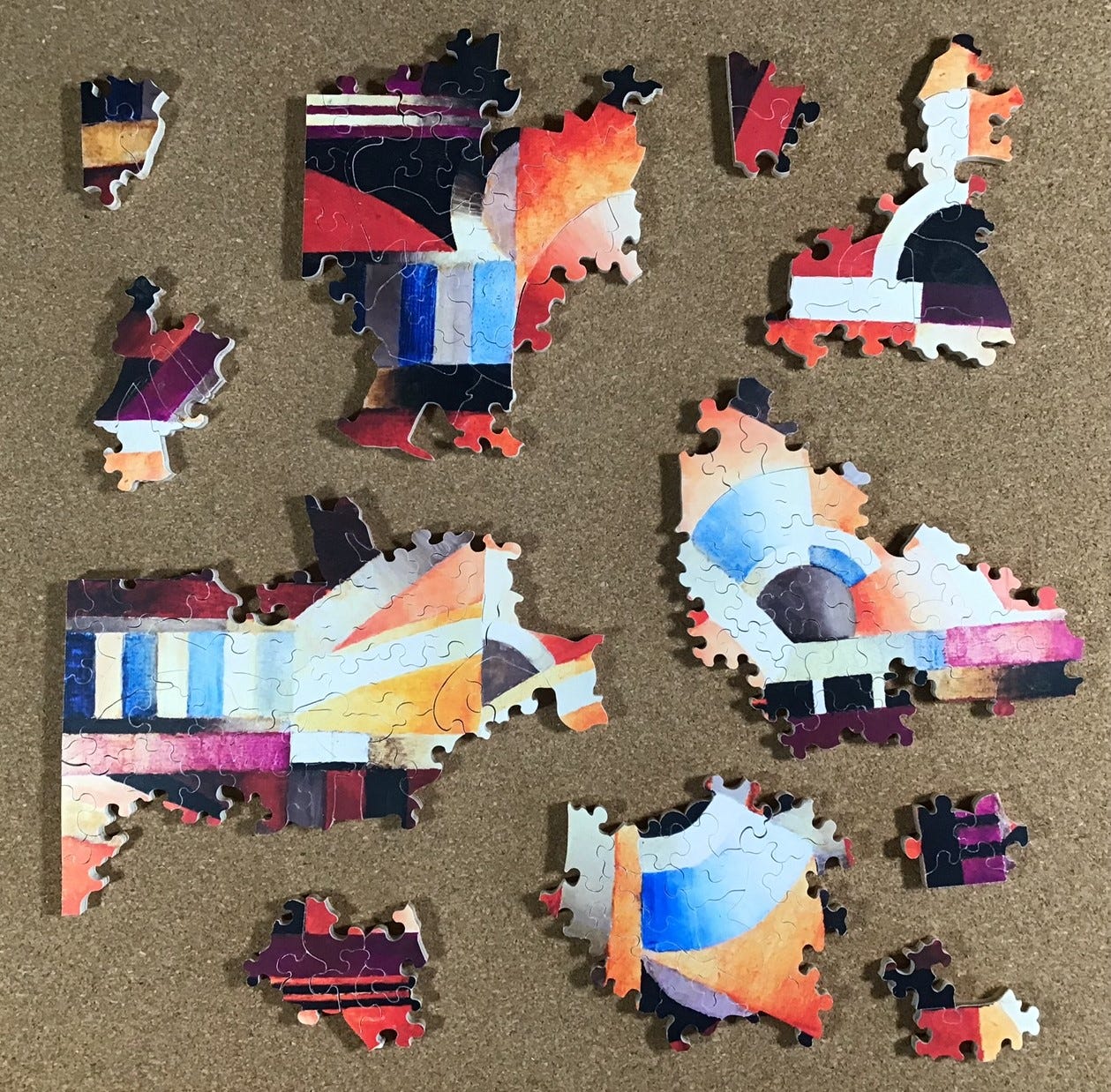
Now that I was getting down to fewer pieces the many subtle variations in shades and tones was really beginning to pay off, as was the brushwork. The going was still fairly slow but I was having a lot of fun and the image of a balalaika was beginning to emerge in the largest island in the upper right of the next photo. I could not recall which direction it should go in the image, and as I would expect from a cubist painting there are no shadows to provide clues. Having it either upright or with the body of the instrument(s) on the left and the neck on the right both seemed like they would be good composition.
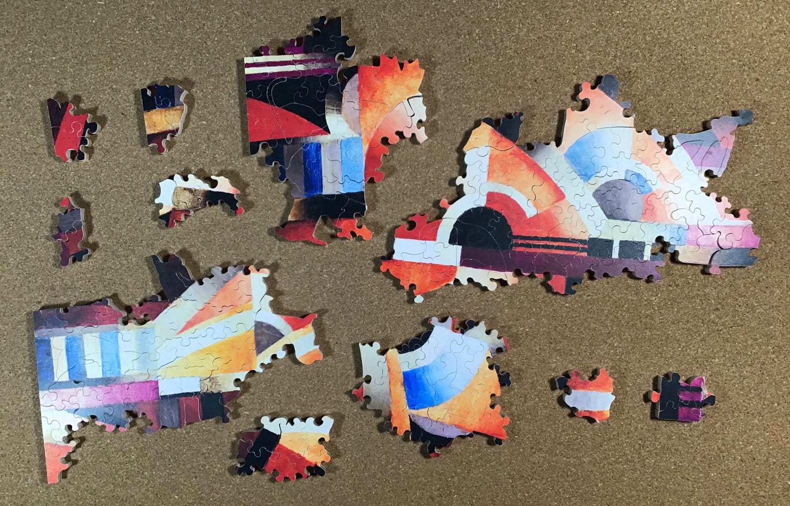
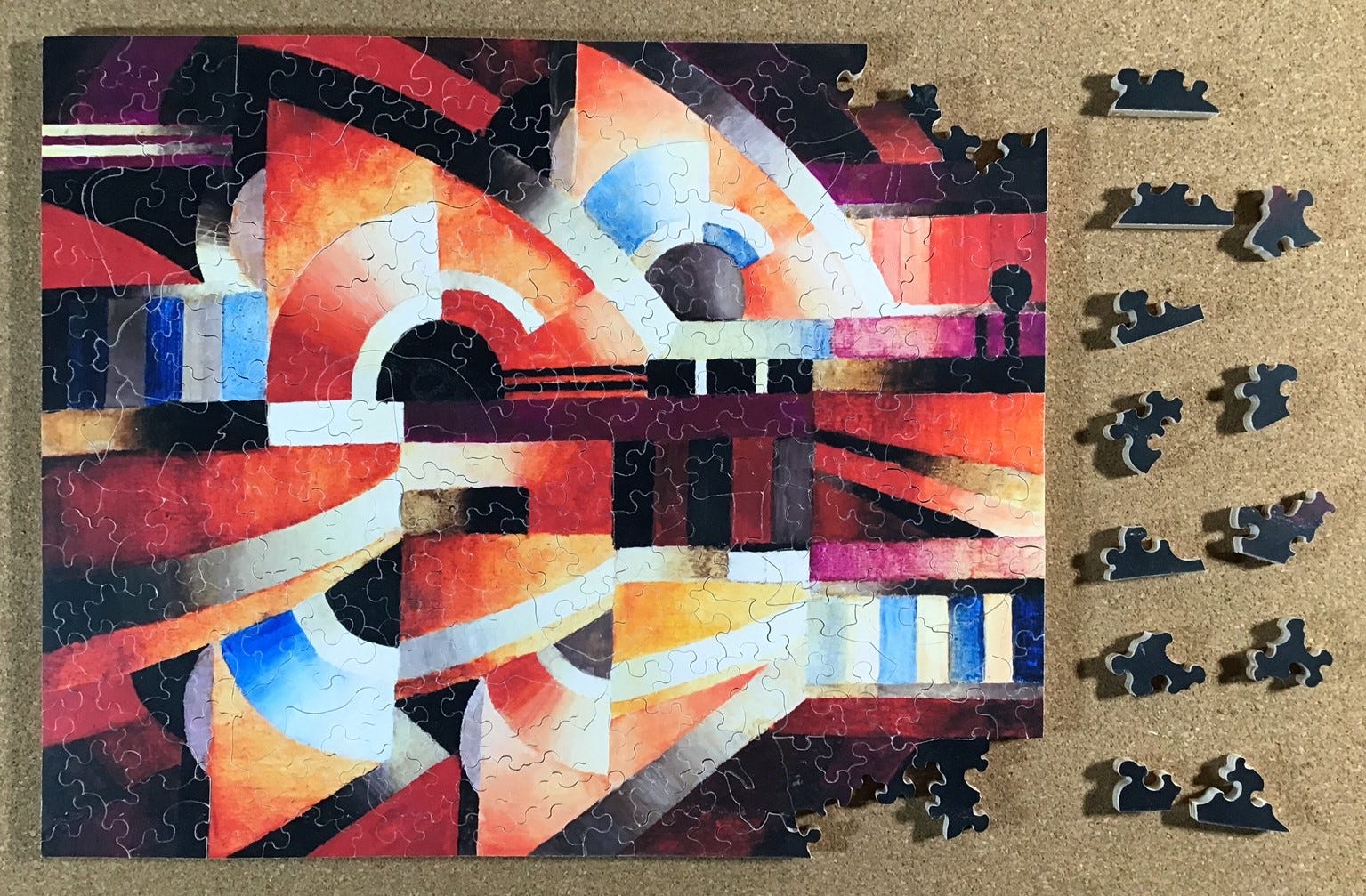
All of a sudden I was able to merge the larger islands and fill in the gaps and the image was really began to come together. It was at this stage when having to occasionally slip pieces underneath the puzzle to get them to fit in became more of a challenge. Sometimes I had to do a bit of deconstruction to get access. Having to do so was a bit of a bother but not really all that difficult. My thin stainless-steel 6” ruler and a pair of pointy-nose tweezers became handy tools.
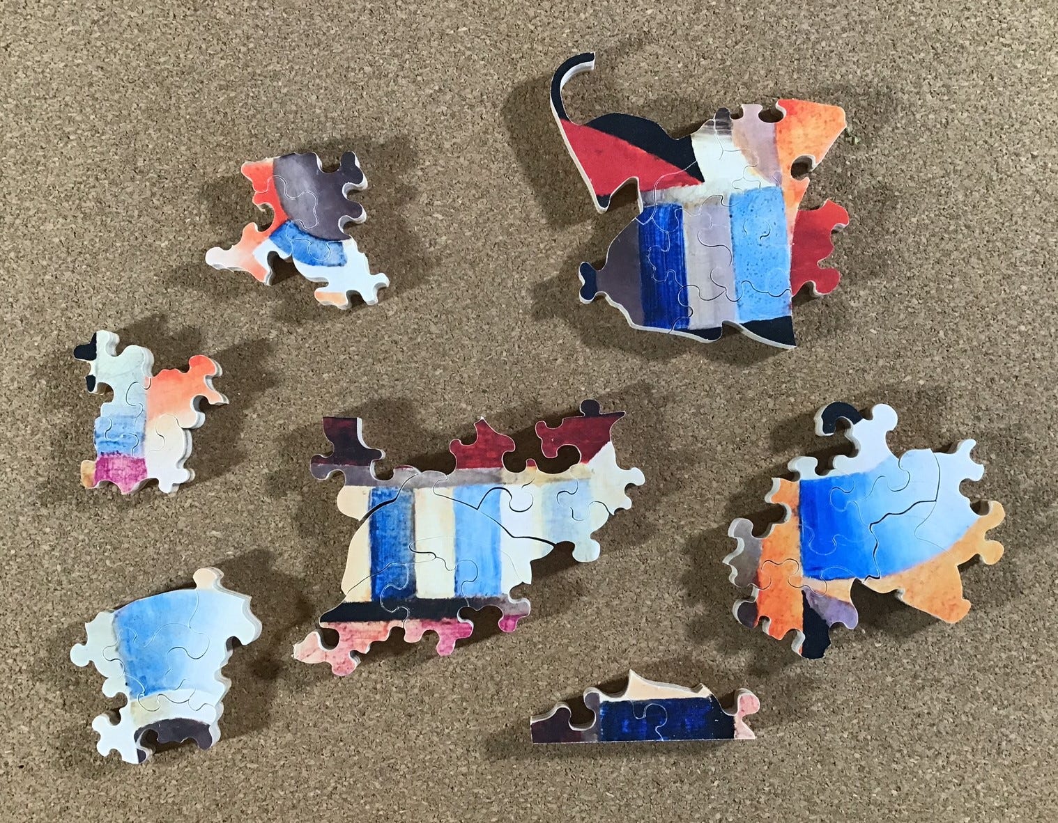
The balalaika in the painting was more dismembered than I had remembered:
With fewer loose pieces to look through for a match the pace of assembly was really picking up now.
Only after it was completed did I go to Mary Lee’s website to see what the proper orientation was for this painting. I had been looking at it and enjoying it sideways all along.
Good stuff, Bill. I had sort of slipped into thinking that your affection for the puzzles you review and the ones you own had mostly been centred on laser-cut puzzles. I was glad today to be reminded about hand-cut puzzles. What you shared about the skills and tools involved in the latter is appreciated. I rather think technological approaches to bringing out the colours for a hundred-year-old painting are blessing,. especially as that image is now being made available as a puzzle. I fear that full enjoyment too many of the historically great paintings gets diminished because of varnish darkening, pollution effects on paints, etc. So, I was especially interested today in your discussion and comparison re: colouring. By the way, I also love the image of the balalaika and Smyth's commentary about that. Thanks for this posting, Bill.
Regards,
Greg Skala