


43. Vintage Victory puzzles – Part 3
Relatively recent Victory Artistic and Gold Box series puzzles, another Super-Cut one, and conclusions from this recent vintage puzzle binge. (about 7000 words; 51 pictures)

This is Part 3 of a three-part series. If you want to begin at the beginning, go here.
Part 1 gave a brief overview of the history of the G.J. Hayter company, which made Victory puzzles for over 65 years, and it showed two examples of puzzles that were made before the company became a major puzzle manufacturer. Part 2 presented examples of the company’s two higher-end series puzzles — Artistic and Super-Cut — from when the company became a factory-style manufacturer in the 1930s. This final Part has two such puzzles that were made in the early 1970s and another example from the company’s premier Super-Cut series.
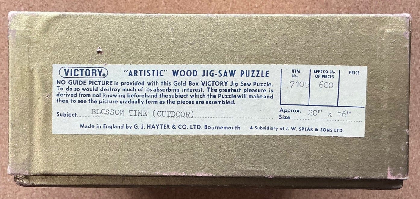
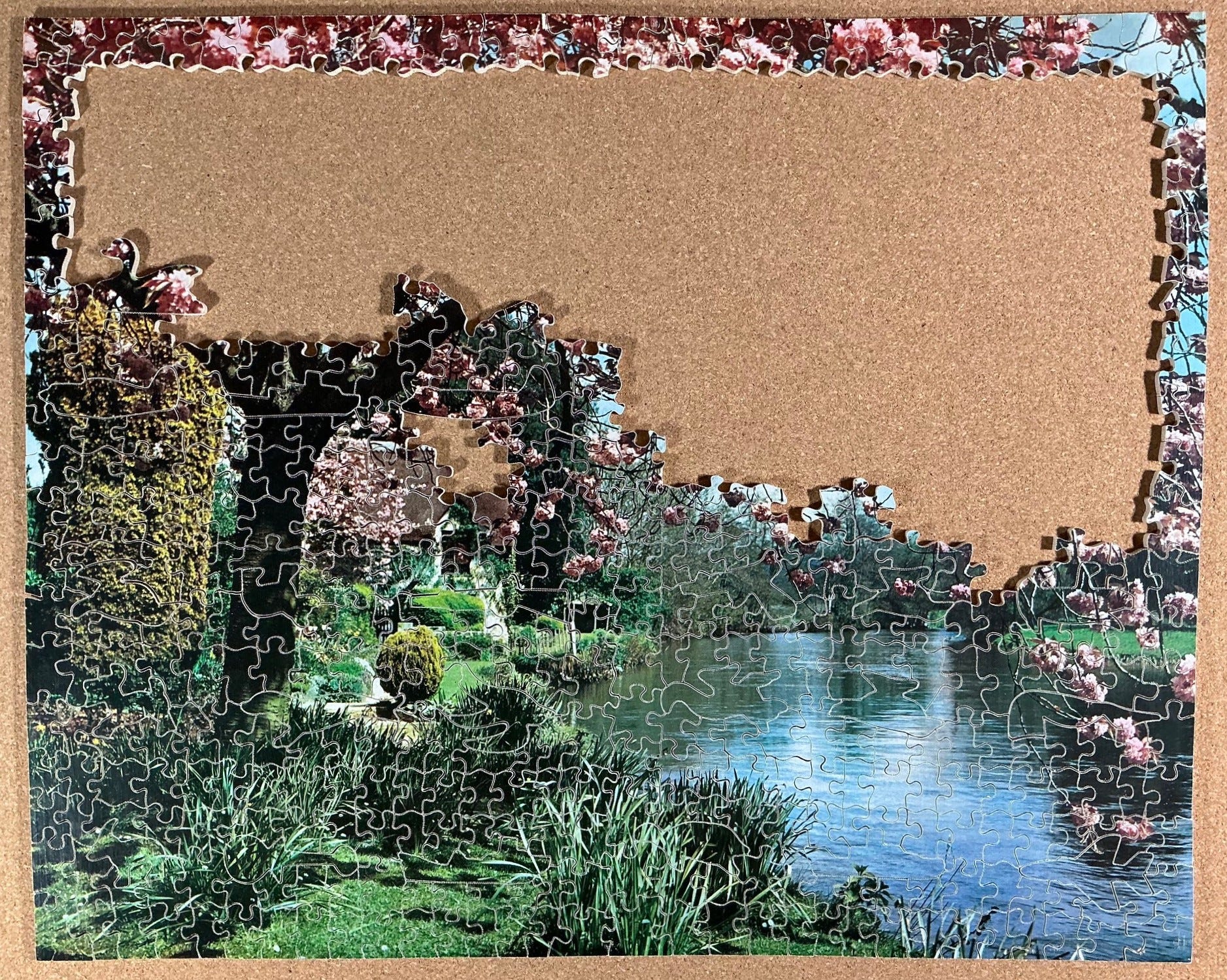
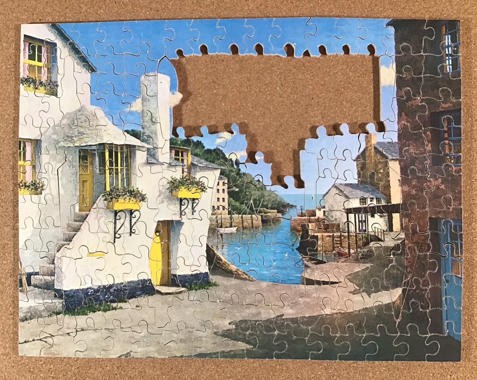
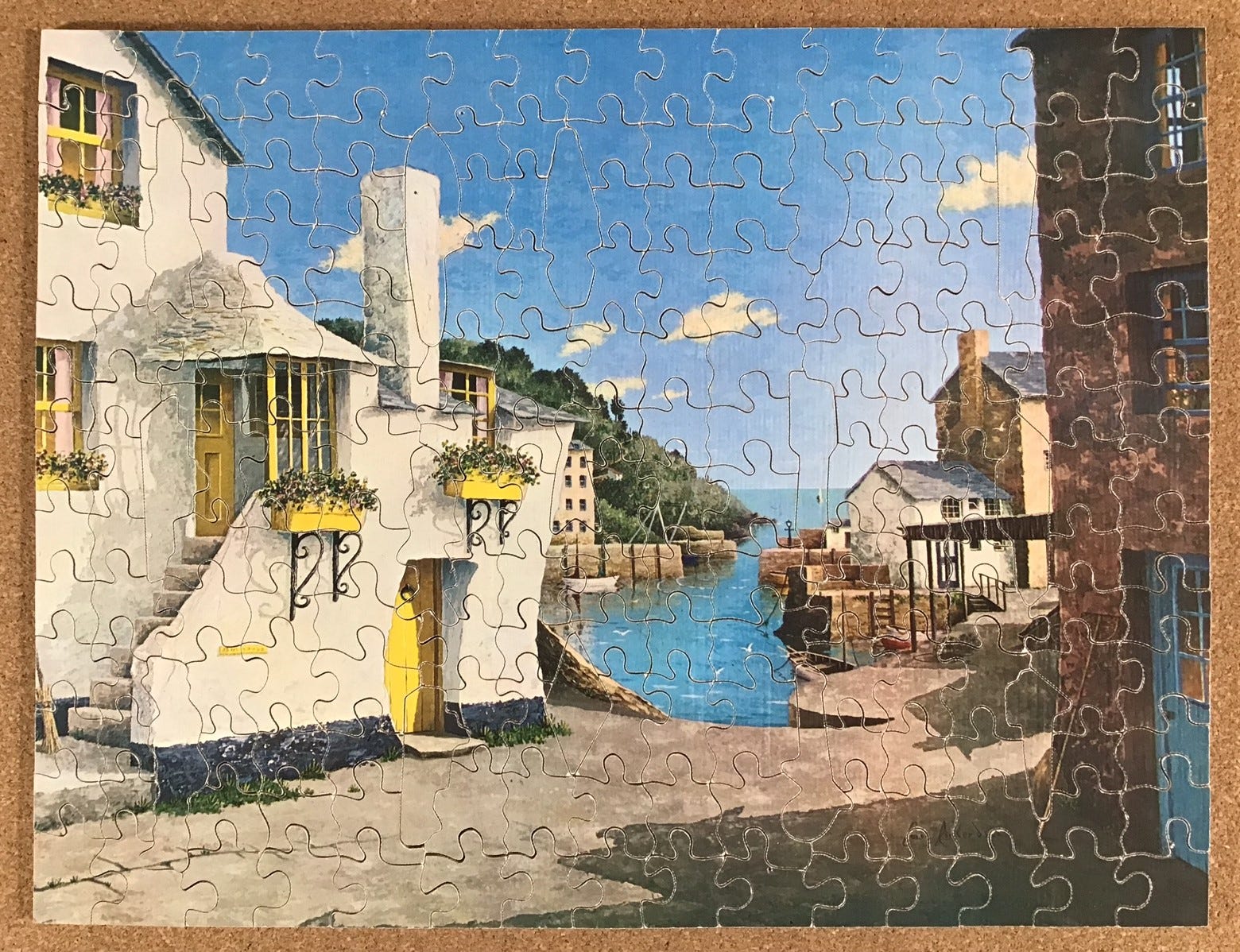
Blossom Time; Artistic series, made ca. 1971

Puzzle – G.J. Hayter & Company Artistic series made ca. 1971
photographer – not identified
about 600 pieces 15½” x 19¼” average 3.3 cm²/pc 4mm 3ply
36 figural pieces; small-wave horizontal cut-lines with glides; fully interlocking vertical cuts
This puzzle was made very soon after Gerald Hayter retired and sold his company to the game-maker J.W. Spear & Sons. I can tell that because, although it is an Artistic series puzzle, its end label says that G.J. Hayter & Co. is a subsidiary of the new parent company. (Before too long Spear changed its status from being a subsidiary to being a division of the parent company.) The label also includes an item number (presumably a continuation of Hayter’s stock numbers, which were never shown on the label during his day,) and also a new logo for the company (which is not on the box top stickers.) I infer that it must have been made very soon after Spear acquired Hayter and that it may have been made in 1970, but I’m playing it safe by calling it circa 1971.
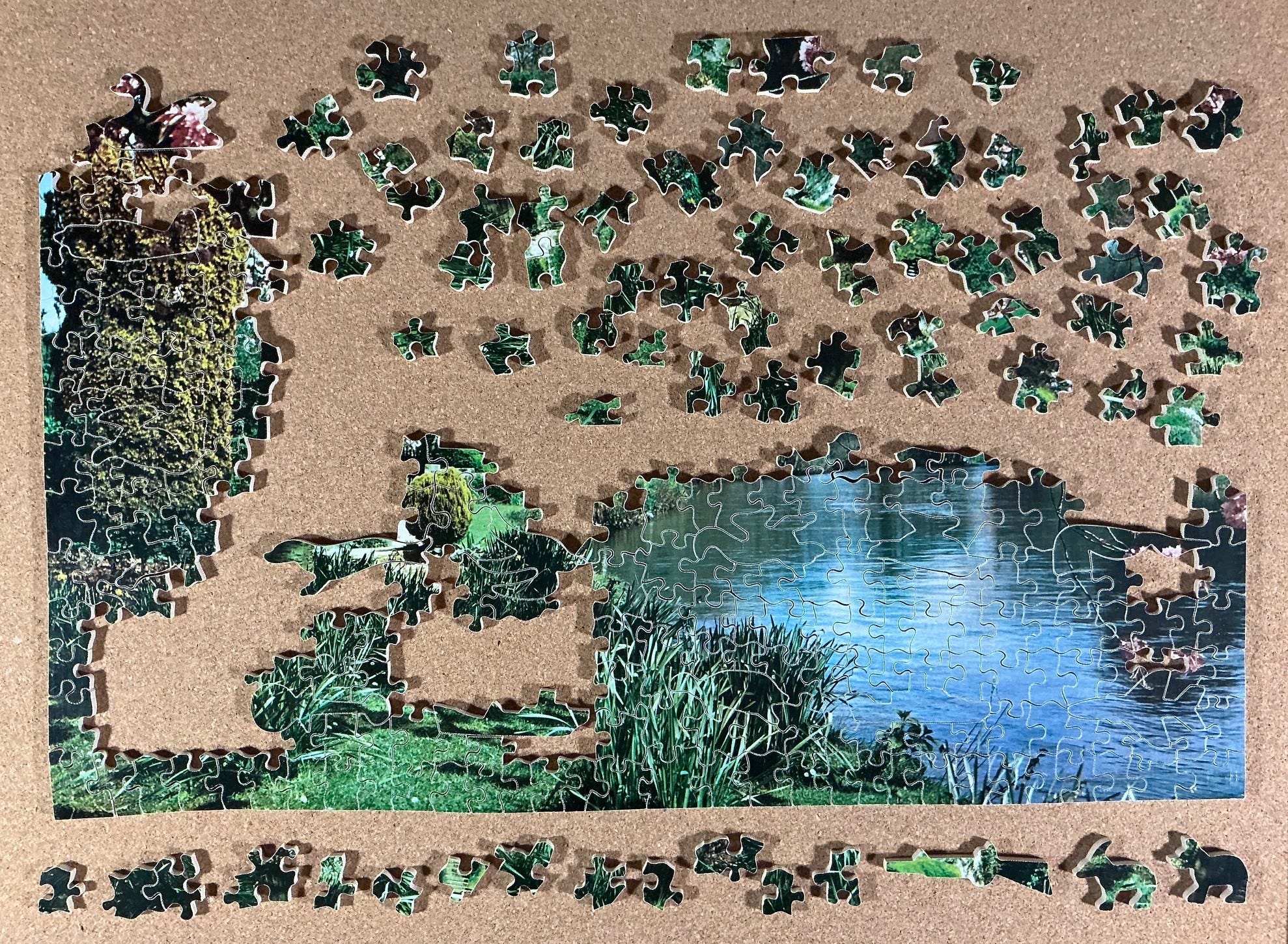
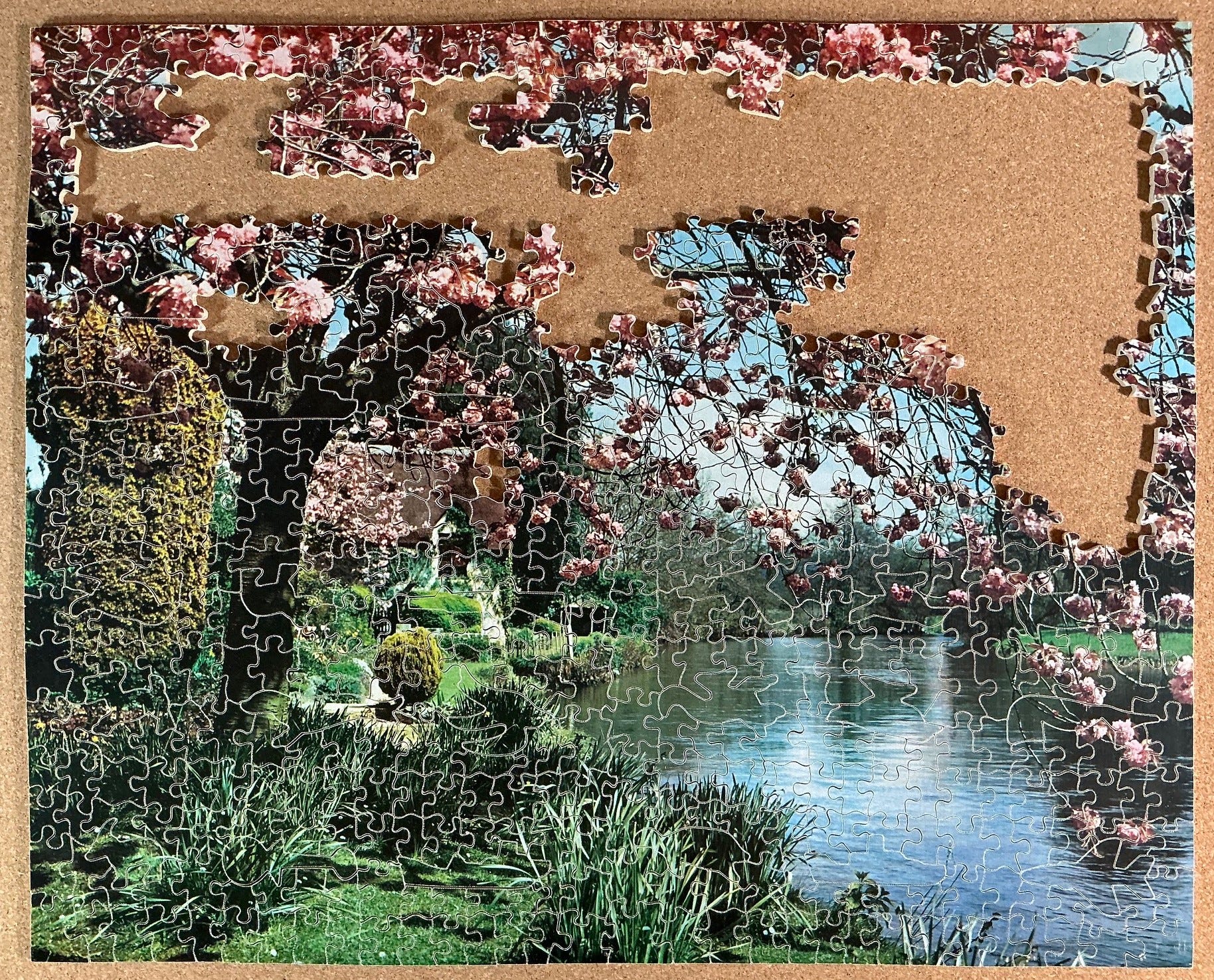
The photographic image of this puzzle didn’t especially appeal to me but I was able to buy Blossom Time for a bargain price for a 600 piece Artistic puzzle; £42 (or about $50US or $75CDN.) When I selected it for assembly several months later I remembered having thought when I bought it that its artwork would likely prove to be a very forgettable. As it turns out I was right, so this was about as close as I can get to the authentic experience of beginning a puzzle with no idea of what the image would look like except for scanty information on the label: “Blossom Time (Outdoor)”.
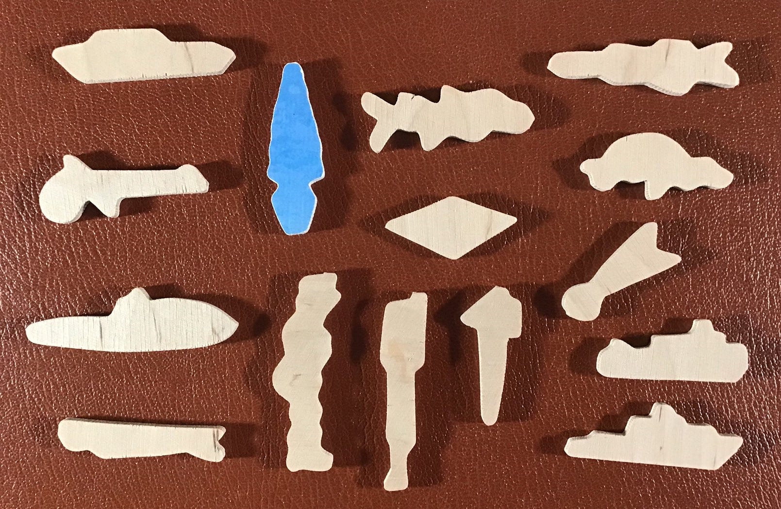
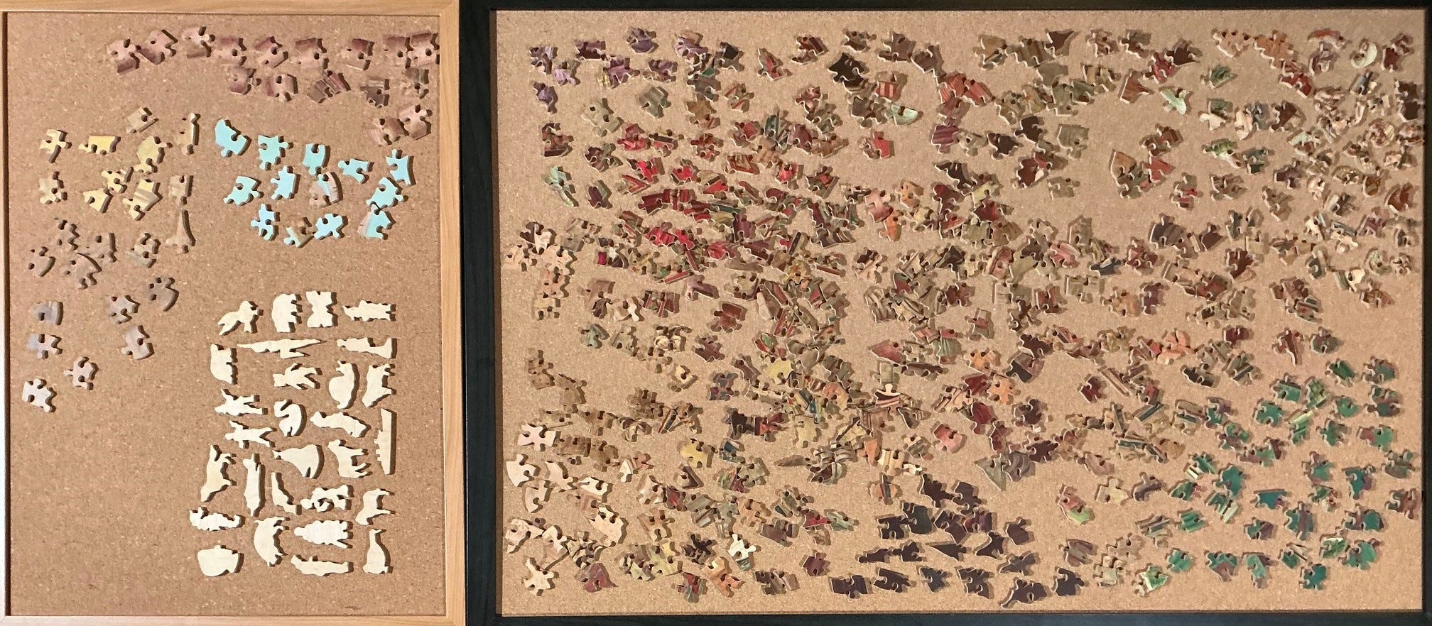
It is one of the largest wooden puzzles by piece-count that I have assembled to date, so I decided to spread the sorting out onto all three of my corkboards to give myself lots of working space. After flipping I recognized that, as expected from the name, a lot of pieces were coloured like cherry tree-blossoms. What made some pieces promising places to start was when they didn’t include blossoms at all. So my initial sorting was quite simple: In addition to separating out the whimsies (36 of them!) I clustered together pieces that appeared to be or have water, and others that were rather distinctive shades and textures of gold foliage.
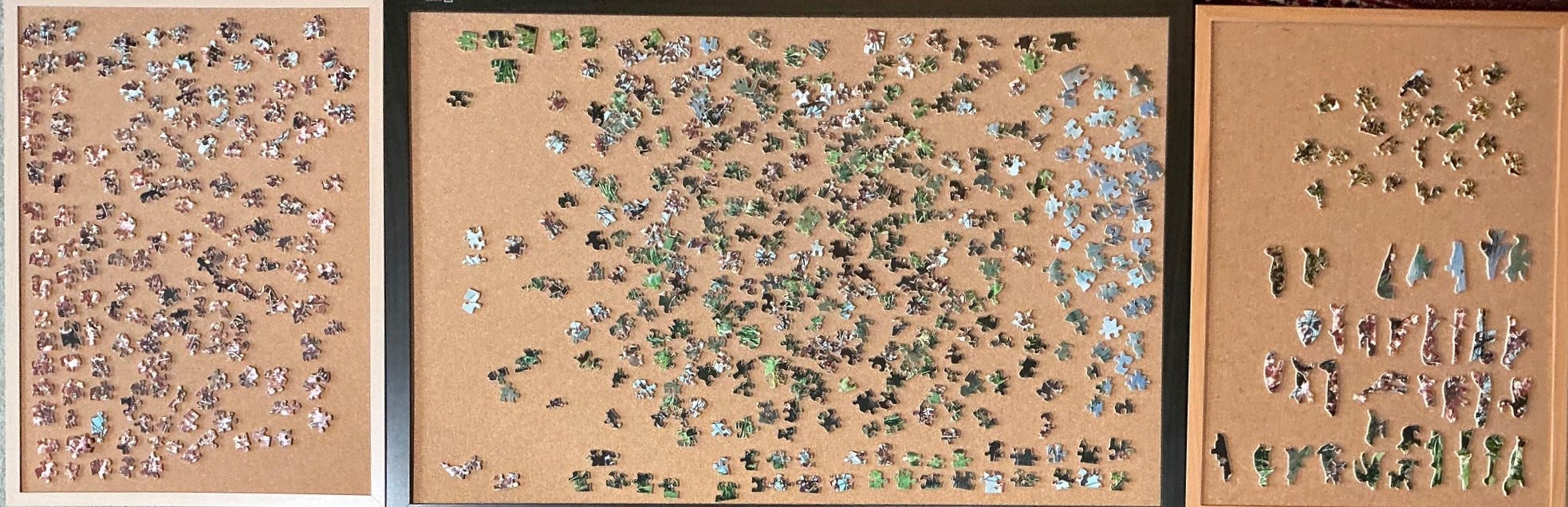
I began with the blue water pieces that had parallel wave lines, and their recognizably adjacent pieces:
I made good progress that way, especially because the water part of the image included four figural pieces. Actually, all of the figure pieces in this puzzle are very well cut for an Artistic series puzzle – none are quite as intricate as some of the whimsies in a Super-Cut puzzle but every one of them is a good recognizable silhouette. I certainly can’t say that about all Artistic series puzzles.
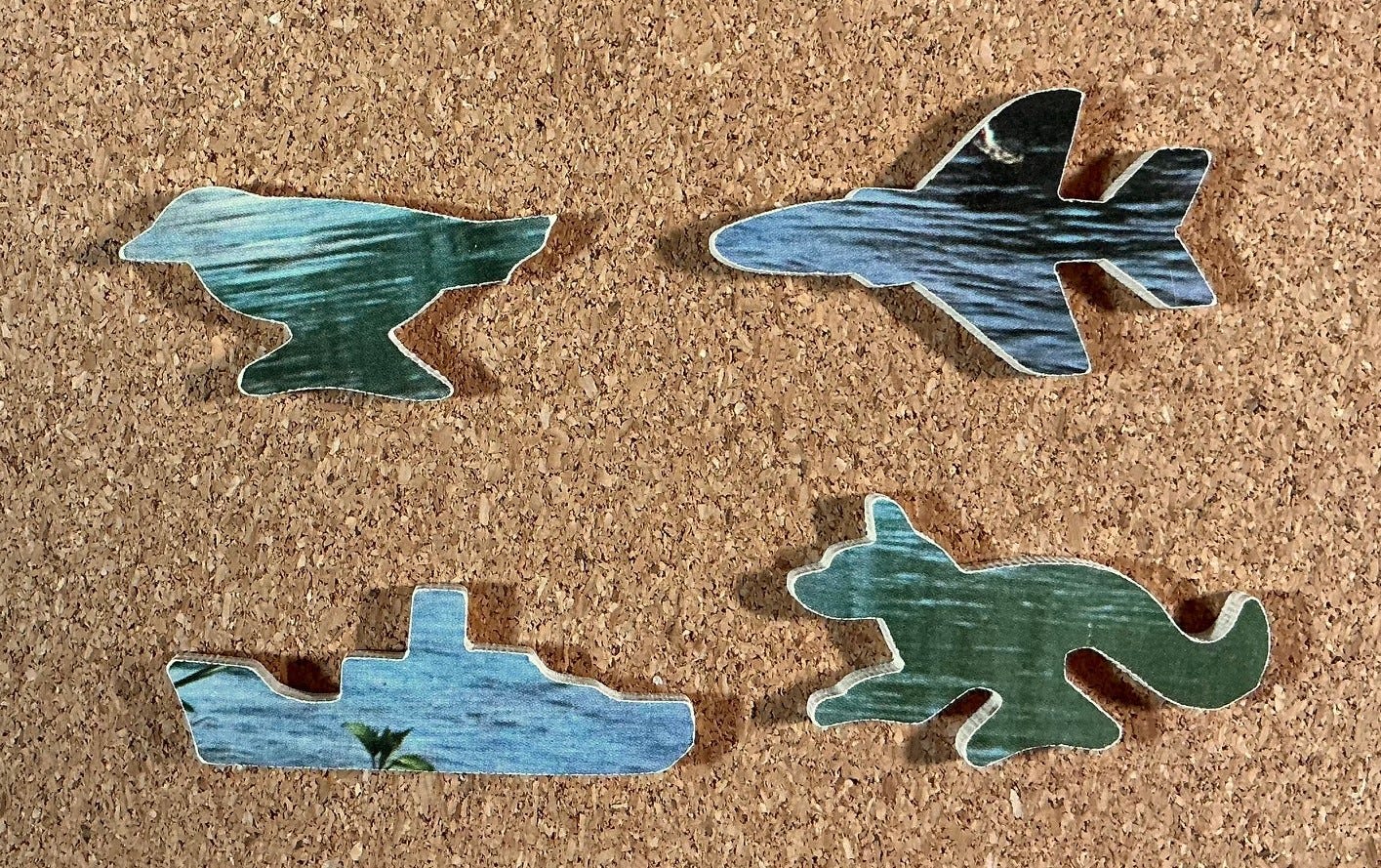
After that I turned to bladed foliage that appeared large enough to be in the foreground, and placing them was aided by three more whimsies. Figural pieces, because of their distinctive silhouette outlines, are an aid to shape-matching. I could tell that having 36 of them would be very helpful for this puzzle.
Next I did the pieces with golden foliage. There weren’t very many of them but they included four more whimsies.

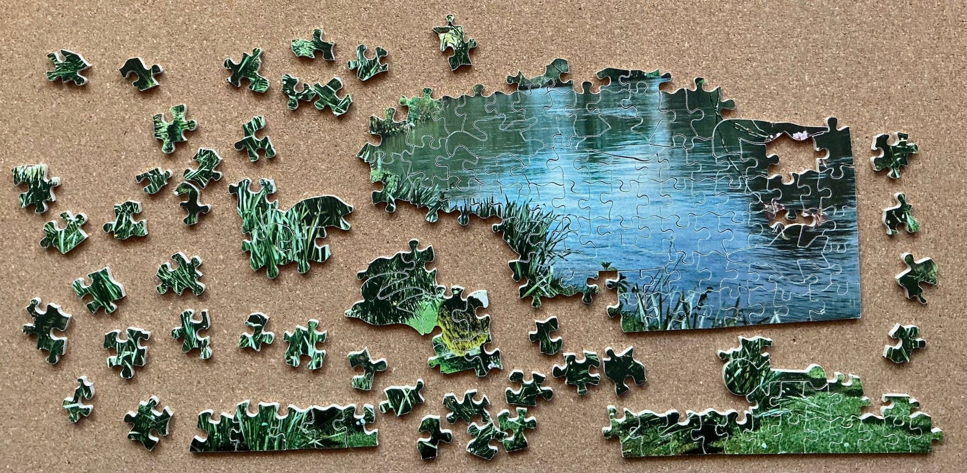
Then it was back to the water. I extended it by scrounging through the loose pieces for water-adjacent pieces that did not have waves but which were recognizable by gray-green or black featureless textures. This puzzle had very few such pieces.
There were also green and black pieces with a texture that was much like the reeds adjacent to the lake or pond, and some of these were edge pieces. Since reeds grow straight and upright I could tell that they would be along the bottom edge. But before I got very far along doing that I got distracted into assembly of some other green and black edge pieces that had a different distinctive texture but they were easy to assemble into linear edge islands. I didn’t know whether they would be on the bottom or one of the sides.
Dealing with the reeds proved fairly slow. I know from personal experience that when cherry trees are in their fullest blossom in springtime they show little or no green foliage because the leaves have not yet begun to unfurl. It occurred to me that all of the bright green would therefore likely be in the brightly-lit foreground rather than among the tree branches.
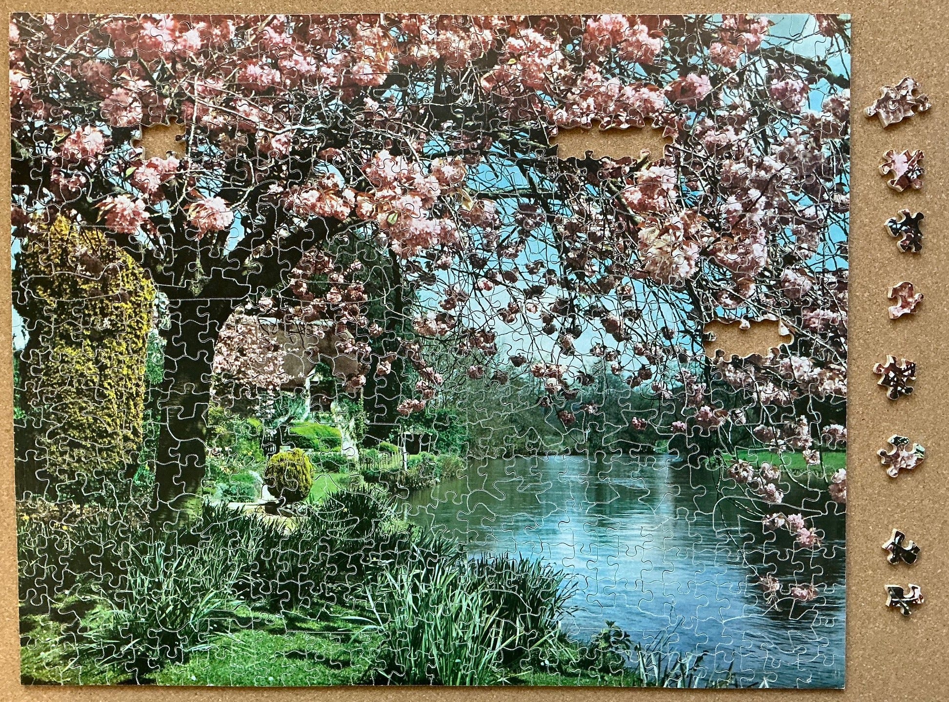
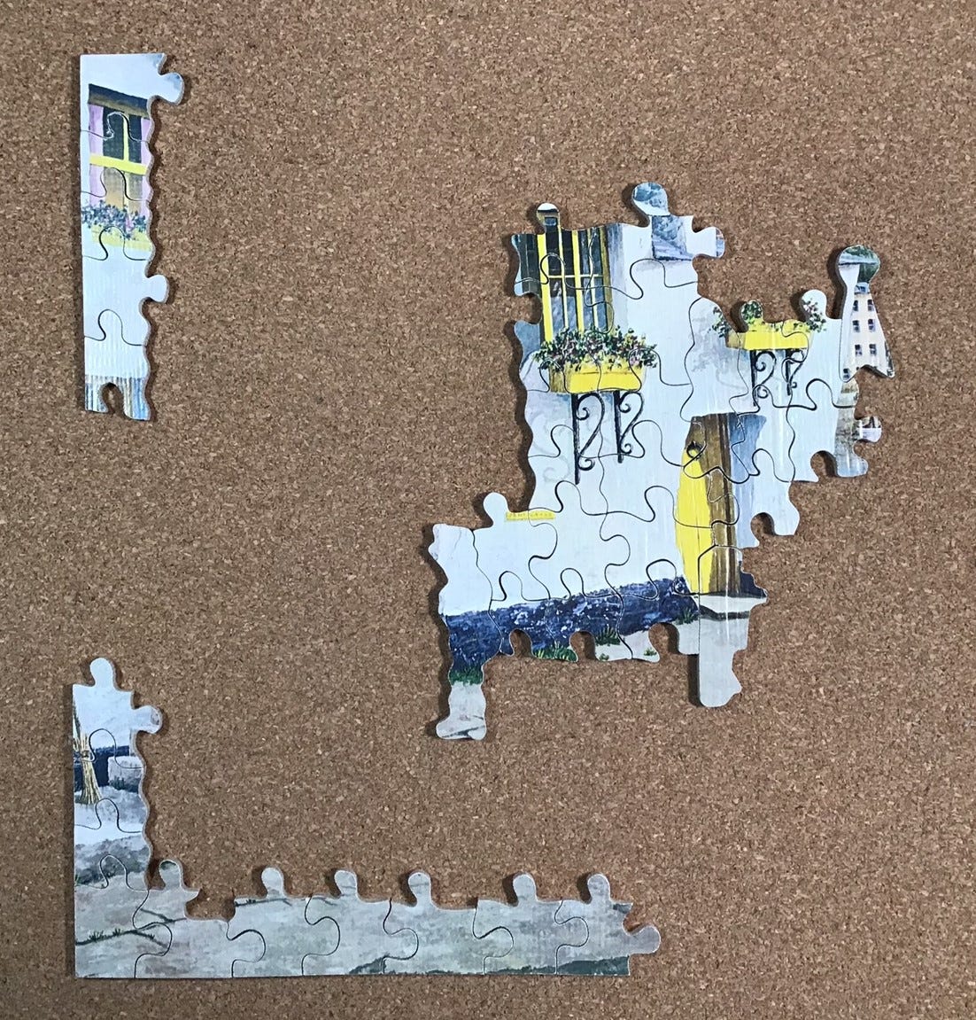
While moving all the bright green loose pieces to be within easy reaching distance I noticed that a high proportion of them were also edge pieces. Focusing on these green edge pieces made for fairly quick progress and was quite pleased when I was able to connect the lake assembly to the golden foliage. But I probably should have taken a photo before making a very timid tentative placement of my next-largest island to where it only touched the large assembly in two places:
I could then see that the placement of the figure pieces was conforming to the cutting style that I had previously inferred for both The Victory puzzles and Artistic series ones, in which the cutter locates whimsies into a line in order to maximize the potential for continuous line-cuts that span the puzzle. In this case, the figures were “laying down” so that those continuous cuts, with their glides, would be horizontal.
This is the first puzzle in which I put that insight to good use. I tentatively placed figural pieces based on colour and sometimes-very-meagre shape evidence. This helped me find other adjoining pieces to confirm my tentative placements and became an important part of my assembly strategy for this puzzle. When taking the following photo I detached five such figural placements that were on the current frontier of my progress to highlight them.
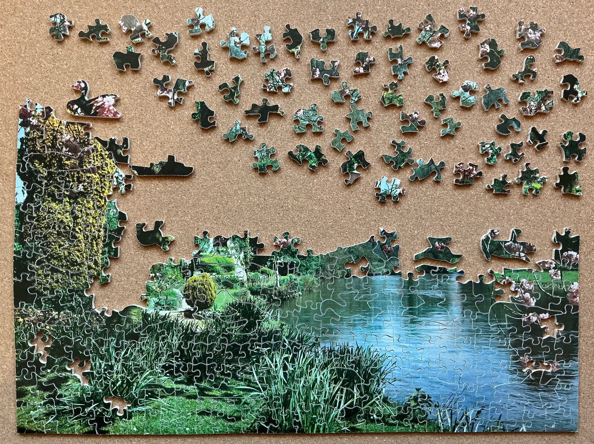
The approach of doing the green/bottom part of the puzzle first seemed to be working well so I moved all of the rest of the loose pieces that included less-vibrant greens so that they would be in easy reach (and within the focal length of my reading glasses.)
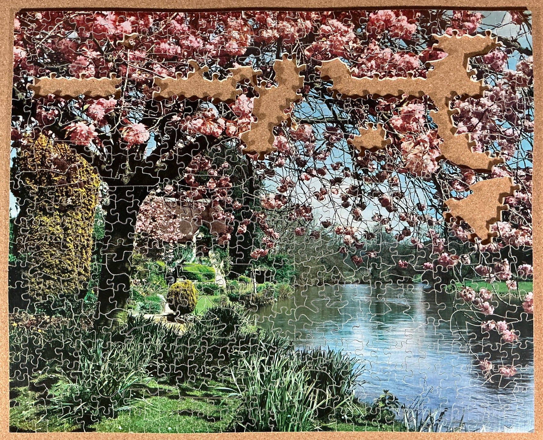
I got rather stuck after I ran out of green pieces. You can see here what I did next. I had to fix some incorrect placements of edge pieces but eventually got the edge completed.:
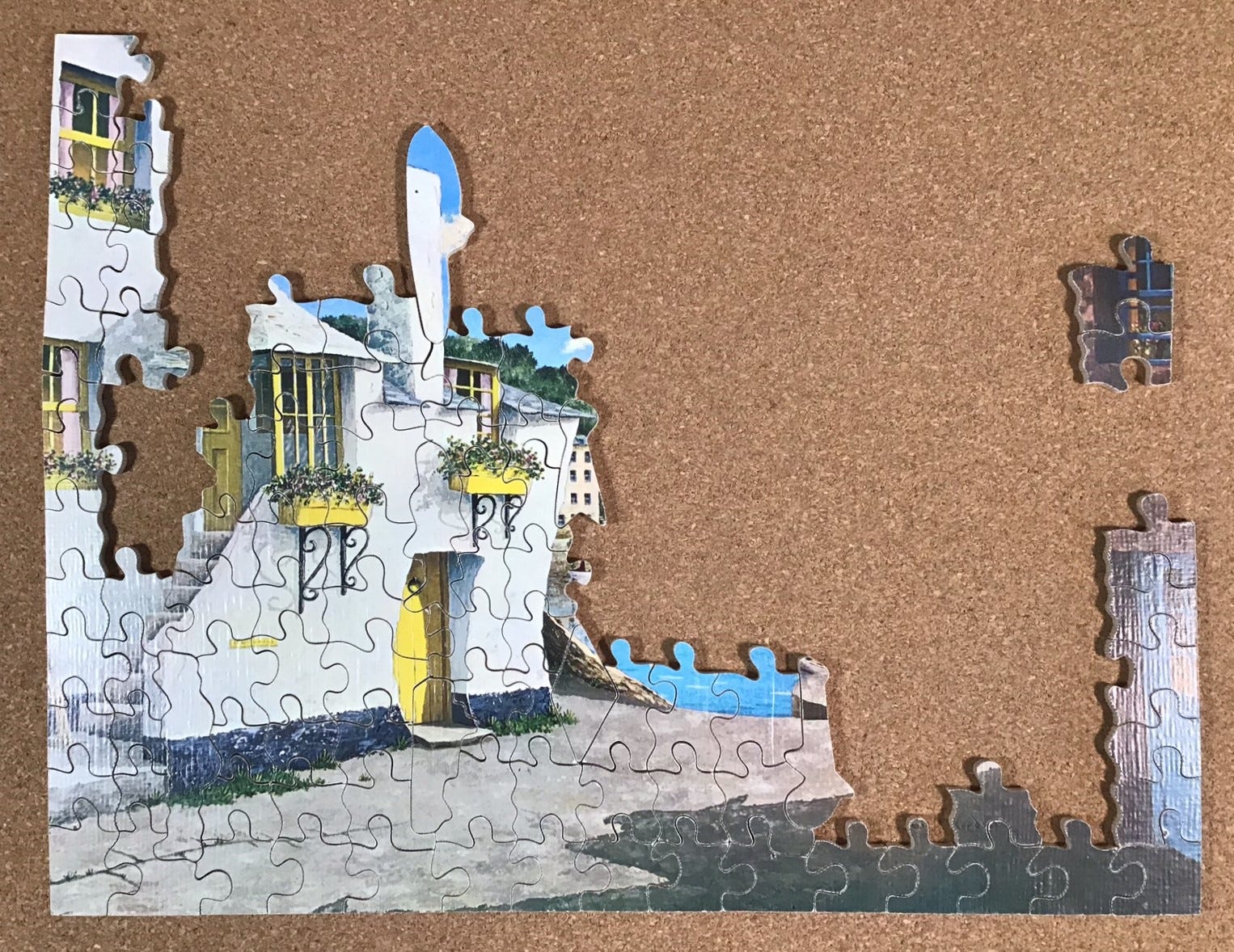
Next I turned my attention to pieces that included some sky-blue. I began with the almost-white ones near the centre of the image just above the water. The sheer quantity of bare-branches set against the sky prevented their chaotic lines from being very useful in placing pieces, but they did give satisfying confirmation whenever I made a correct placement. In addition to what you see here I was making progress developing a number of 2-4 piece assembly islands that are not shown in the photos, but overall my progress was getting really bogged down about here, and it remained slow all the way to the end of the puzzle. (As always, when I say progress was slow I am not complaining - just being descriptive.)
My lack of progress in the top-left of this next photo certainly wasn’t for lack of trying. What progress I made came mainly by applying my newfound understanding of the way that figure pieces would “lay down” in rows. I would continue to look for tentative placements for islands that I built around the figural pieces, and when I did it gave me two or three sides around a void, making it easier to find the missing pieces. It sure helped to know that the wavy “glide” side of pieces would be a horizontal cut-line.
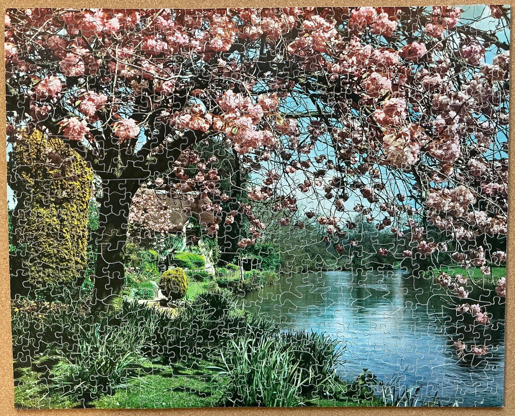
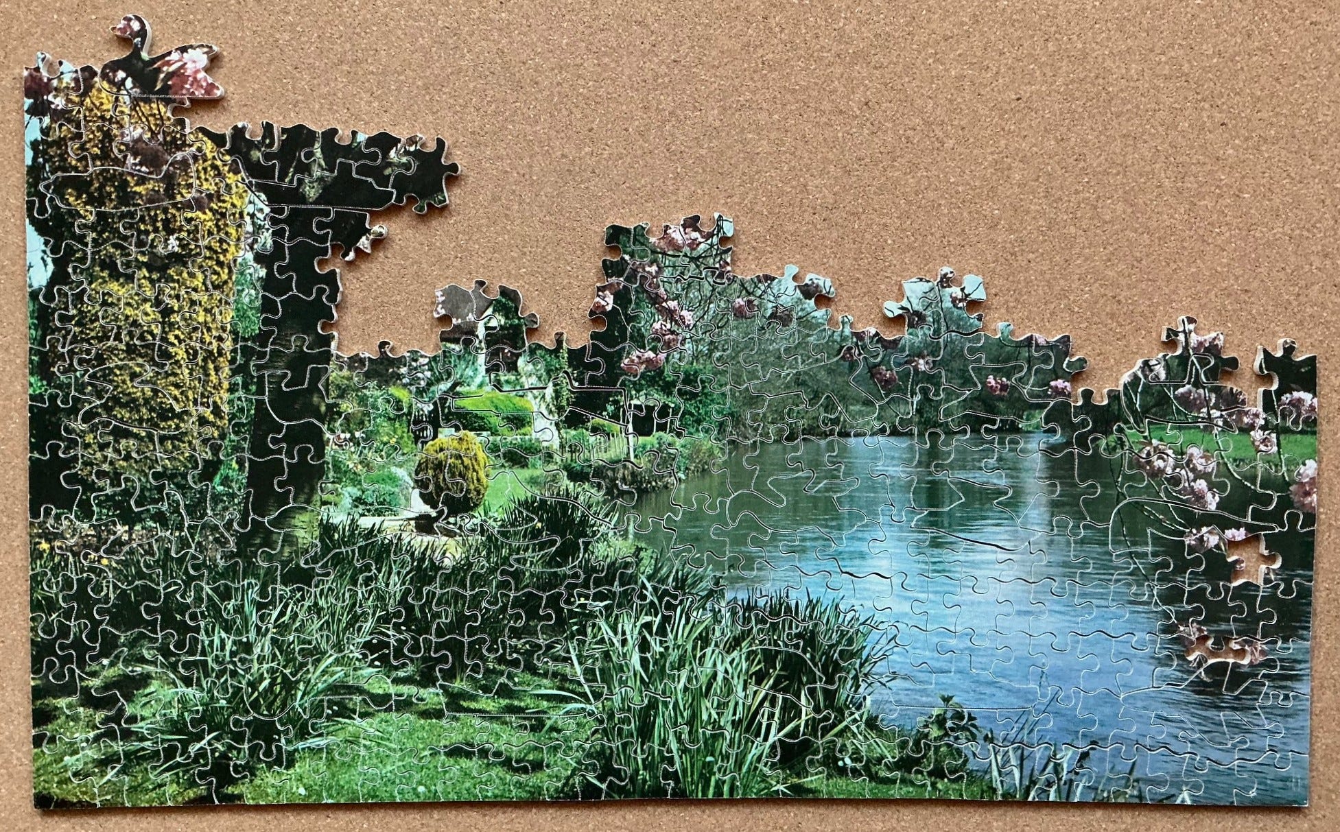
This is probably the most well-cut Artistic series Victory puzzle that I have done to date, and I got satisfaction from developing new assembly skills based on new-found understanding of this series’ house style. But, all-in-all, I didn’t really enjoy doing this puzzle all that much. Part of it is that is because its image is a photograph and I prefer images that are paintings. Another is that at 600 pieces it is at the very top end of my current patience level and the top half of this puzzle was really challenging. But I am pleased to say that I never felt like I was developing feelings of frustration, although I did get to the point where I just wanted to get it over with.
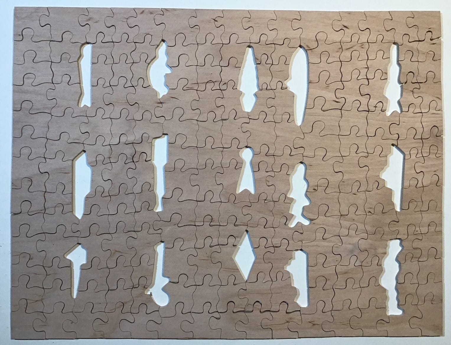
For laser-cut puzzles I often look at the back-side to see if there are any clever placements of whimsies such that they relate to each other, or multi-piece ones that I had not previously sufficiently appreciated. But in my experience to date, those are cutting tricks that had not yet been developed in the age of vintage hand-cutting.
Still I do sometimes look at the back of vintage puzzles, partly out of habit but also to see if I can figure out the hand-cutting process better and see if I can discern the order in which the initial cuts were made. As far as I can tell the blank was usually cut into quarters for easier handling, with continuous up-down and side-to-side cut-lines in the middle. In this case, the first cut seems to have been up-down.
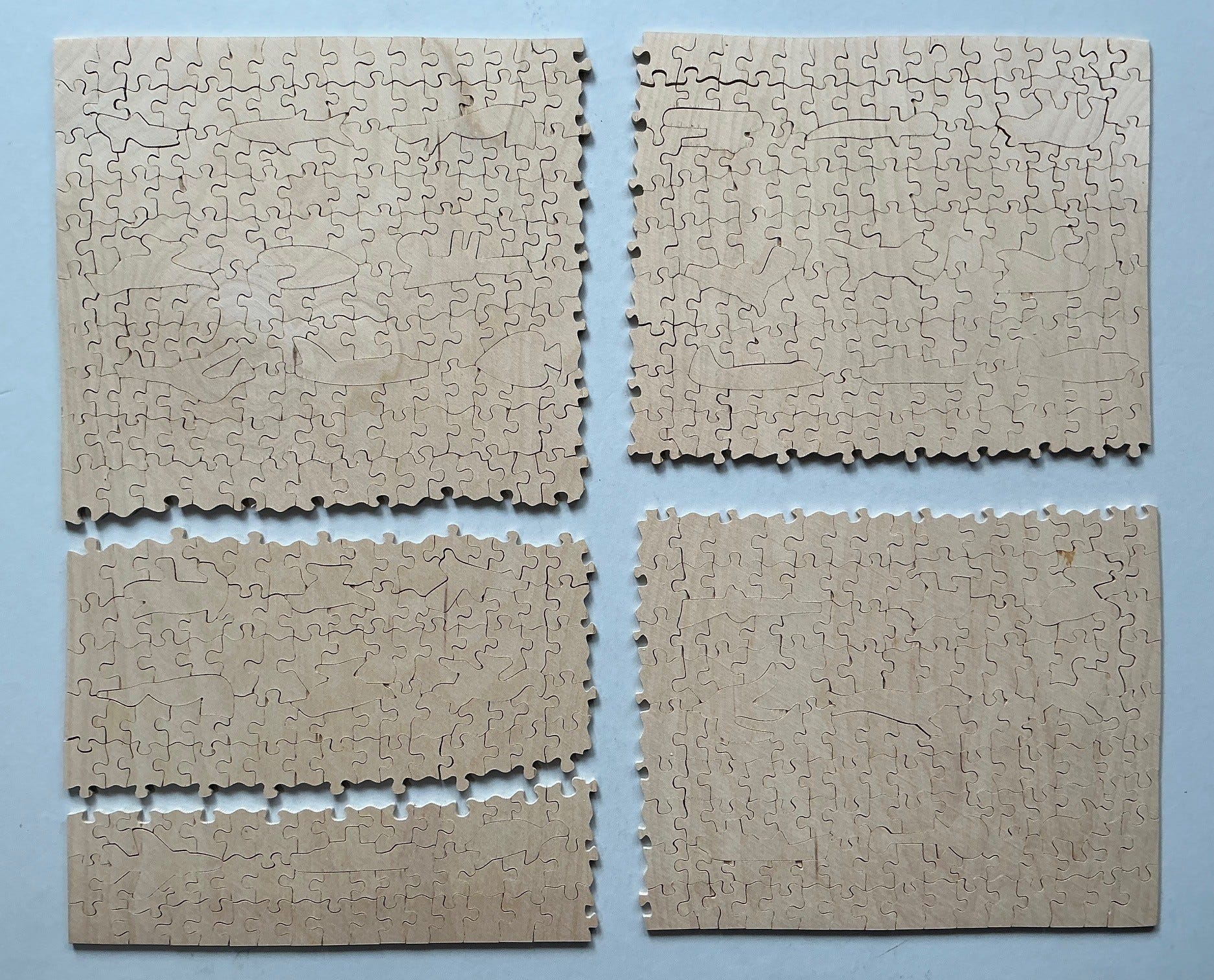
I presume that the next stage in cutting was deciding how to position the figural pieces to maximize the number of additional continuous left-right cut-lines that could be fit in those quarter-puzzles. This puzzle has continuous horizontal cut-lines but very short up-down ones (recognizable by the fact only crossing cut-lines can make “four corner intersections.”) After cutting the continuous line-cuts I suppose it is a matter of cutting out the whimsies either free-hand or using paper templates, and then cutting the remaining background into standard size pieces.
All of the non-whimsy pieces in this puzzle are a reasonable approximation of the standard Victory puzzle average piece size of three to four cm²/pc (about 2 pieces per sq. in.) which is more consistent than in many other Artistic series puzzles. This is another sign of proficient cutting. As in all Victory puzzles that have whimsies, the figural pieces are almost always considerably larger than the overall average piece size.
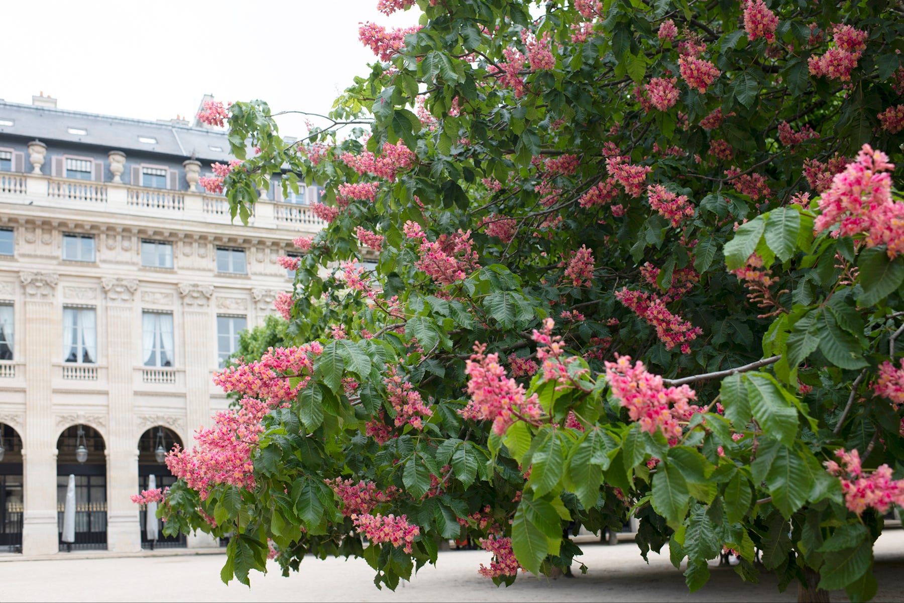
The photographer of this image is unknown, and the image of this puzzle did not lead me into any research rabbit holes. But it does give me the opportunity to tell you about the many species and varieties of ornamental cherry and other blossoming trees that we have as our boulevard trees here in Victoria. Each street has its own distinctive variety so different streets come into full bloom at different times, beginning in early February and the bloom times cycle through different streets through to May. This was all planned back in the 1930s (coincidentally, about when this puzzle was made) by Herb Warren who was our city’s Parks Commissioner for many years. He was a landscape architect whose PhD dissertation had been about ornamental tree species. I got to know him back in the 1980s, long after he had retired, when both of us were on a heritage tree committee.
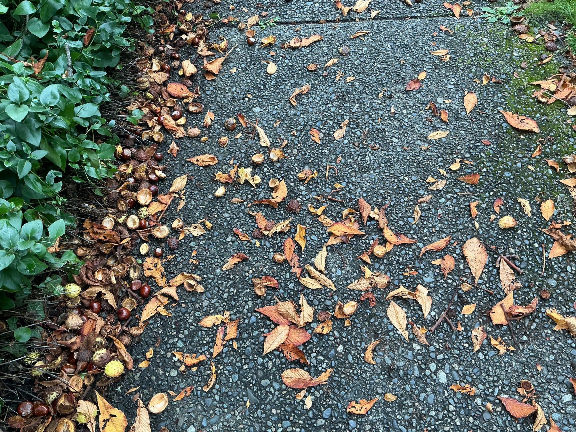
Most of Victoria’ blossoming boulevard trees are magnolias or ornamental prunus species (plums, cherries, peaches, apricots, almonds, etc.) that do not yield fruit later in the trees’ annual growth cycle. That is, except for Cook Street, the arterial street on which I live. We have something special – a variety of very large horse chestnut trees (aesculus hippocastanum baumn) that were bred to have a lovely show of large pink, red and white blossoms in the springtime.
But as I write this we are not in blossom season; we are in the annual autumn conker season (named after a horse chestnut smashing game) during which very large inedible seeds that developed from those blossoms tumble down onto the street, boulevard and sidewalk from heights of up to 12 metres (40 feet.) Clad in leathery-textured spiked husks, the projectiles produce a loud THUNK sound when they hit the ground with enough energy for the seeds to break free from their casings.
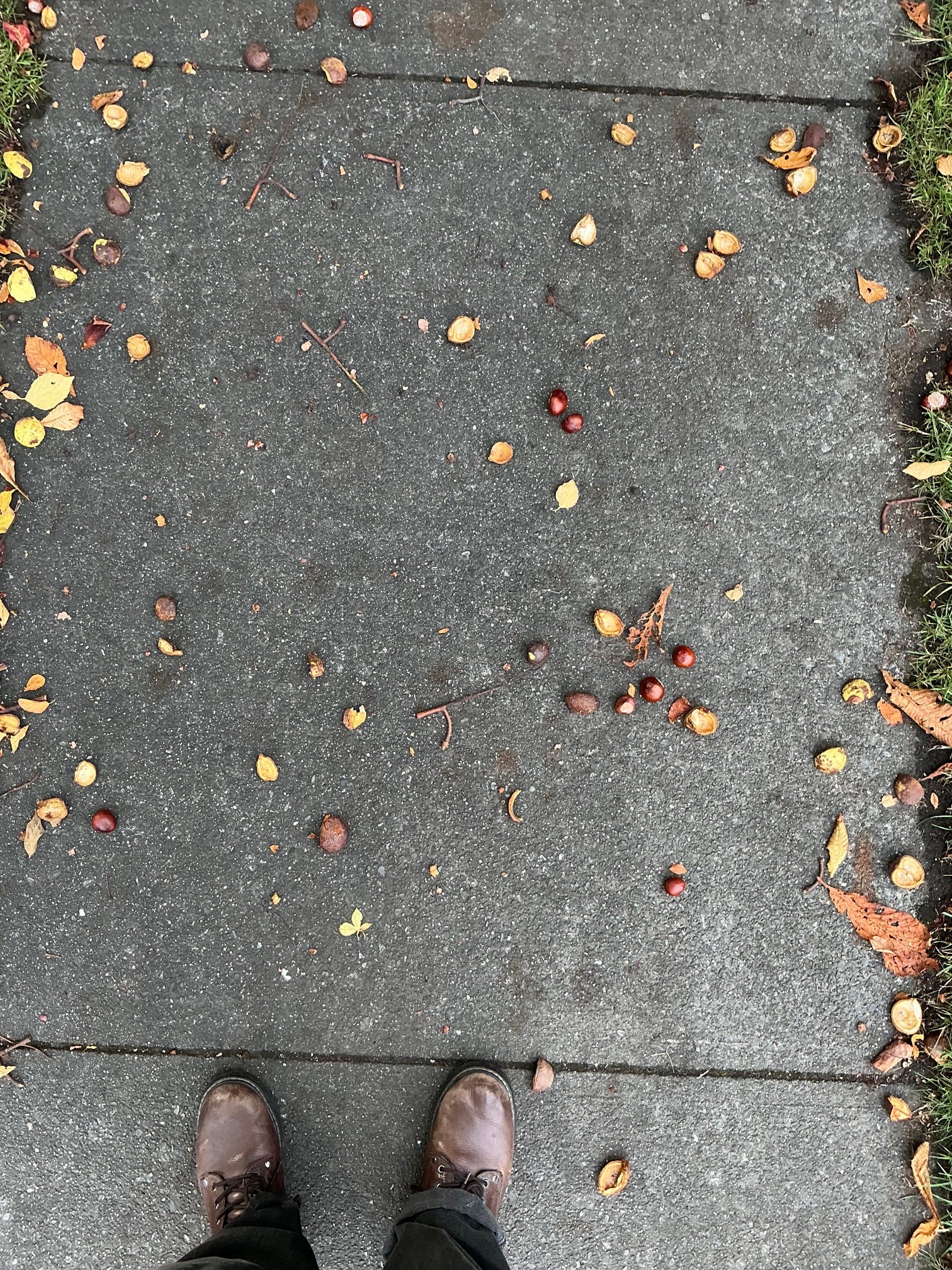
Pedestrians need to be very careful to avoid stepping on the beautiful brown marbles, and there is always the risk of having one of those spike-clad objects (larger than a golf ball but about the same weight) crash down upon one’s head. That makes this a very exciting time to go for a walk here along Cook Street. Especially during windy weather wearing a hat is advisable. Like many neighbourhood residents, during this season I tend protect my fellow citizens by kicking the conkers aside as I shuffle along.
But in the springtime, the blossoming trees and their later snowfall of petals are indeed beautiful.
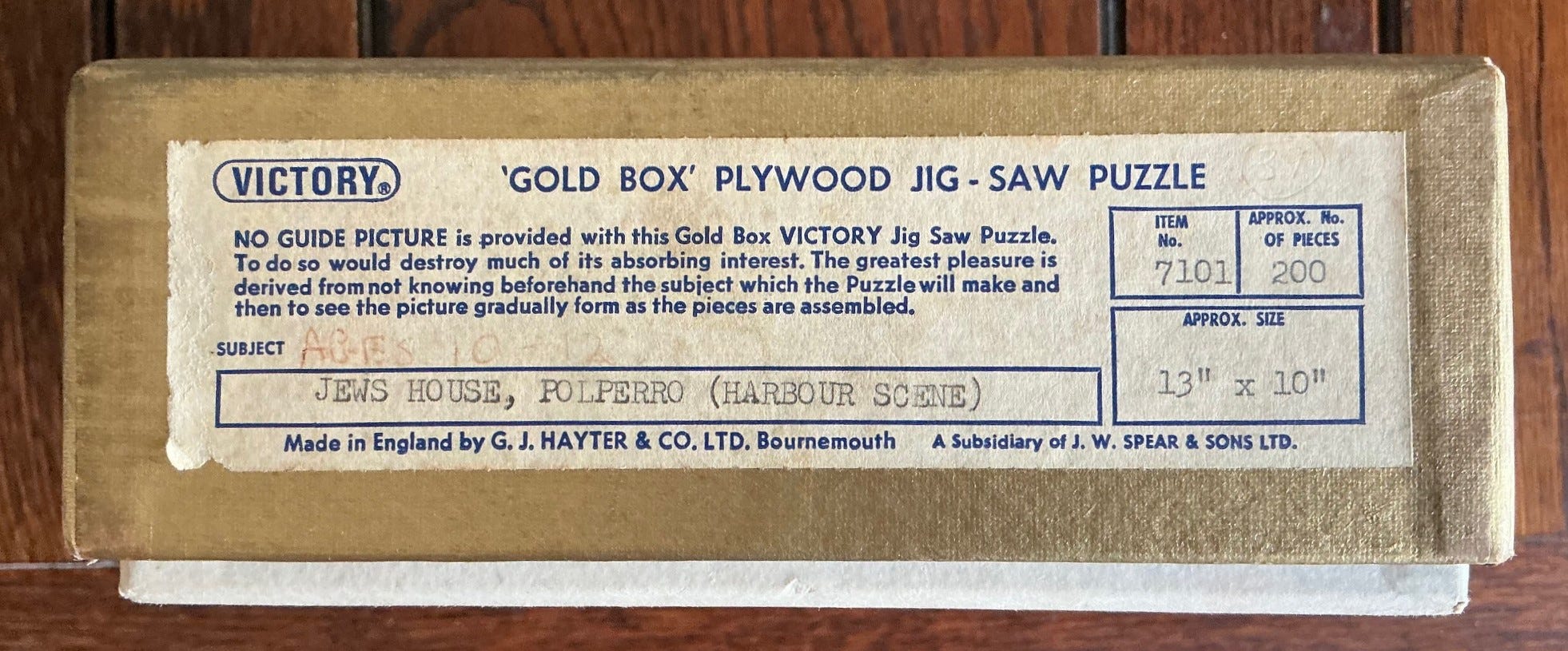
Jews House, Polperro; Gold Box series made in the early 1970s
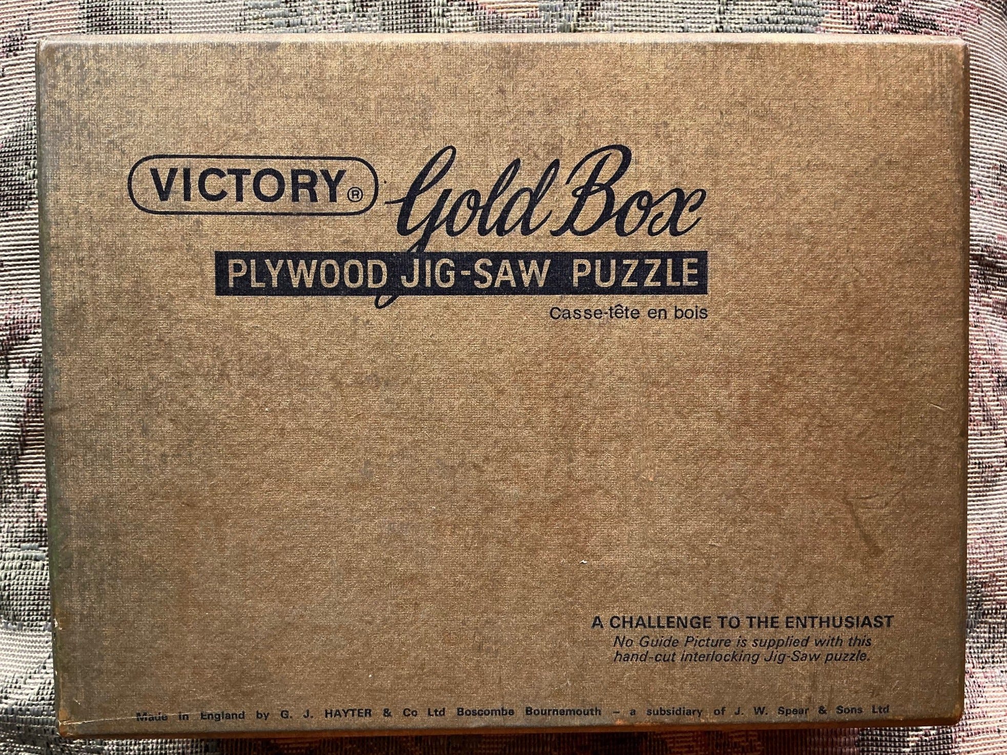
puzzle – Victory Gold Box series; made in the early 1970s
made by – G.J. Hayter & Co. (when it was a subsidiary of J.W. Spear & Sons)
artist – Colin Richardson; date unknown
about 200 pieces 9¾”x12 ¾” (25 x 32.5 cm) 4.1 cm²/piece 3½mm 3ply
Sometime within the first few years after taking over, Spear discontinued the Super-Cut series and rebranded the long-running Artistic series as “Gold Box” (which is probably what people had been already been calling the Artistic series puzzles anyway.)
This is the third “Gold Box” puzzle from the Spear era that I have assembled and reported on: You can read about Strolling on the Beach here and St. Paul’s here. They were both enjoyable to assemble and both have good printing and attractive artwork. As with them, this puzzle is only about 3½ mm thick. That is considerably thinner than the 5mm thick plywood that had been used to make Artistic series puzzles in the 1930s.
The image of this puzzle has a signature; Colin Richardson. I was not able to find much information about him online other than that he was born in the 20th century and that all of his paintings seem to depict places in Cornwall. In fact, I found four other paintings online that have been put up for sale in art auctions which were from this very same vantage point, and all of which were called The Jew’s House, Polperro. The others were painted in the early 1960s but they appear to my eyes to be a more modern and stylized than this one, which seems to be more photo-realistic. My guess is that this was painted somewhat earlier than those, and that he probably made paintings for the Cornwall tourist trade. His paintings do not sell for very high prices at art auctions.

Polperro is a small secluded fishing village on the south coast of Cornwall. Until the 20th century it was only accessible by sea, and even today cars cannot enter the village because its winding narrow streets were laid out for pedestrians and hand-carts, not vehicles. In recent years tourism has replaced fishing and other activities as the village’s primary source of income because the village is quaint and largely unchanged since the 18th century. Many consider it to be the most beautiful village in England! The titular “Jews House” is the building on the left in the puzzle’s image. It is a Grade II listed heritage building and was re-named Jews Bank Cottage in 2013 when it was adapted to become a B&B. According to the Historic England website:
This house with its doorway on the first floor is typical of coastal towns in the South West. The lower floor would have been used for storage, probably as a fish cellar for storing fish. The entrance to this storage area can be seen in the wall on the side of the building. The house probably dates from the 17th century and is made of rendered and painted stone rubble.
I found an interesting 2003 academic study online called The Jews of South-West England written by Rabbi Bernard Susser. During the 17th and 18th centuries a number of Jewish people found refuge in Cornwall and Devon from the waves of anti-Semitic oppression that would frequently break out in the more prosperous parts of England. Many small towns in this region had one, two or three Jewish families, but only in the principal centres of Plymouth, Exter and Penzance was there a sizeable enough Jewish population to support a synagogue.
From another source I learned that this building is also locally known as “Job’s House.” Polperro was technically a fishing village but it is better known in England as having been a base and refuge for smugglers, and the associated professions of wreaking, privateering and piracy going back as far as the 13th century. From about 1770 until his death in 1822 the local lynchpin in Polperro of those activities (as well as several legitimate businesses) was Zephaniah Job who was known as “the Smuggler’s Banker.”
Job had moved to Polperro as a young man and originally served as its schoolteacher. But the community soon learned that in addition to being one of the few people in the town who were literate he was also knowledgeable about accounting, and it turns out that he was proficient at what we would now call money-laundering. They began to hire him to assist with their bookkeeping and financial management, for which he was given a share in the profits. Before long he accumulated considerable wealth and rivaled the local gentry as the financial backer for their entrepreneurial activities.
There have been two books and a treatise written about Zephaniah Job. I haven’t read them but I understand that they both cite evidence that he had been baptized in 1750, the year that he that was born. I suppose that it is possible that his family had continued to follow the Jewish religion but had nominally converted to escape the punitive measures against Jews that English law frequently implemented. It is also that he was not Jewish at all but his moneylending profession induced the locals to give him that nickname based on the racial stereotype. Either way, the information I found online, including here and here, suggests that Zephaniah Job was a highly respected businessman and community leader in Polperro at the time.
As always, I began this assembly with a high degree of forgetfulness as to what the puzzle would end up looking like. Since it was only 200 pieces I did not sort the pieces except to separate out the figural pieces for picture-taking and putting the sky blue pieces together along the top:
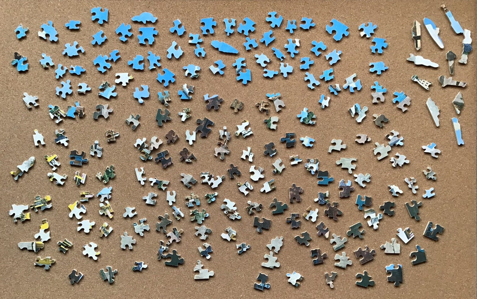
I thought I could begin with the pieces that included bright yellow but that proved less helpful than I expected. There was a strip of mottled dark blue, and edge pieces of dark gray that worked better:
From there it was just a typical assembly for a small puzzle:
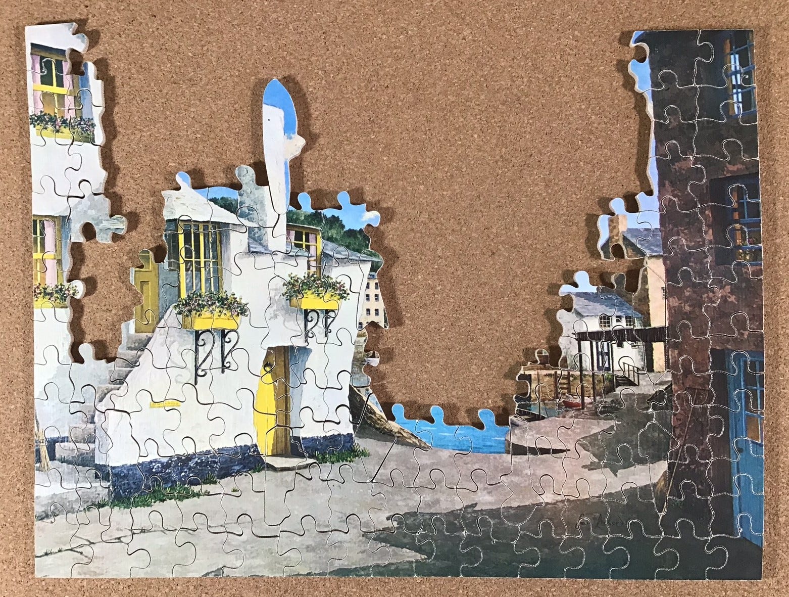
As you can see, as with all of the other Victory puzzles (except the Super-Cut series) this one is grid cut and it has small-wave glides just like the Gold Box puzzle Strolling on the Beach, reported here. I am quite sure this was primarily done to speed up the cutting but it also has the serendipitous effects of making assembly slightly more challenging and the pieces look more varied. As you can see in the above photo the selection and placement of the figure pieces enables nine continuous cut-lines spanning the puzzle from top to bottom.
All in all this was a fun little puzzle to assemble that went together quite quickly (by my standards.) The image is attractive and the colours were bright for a vintage puzzle. I did feel a bit uneasy about buying a puzzle with the rather archaic name Jews House (and costing only £17 it may have been less expensive for that reason.) That was ameliorated somewhat by learning that the secluded village of Polperro was probably a refuge from oppression for a Jewish person in the 17th century (if indeed it was truly a Jew’s house and not a stereotype slur about the building’s moneylender owner.)
The “banking” that was done from this building was seen by the locals as valuable community service. It enabled local fishermen to prosper by smuggling, privateering (during the American War of Independence,) wrecking (salvaging, whether the vessel had been shipwrecked or not), and even piracy. I think it was the piracy connection that pretty thoroughly suppressed my qualms about assembling a puzzle with a name that sounds potentially anti-semitic. I hope that there is an interpretive plaque near the building now called Jews Bank explains its role in the community’s history.
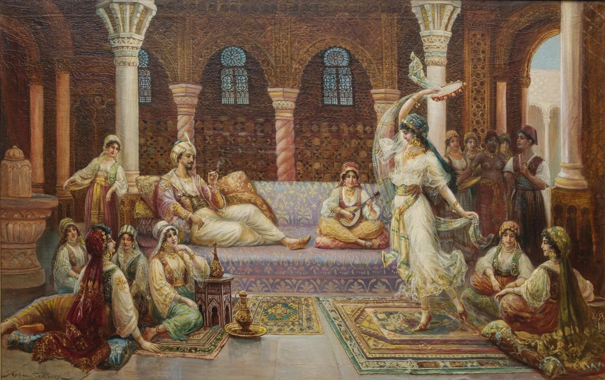
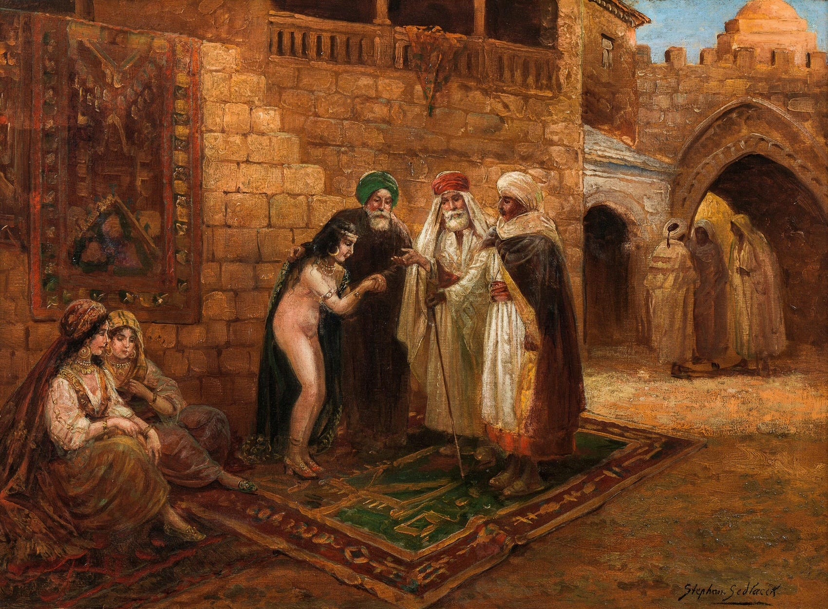
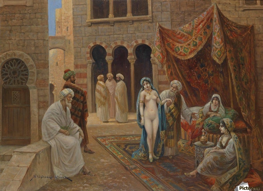
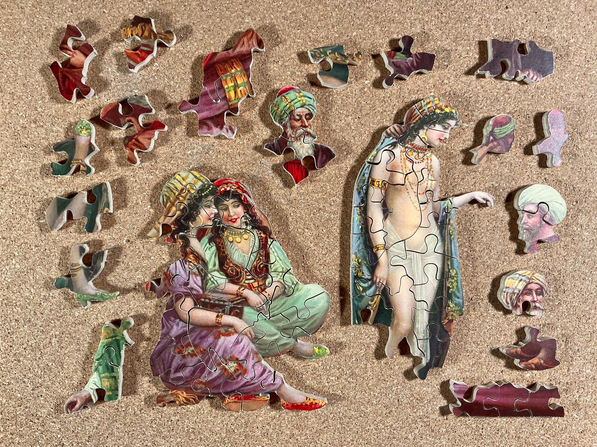
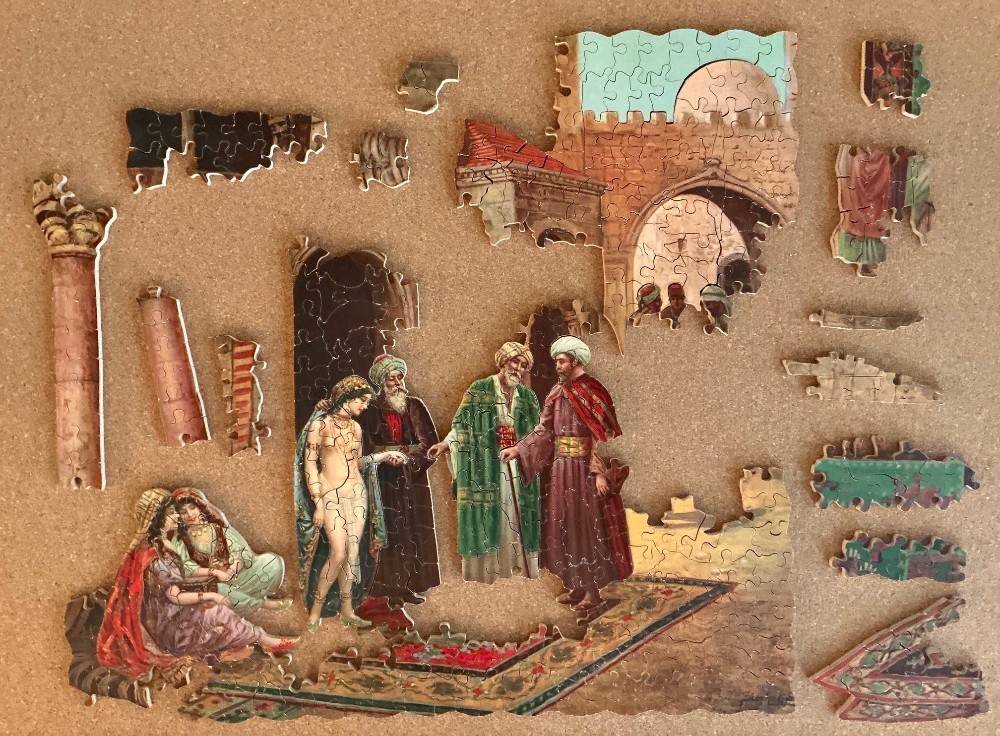
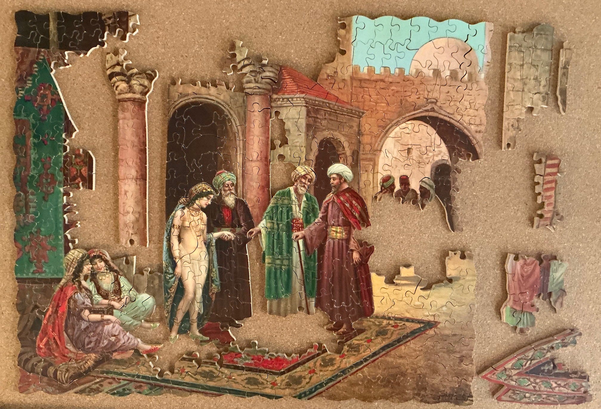
The Slave Market; Super-Cut series, made in the 1930s
puzzle – G.J. Hayter & Company Super-Cut series made in 1930s
artist – Stephan Sedlacek; aka: August Stephan (1868-1936)
about 450 pcs 35 x 46 cm average 3.6 cm²/pc 5mm 3ply
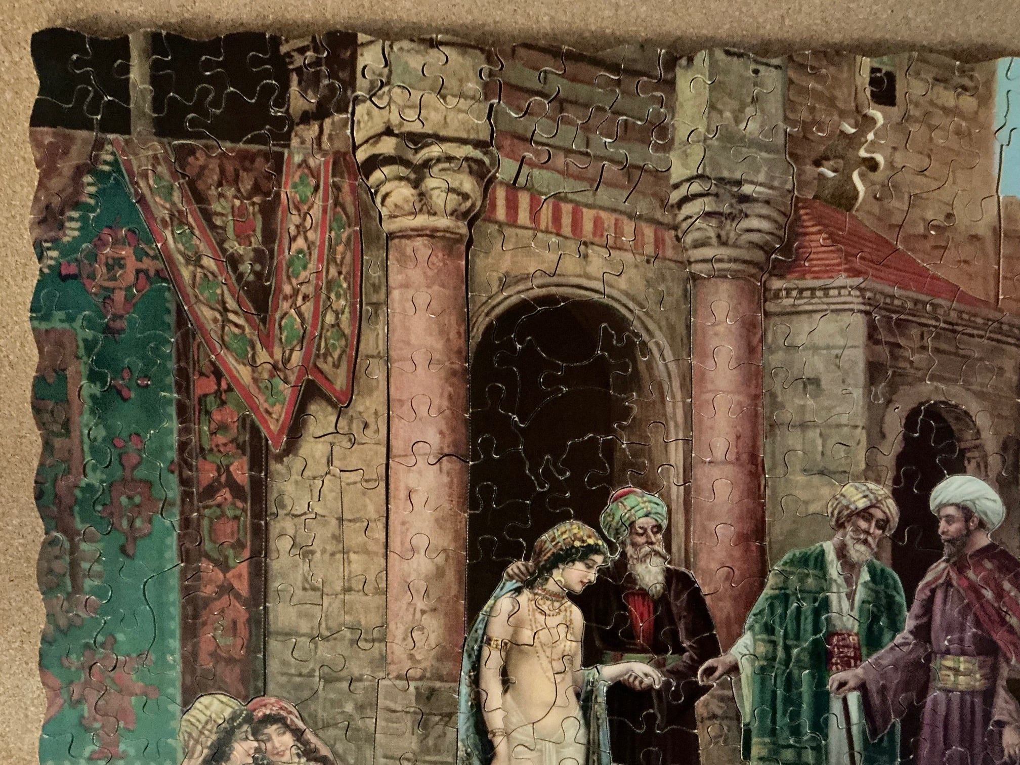
26 well-cut silhouette pieces; extensive colour-line cutting
Speaking of having qualms about a puzzle because of its name I will end this 3-part series of the higher-end Victory puzzles with this one. My initial plan had been to present all of the puzzles in this series in their chronological order, but instead I decided to follow the principle of “save-the-best-for-last.” This is an excellent example of Hayter’s Super-Cut series but based on the packaging it was clearly made back in the 1930s.
Don’t worry – this painting did not inspire me to do deep dive historical research on slavery. But I did look into the art movement called orientalism which this image represents. It is a signed painting, but the signature has been cropped down to just “Stephan S”. Doing a reverse image search revealed him to be Stephan Sedlacek (1868-1936) about whom very little is known other than that he seems to have been quite prolific and that he also sometimes went by the name August Stephan. Various sources identified him as Austrian, German, or Czechoslovakian, but with Austrian as the most frequent. According to this website which displays many other examples of his paintings:
Stephan Sedlacek is one of many wonderful Victorian artists that I fear I shall not be able to uncover full detailed biographies on. … From what I can see, it appears that the artist had quite a close understanding of the upper classes, with a few images of lower classes visiting fortune tellers, and a series on visiting an oriental harem, but for the most part Sedlacek seems to focus on capturing the opulence of the social activities of the elite. The people are small, wrapped in the finery of their fashion and surroundings, basking in the fortune that has smiled upon them. The scenes are calm, fun, peaceful and very refined. An embodiment of the ideals of the era.
Several of Sedlacek’s paintings are in the orientalist style, a category of romantic 18th century academic painting that evolved into a popular subset of 19th century nostalgic genre painting. According to art historian Jennifer Meagher on the Metropolitan Museum of Art’s website:
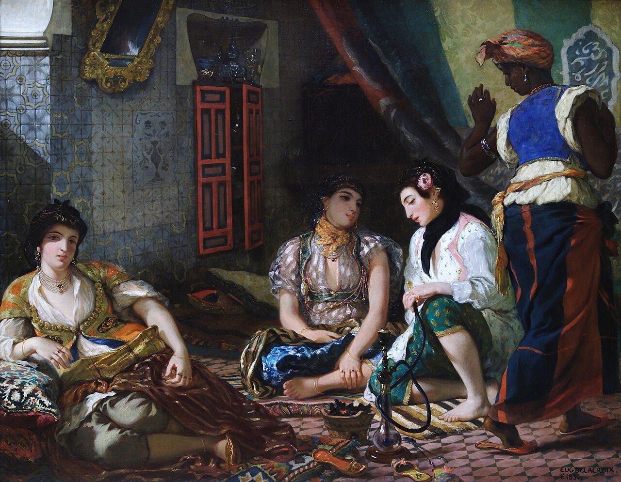
Some of the most popular Orientalist genre scenes—and the ones most influential in shaping Western aesthetics—depict harems. Probably denied entrance to authentic seraglios, male artists relied largely on hearsay and imagination, populating opulently decorated interiors with luxuriant odalisques, or female slaves or concubines (many with Western features), reclining in the nude or in Oriental dress. … Beyond their implicit eroticism, harem scenes evoked a sense of cultivated beauty and pampered isolation to which many Westerners aspired.
Orientalism was an art movement that reached its height the late 18th and early 19th centuries, when Europeans and North Americans’ foreign policy attention was focused on enlarging colonial empires. Those military actions gave soldiers, traders, and adventurous tourists greater access to the places and peoples of lands that were little-known or understood by most westerners. Those travelers conveyed their experiences back to their home countries, unleashing further interest in the far-off lands.
The orientalist movement manifested itself very broadly in the arts – exotic architectural motifs, furniture and decorative arts, as well as clothing fashion trends and textiles – but is perhaps best known today for its impressive oil paintings. Those works were mostly by male Western artists, made to satisfy an enormous public interest in mysterious and glamourous foreign lands. Broadly, orientalism includes depictions of China, India and Japan, but I only delved into its depiction of aspects of life in Muslim countries of North Africa and the Middle East.
Art historians tend to identify two broad types of artists: realists who carefully painted what they observed, and those who generated scenes from their imaginations. Realists, who were quite rare in orientalism, travelled to the places they depicted, whether Constantinople, Jerusalem, Cairo, Algiers or Marrakesh.
Paintings by well-travelled realist artists (such as Eugène Delacroix, Jean-Léon Gérôme and Louis Devedeux) can be thought of as an historical record: They provide useful glimpses into their depicted times and places. But in the case of orientalism they are very few. And even the accuracy of their paintings needs to be taken with a grain of salt since the paintings were sometimes made several years after the artists’ travelling days had ended and may be tinged with nostalgia or pandering to market expectations.
Also, orientalism was during the era of European colonial empires and they reflect the Eurocentric values and prejudices of their time. More recent scholarly appraisal of orientalist paintings them of tends to focus on looking for aspects that are deemed to be racist, condescending or patronizing. This new way of studying history in art is discussed in orientalism’s Wikipedia entry.
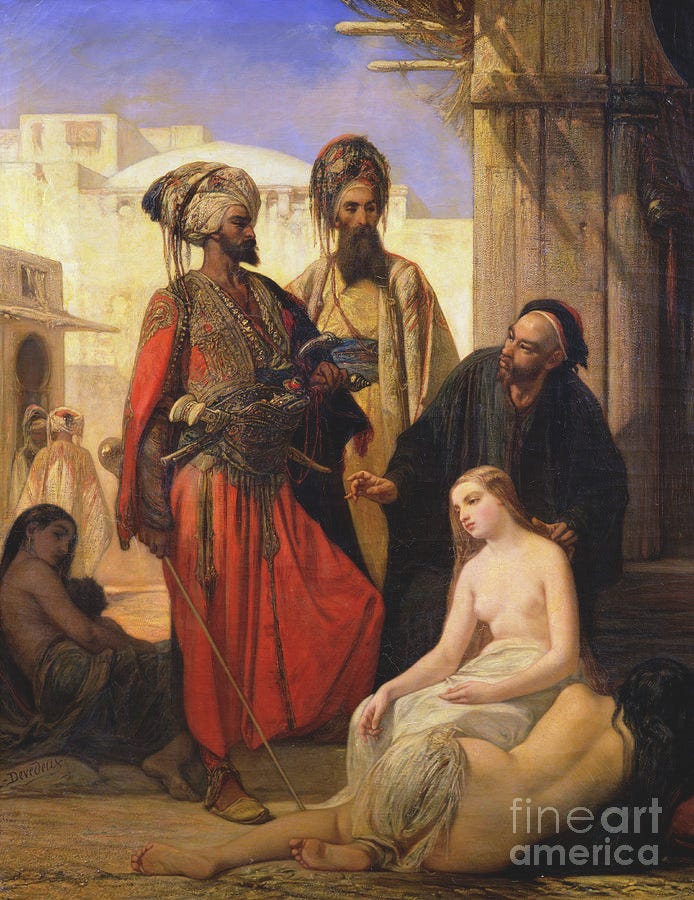
Louis Devedeux (1820-1874) made the above painting, which was exhibited at the 1867 Paris Salon where it was bought by Napoleon III. Devedeux was one of the most prominent academy-schooled French orientalists and he spent a significant amount of time living and sketching in Ottoman Turkey, so the slave woman’s public nudity is probably based on fact.
Another realist was Jean-Léon Gérôme (1824-1904.) Gérôme became successful early in his career and used the proceeds from his sales to fund trips to the artistic centres of Europe and to the Middle East. His travels included Constantinople (1853), Turkey (1854), and in 1859 (coinciding with the opening of the Suez Canal) he undertook the Grand Tour up and down the Nile in Egypt and then across to Jerusalem and Damascus. His travels took place at a time when slave-trading by Barbary pirates was still taking place in North Africa. After each trip when Gérôme returned to Paris he used his field sketches and memory to produce many orientalist paintings and became acclaimed as being one of the foremost French practitioners of orientalism in academic (as distinct from genre painting) circles.
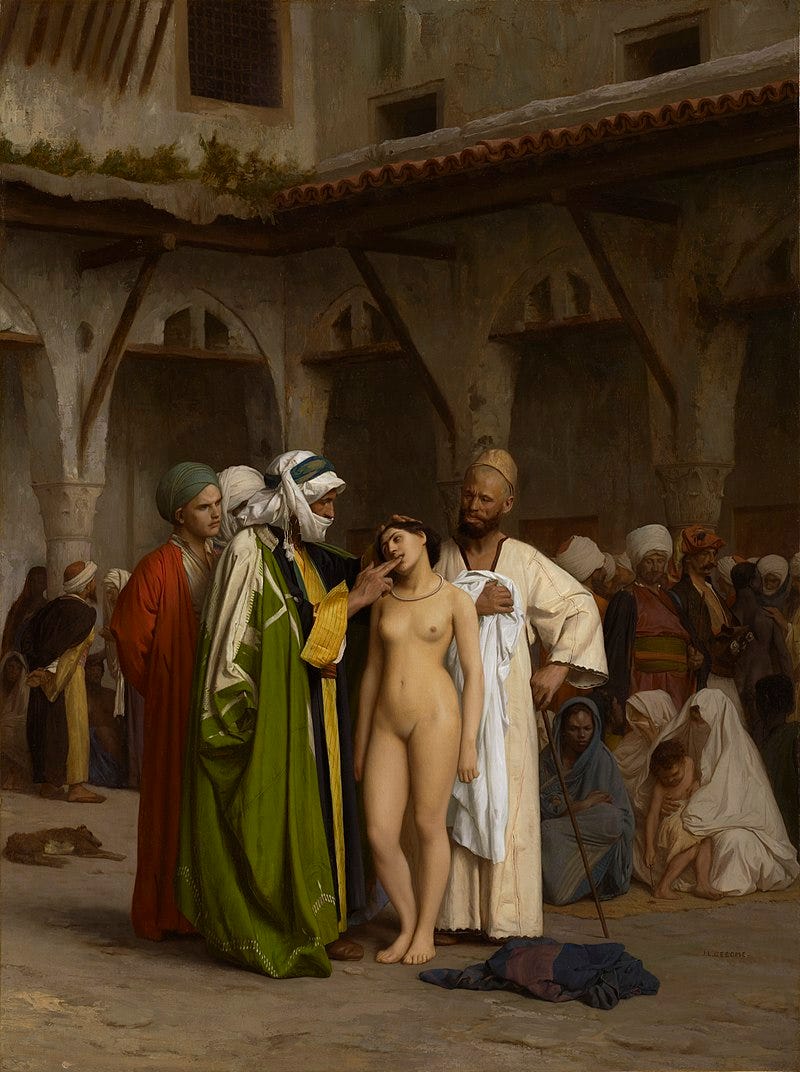
The above painting of a woman’s teeth being examined by a potential buyer in a slave market, for example, was painted by him in 1866 and exhibited at the Paris Salon in the 1867. The French writer, photographer and art critic Maxime Du Camp, one of the most famous near-east travelers of his time, reviewed the painting when it was at the Salon. He located its setting as being Cairo's slave market. He seems to confirm that this is typical of what could be seen there as he went on to say:
It is one of these [more expensive] women, an Abyssinian, that M. Gérôme has taken as the principal figure of his composition. She is nude and being displayed by the djellab, who has the fine head of a brigand accustomed to every sort of abduction and violence; the idea of the eternal soul must not very often have tormented such a bandit. The poor girl is standing, submissive, humble, resigned, with a fatalistic passivity that the painter has very skillfully rendered. (source)
But very few orientalist paintings would be able to live up to scrutiny by such a knowledgeable individual. Most artists’ depiction were second-hand, based on travelers’ published memoirs, artefacts, early photographs, costumes, other artists’ paintings, and their own vivid imaginations rooted in literature such as the Tales of the Arabian Nights (first translated into European languages in the early 18th century.) They used those resources to create detailed but fanciful depictions of exotic scenes knowing that that the public had very little factual information upon which to assess the authenticity of their work. Their paintings are not useless for understanding history, but they are only useful for giving us insight into the perspective of European men at that time and the tastes to which European artists were catering.
Those two orientalist slave market paintings by realists seem to confirm that young, pretty female slaves were indeed displayed nude in the public markets. It is perhaps meaningful that during my research into orientalist slave market painting I saw many with nude young pretty females, and none depicting the sale of anyone from any other demographic group.
And all of painted images of a harem are the products of imagination because, by definition, that is a place where outside males were not permitted to enter. In the very rare times when an outsider was given access to the women’s apartments in Muslim countries the event would have been very staged. But harem paintings abounded none-the-less in 19th century Europe and were acceptable as historical even by the strict standards of the Académie des Beaux-Arts for exhibition at the Salon.
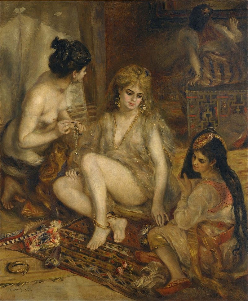
Even Pierre-Auguste Renoir got in on the trend, although he may have self-sabotaged his 1872 Salon entry of the following painting by identifying it as Montmarte prostitutes doing harem cosplay:
The scene depicted in this puzzle’s image is typical of an orientalist harem painting even though it takes place out public. We do not know whether or not Stephan Sedlacek ever actually saw such human trafficking himself, but my guess is that he didn’t. I also suspect that academic circles looked down their noses at him in his day, considering his work to be, like Renoir’s above painting, prurient genre painting for popular consumption rather than fine art.
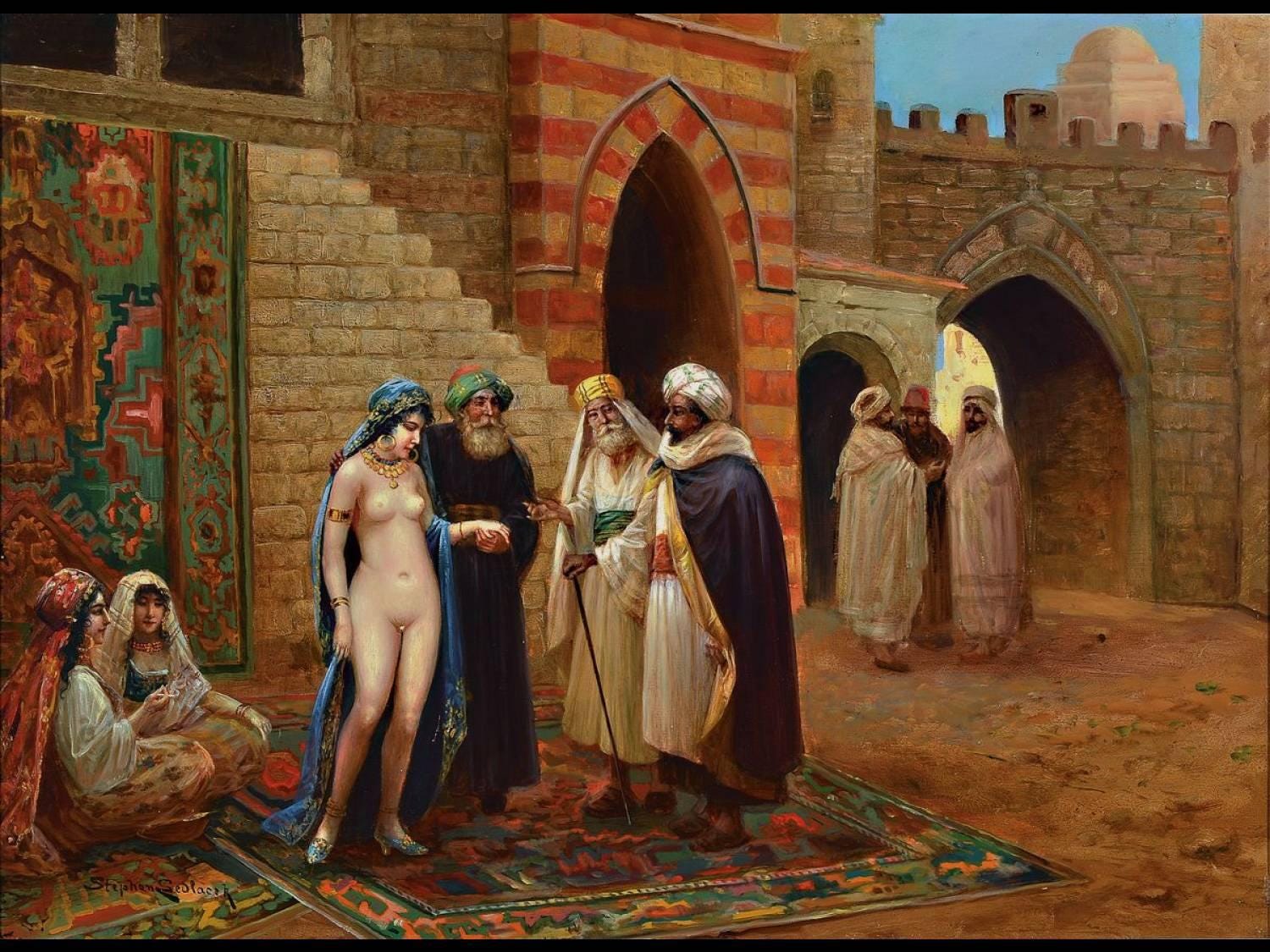
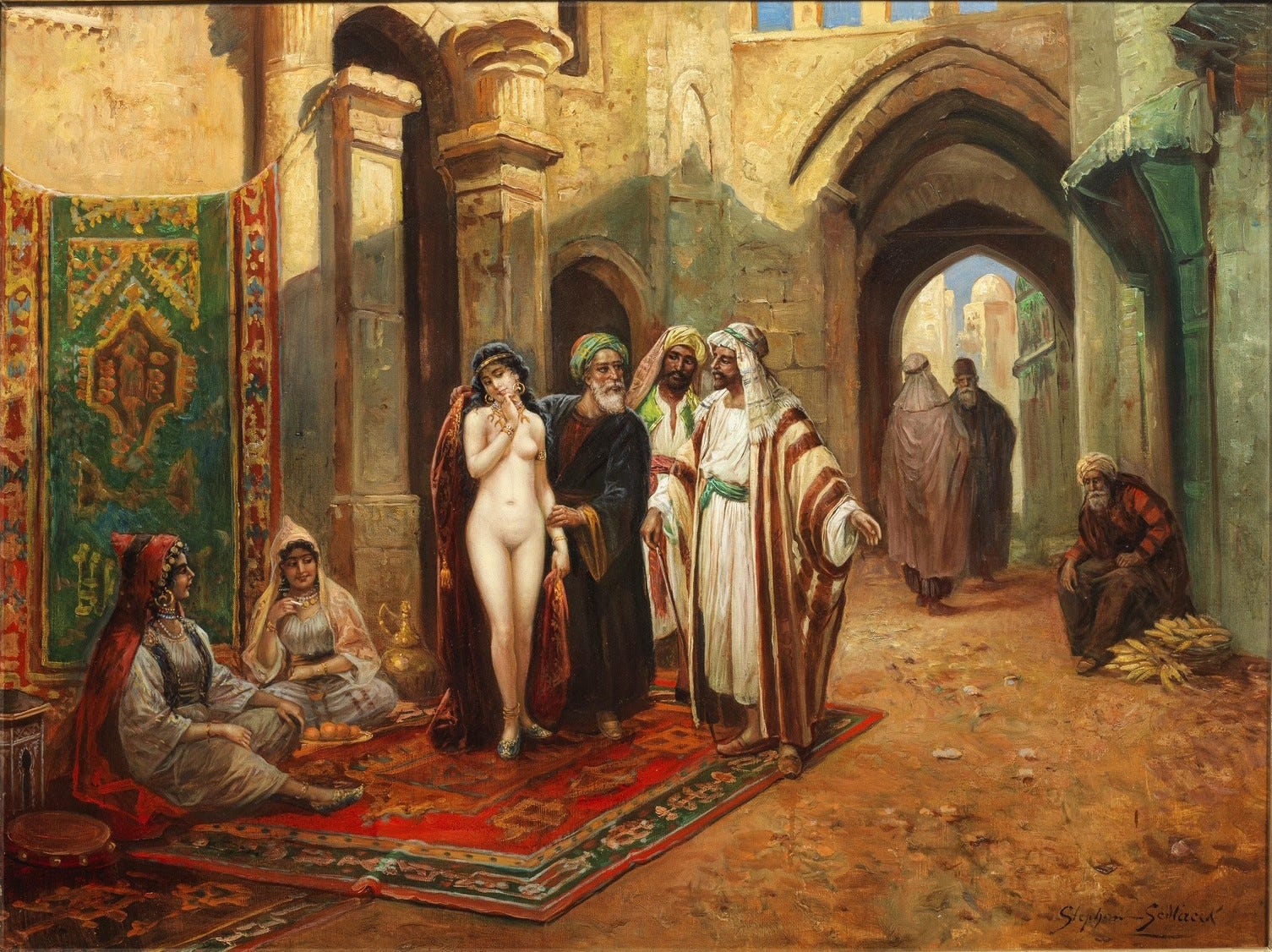
Sedlacek’s painting of a wealthy man, perhaps intended to represent an Ottoman sultan, or a Persian, or a Moroccan potentate acquiring a new wife, concubine or slave is typical of the 19th century genre orientalisism. It must have been a money-making formula for the artist: I found three other paintings by him online with essentially the same composition. The only reason that I could find them is that they have been sold in relatively recent art gallery auctions. I also found two more paintings by him with the same subject matter but with a different composition. It makes me wonder how many other such works Sedlacek painted but which have not been put up for auction since the advent of online record-keeping.
As far as I can tell, none of his paintings are in art museum collections.
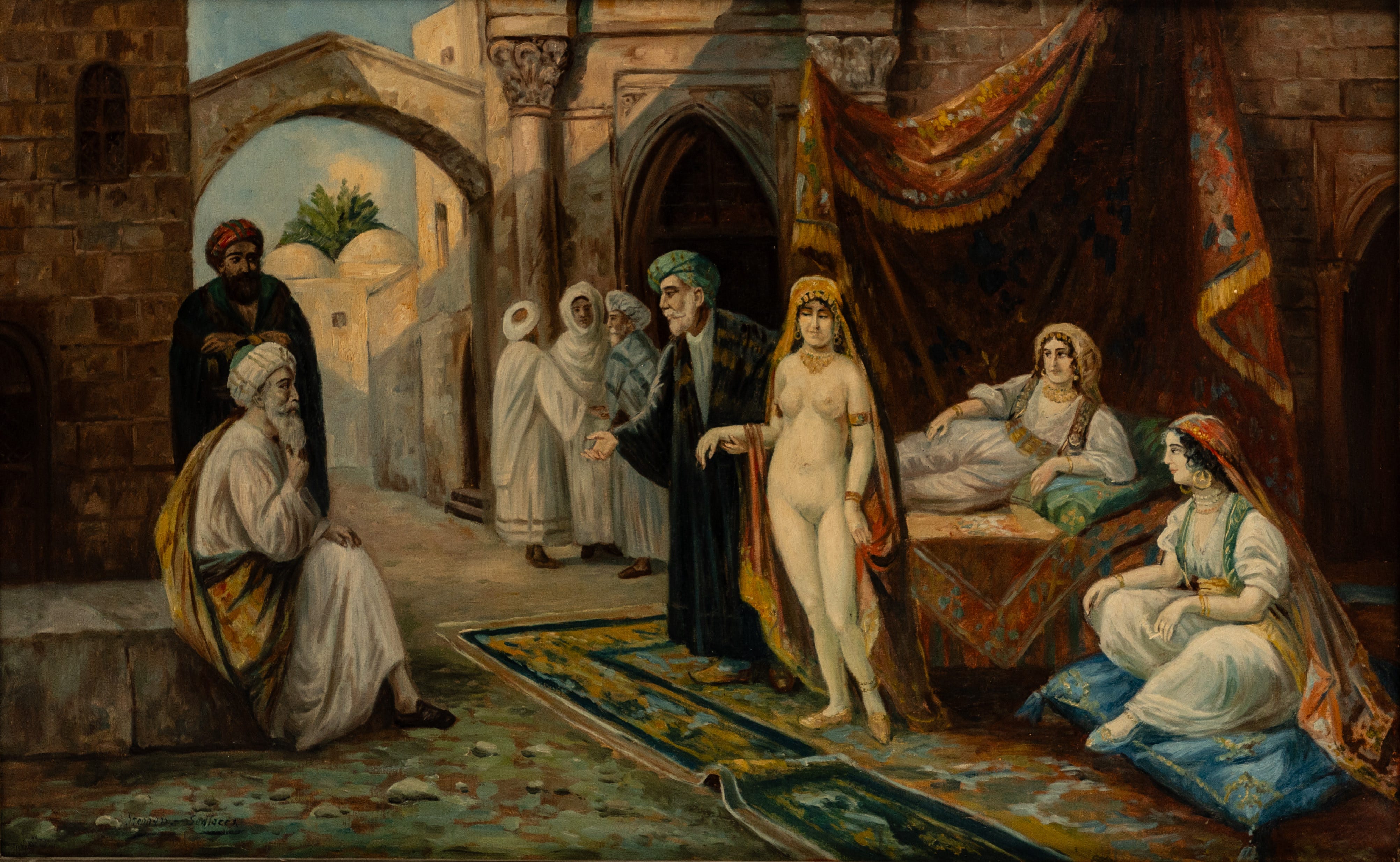
I also found these two paintings by Stephan Sedlacek that have the same subject matter but a different composition:
But just to show you that Sedlacek could also do paintings of more typical European subjects, whether they be genre or portraiture, here are a couple of other works by him:
But now, on to the puzzle. As mentioned above it is a 450 piece Super-Cut that was made in the 1930s. (This time I will forego telling you about how slow it went for me.)
I began with my usual flipping and rough colour sorting:
After my recent success with using a focus-of-attention starting strategy for a Super-Cut (reported here.) I began by clustering together the pieces that looked like people or clothing. I wasn’t surprised when, as with Drawing the Covert, that introduced me to some of the expected colour-line cutting.
While doing that I also got some easy wins on the architectural elements:
I continued on those two separate tracks …
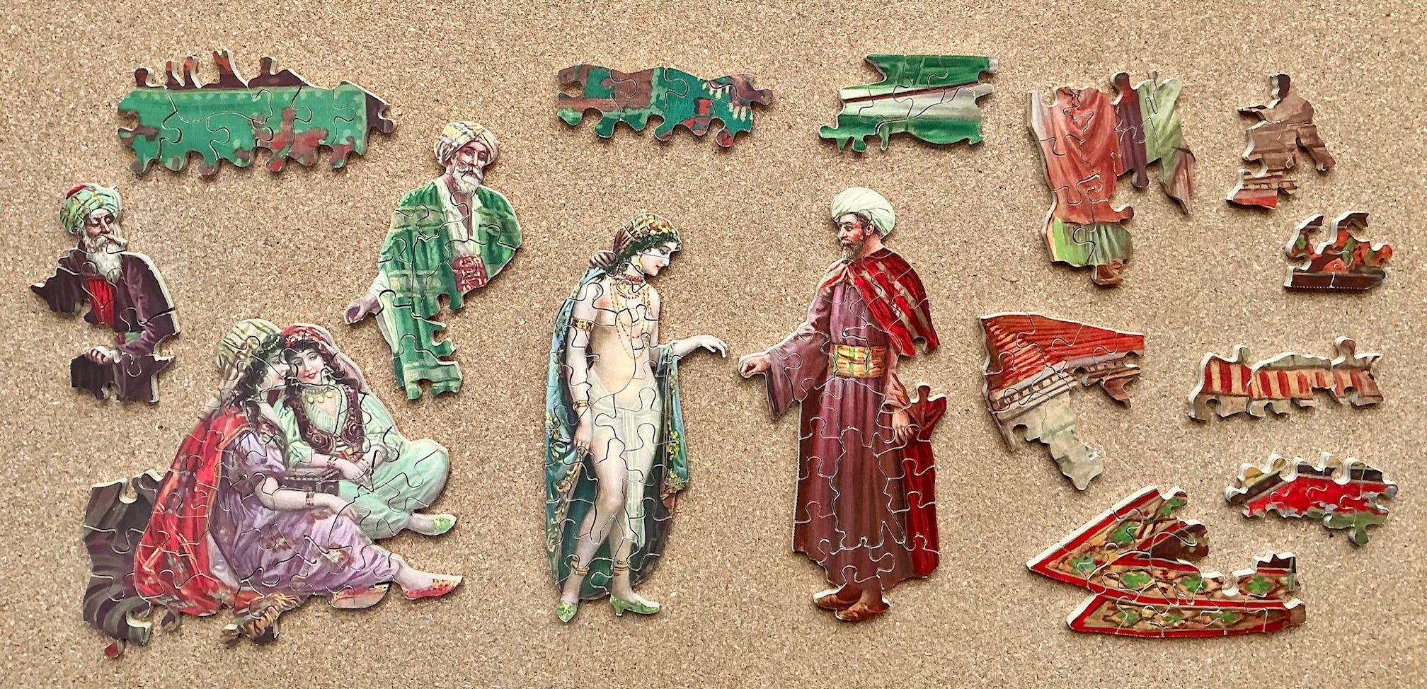
… until I could combine them together:
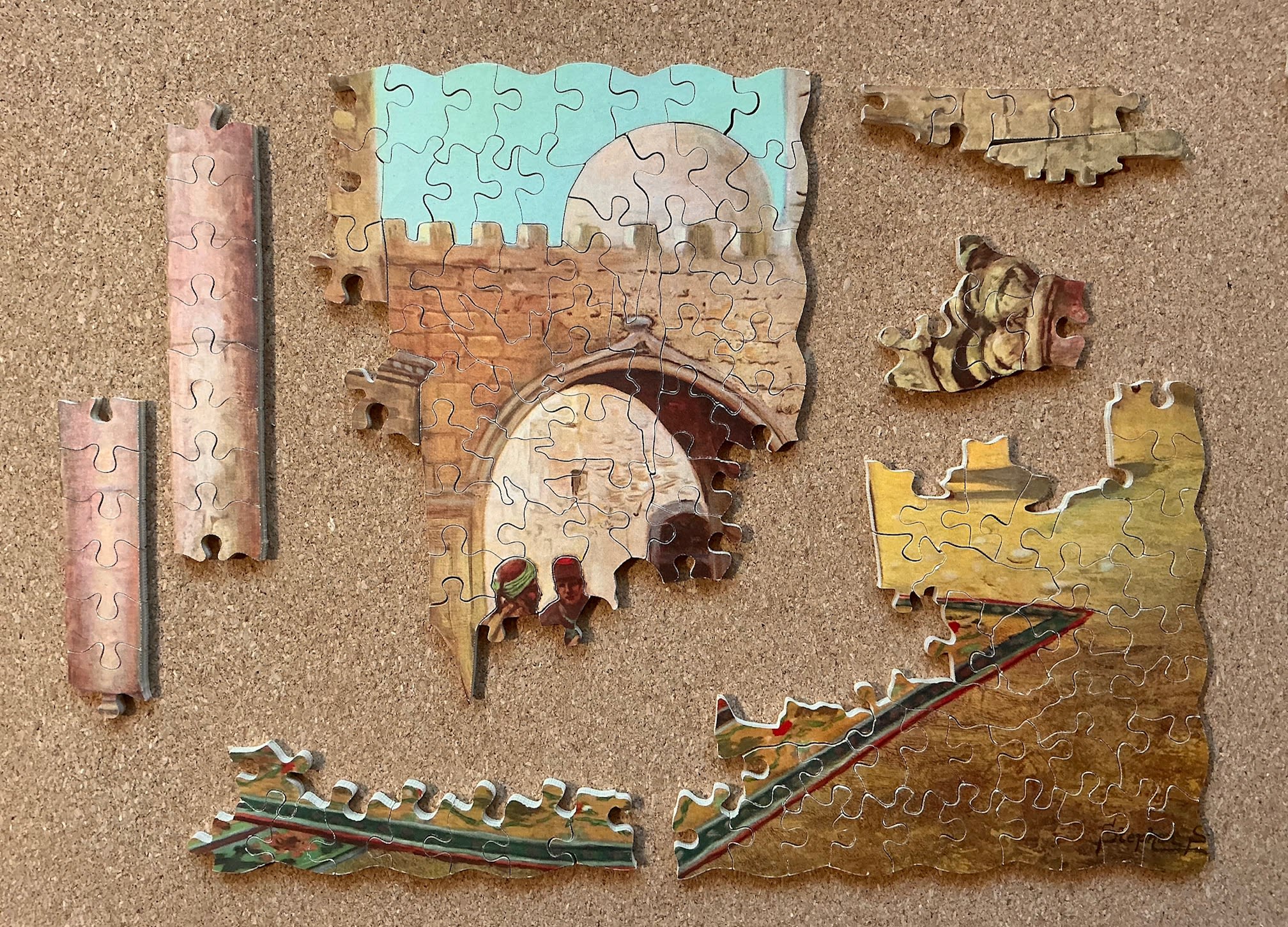
I then had one of those sudden bursts of progress when I realized that I could connect the upper architectural sub-assembly with the man in the white turban and place one of the columns:
Progress came in the upper right when I realized that the island that I had long assumed was a rug was actually some kind of drapery. From there I was able to fill in the wall and place the other column and both of their capitals, as well as most of the rest of the upper architecture:
Then it was just a matter of filling in the holes until completion:
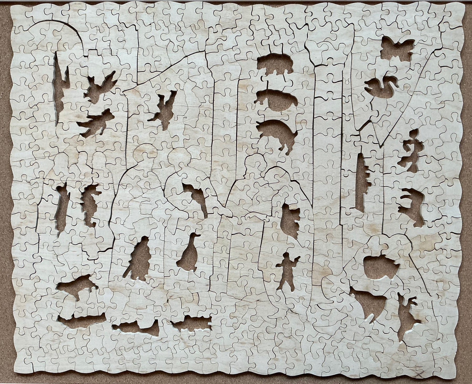
As with other Super-Cut puzzles there is no strip-cutting of the non-figural pieces in this, and the cutter placed the figural pieces upside-down and sideways even when) as far as I can tell) there was no puzzling benefit or cutting efficiency in doing so.
Conclusions
There’s not much more to say. Both the craftsman-era “The Victory” puzzles and the Super-Cut series are certainly the cream of the crop, and in my mind they are worth the premium price that they draw when these types of Victory puzzles come up for auction. I’ll continue to keep my eyes out for them, and will know that I need to make serious bids if I want to outbid the collectors since they are the two Victory series that most draw their attention. But even so, both of these types of puzzles can be expected to sell for considerably less than comparably-sized newly made hand- or laser-cut puzzles
One of the things that I like best about wood puzzles is their rich, luxurious tactile sensation of handling their pieces. All three of the pre-factory “The Victory” puzzles that I have assembled to date were 6 mm thick – an honest quarter-inch which is about as thick as wooden jigsaw puzzles ever get. The Artistic and Super-Cut puzzles made in the 1930s were a bit over 5 mm thick – still pretty good and comparable to some of the high quality best American laser-cut puzzles (e.g., Liberty and Hidden Piece puzzles.)
The later Spear-era Gold Box puzzles, on the other hand, are only 3½ mm thick. That can feel luxurious if the piece sizes are smaller, but Gold Box puzzles were still Victory’s standard 3 to 4 centimetres average piece size, about 2 pieces per inch² (and much larger for the figural pieces.) So the 3.5mm thickness detracts considerably from their tactile feel. As another sign of lowering standards, as in the figurals found in Jews House, Polperro, all of the Spear-era Gold Box puzzles I’ve seen have among the crudest figural pieces of any puzzles I have assembled to date.
These factors are balanced by the fact that puzzles from the Spear era tend to sell for lower prices at auction than the earlier Artistic puzzles, and especially the Super-Cuts (but still for higher prices than the series of Victory puzzles that do not have whimsies.) Figural pieces are very trendy in wooden puzzles these days. Computer-controlled lasers are capable of routinely cutting whimsies that are much more detailed than anything than reliably be cut by hand. In fact, sometimes the figural pieces in laser-cut puzzles are so intricately cut that they are too fragile.
That is certainly not the case with vintage hand-cut ones, but anyone whose experience has only been with modern wood puzzles might be disappointed in the simplicity of whimsies in any of these vintage puzzles (even the Super-Cuts!) Despite that, and the fact that modern printing is usually superior to that from 90 years ago, I consider Artistic and even Gold Box series puzzles to be a good and very inexpensive way for people to experience hand-cut puzzles.
I began this whole exploration into the world of vintage factory-made puzzles as a search for “frugal alternatives” to mix in with my purchase of new premium-quality laser-cut puzzles. Along the way I learned that besides their lower prices there is an intangible appeal that comes from their age. There is indeed something special about assembling hand cut versus laser-cut puzzles even when their cutting designs are often not as sophisticated as those of the modern laser puzzle designers. Today’s designers are able to spend days or even weeks fine-tuning their cutting designs, and they “stand on the shoulders” of many generations of cutters who developed an ever-expanding bag of tricks for making jigsaws more puzzling.
Early “The Victory” and Super-Cut series puzzles have risen to be among the top of my favourite “frugal alternatives” even though they are not as frugal as the other Victory series or the 3mm thick no-name puzzles from Chinese vendors. Personally I have decided to forego buying more puzzles from the Artistic and Gold Box series unless the image particularly appeals to me and the price makes it irresistible (which does still sometimes happen.)
For me, the novelty value of puzzles having figural pieces has somewhat worn off. Oh, I do still like good silhouette pieces, but I value interesting cutting more. I would prefer to have no whimsies, but an intriguing cutting design, rather than a puzzle with simple, crude whimsies for which I sometimes cannot even recognize what their shape is meant to represent.
For me, “The Victory” and Super-Cut are therefore a great fit. They are still inexpensive compared to new premium puzzles – just not as much so as the Artistic and Gold Box series – but they give good value and great assembly satisfaction for my money. (One unexpected outcome from my search for frugality is that my growing appreciation for hand-cutting has led me to occasionally commission newly made hand-cuts as a rare special treat for myself.)
I now find that when shopping that although it is the image that catches my initial attention, it is the cutting pattern that is more important when making a buying decision. When vintage puzzles are put up for auction (and that includes early green- or red-box Wentworth laser-cut puzzles, which are only about 20 years old) I zoom in and study the photos of the assembled puzzles to see their cutting pattern. My eyes are focused both on looking for damage and also on assessing whether the pieces are interesting shapes.
It is similar when I am shopping for new puzzles. It seems like all of them show off at least a few of their whimsies as an indicator of their design quality. Some makers show their cutting design, others don’t, and still others don’t show the design but they do show some loose “regular” pieces. For those, if I see pieces that have the iconic four-sides with a connector or socket on each side I tend not to buy the puzzle even if I love its image. But perhaps it is not so much that I am turning into a wooden puzzle connoisseur; I am becoming something of a wood puzzle snob!
Coming up: I will be taking a short break writing about puzzles because I need to turn my attention to another hobby: I am also an amateur Christmas and midwinter music collector, historian and folklorist and each December I send out a daily set (10-25 minutes) of festive seasonal music (along with the type of rambling write-ups that you have come to expect from me.)
If you think you might like to subscribe to my FREE musical advent calendar you can first see what they are like here in my newsletters’ blog/archive. Don’t worry - these are mostly not the over-familiar songs that you associate with this season!
Hi, Bill. Thanks for your latest posting. I had to laugh inwardly at myself when I saw that you’d be discussing Hayter puzzles from the 1970s. I thought, “Oh, good, now we’ve arrived at the modern era,” followed quickly by a realization that the 1970s were half-a-century ago. I guess I reflexively think of whatever happened within my own lifetime as “current events!”
For this particular essay, I think it was a good idea to display each puzzle as complete before building up the stages of assembly gradually. That doesn’t mean I think you need to present things in that order during each of your essays; I just think it suited your work well this time around.
“Blossom Time” is a lovely image, and I agree with you (though I am no expert) that it seems to have been turned into an especially well-cut puzzle. The figural pieces you revealed to us by showing the underside of the puzzle appeal to me, and even the very regular positioning of those. I think that I’d have been expecting about when another figural was about to appear if I had been doing this puzzle myself, which might have been fun.
The picture by the artist Sedlacek used for “The Slave Market” was a surprise to me. That was a painting I’d never seen before. When I noticed in Parts 1 & 2 of your current series of postings that “The Slave Market” in puzzle form would be discussed in Part 3, I was expecting an image from a painting I did already know, that being “A Slave Market in Asia Minor” (sometimes just known as “Slave Market”) by the French painter Devedeux.
By the way, I really like Sedlacek’s “A Woman with a Red Flower.”
Cheers, and thanks again, Bill.
—Greg