2. Pacific Puzzle Co’s Travel British Columbia Puzzle
An essay/review consisting of: a too-long introduction; a half-resolved quest; assembly and observations about the puzzle; and maybe, just maybe, something thought-provoking [5350 words; 27 pictures]
Travel British Columbia
laser-cut Pacific Puzzle Co (puzzle designer – Aaron)
image – a British Columbia tourism poster ca. 1947 artist unknown
cutting design - Aaron
460 pieces 17.6” x 11.8” (45 x 30 cm) 5mm medium density fiberboard
Husband and wife duo Aaron and Kat have established this laser-cut jigsaw puzzle company the relatively isolated crafts- and artist-haven of Salt Spring Island. Aaron is the the cutting designer. It is a home-based part-time gig for the couple. Like most wood jigsaw puzzle-makers they sell their puzzles online, but their primary outlet is a portable stall at the tourist-destination Salt Spring Saturday Market and at other seasonal markets and craft fairs.
Here is the Pacific Puzzle Co website, and here is their listing for this particular puzzle (with a very humorous write-up about it) from their still-limited catalog of puzzle designs.
[Update: In August 2023 I wrote an essay of another Pacific Puzzle Co puzzle. Near the end of this essay I describe a discolouration issue that is common problem among new laser-cut puzzle-makers. The new essay shows that this issue has been satisfactorily addressed.]
First, a geography lesson
Both I and Pacific Puzzle Co are in a region that is coming to be identified by locals as the Salish Sea. This area is comprised of the waters, islands, and adjoining watersheds of a small area in the southwest corner of Canada and the northwest corner of the contiguous United States. This area includes the large cities of Seattle and Vancouver.
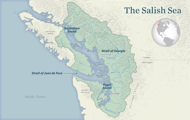
The region was first given the name Salish Sea as a sub-region within the larger trans-border bioregion known as Cascadia. But the Cascadia and Salish Sea concepts as regions are evolving beyond of the realm of ecology to become recognition that we inhabitants also have a distinct cultural identity that is rooted in this place. (There is even a small political movement for Cascadia to separate from the US and Canada and form its own country.)
We here in the sheltered maritime waters of the Salish Sea consider ourselves to be the heart of Cascadia. Aaron told me in correspondence that they moved here in 2014 “to enjoy all the beauty the West Coast has to offer.” The fact that they chose to live on the ferry-dependent island of Salt Spring suggests that it was specifically the environment of The Salish Sea that drew them here.
The name Salish Sea comes from the language of the Coast Salish people who have lived here since time immemorial. We call the language and people “Coast Salish” but in reality it is a family of languages and dialects spoken by over 20 different first nations in this area. Speakers of these different languages and dialects don’t necessarily understand each other very well, and in the case of some of them, not at all. It is rather like the historical situation in Europe. Spanish, French and Italians are all related to each other through Latin but the people in those countries can’t necessarily converse with each other comfortably, and they don’t share a national affinity with each other except through their common Mediterranean and Roman heritage.
In the Salish Sea, first people from different nations were able to interact with each other even when they could not understand each others’ language because they spoke a simple trade language that came to be called Chinook Jargon. Despite their cultural and tribal diversity, first nation people shared similar lifestyles because they had similar lifestyles in the same general habitat in this small sea on the Northwest (the windy side) of the Pacific Ocean.
In the Salish Sea, pre-contact native people lived mainly at protected shoreline locations, and dugout canoes were their main means of transportation. They are sometimes collectively called People of the Salmon, but actually it was all manner of diverse marine life that was the primary source of their food. They lived as hunter-gatherers in a land of plenty. The indigenous people of the Salish Sea shared an expression: “When the tide goes out, the table is set.”
Food gathering for people who lived in and around the Salish Sea was significantly less time-consuming than for their inland counterparts – enough to enable the development of a high culture and advanced craftsmanship and artistry. The tall totem poles that people often associate with this region are actually from further up the coast. Here they carved everything from their spindle whorls, bowls and knives to large house posts and welcoming figures.

If you are old enough, you may remember a type of knitted clothing (now called Cowichan sweaters) that was then called siwash sweaters. They were made around here and that name is an old mispronunciation of the word Salish. Originally the Cowichan women didn’t get their wool from sheep; they bred now-extinct wool-dogs.
What does this have to do with wooden jigsaw puzzles? Many of the people who are attracted to live in The Salish Sea are creative folks like musicians, artists and artisans, and like Colorado this region seems to be becoming hotbed of puzzle-craft. Besides Pacific Puzzle Co and Puzzle Lab, this small area is the location of the well-known laser-cut workshop Ecru. Hand-cutter Mark Whitesell, who operates the Etsy shop SnowflakePuzzles lives here too. Besides wooden puzzles, Victoria is the headquarters and design location (but not the factory location) for the cardboard puzzle company Cobble Hill.
In addition to indigenous people and those who make their living from maritime activities, the folks who most relate to the concept of this area being called The Salish Sea are the residents on the over 400 small inhabited islands in the region. (I’m not including Vancouver Island in that count. Living on this largest and most populous island off the west coast of the Americas is much like living on the mainland.)
By small islands I mean the Northern and Southern Gulf Islands in Canada, and the San Juan Islands and those in Puget Sound in the US. Residents of these islands need to try to be self-sufficient communities, and look out for each other, but the island populations are small. People who live on a small island frequently need to take a ferry or other boat for what the rest of us consider common activities such as much of the basic shopping and medical appointments. For many this means living there requires careful planning and scheduling to avoid having to take more than one weekly trip off-island.
For some reason, the small islands tend to attract two general types of people: artists, craftspeople and the sort of folks that we used to call hippies as permanent residents, and rich people who build large houses there to be their get-away-from-it-all vacation cottages. And that is where Aaron, and Kat, and their two kids, and Pacific Puzzle Co are located.
Salt Spring is the biggest and most populous of the Canadian Gulf Islands, but by most populous I mean just over 10,000 year-round residents. Folks here in Victoria know that in the summer a short drive (or a long bike ride) and a half-hour ferry trip can take you to Salt Spring’s Saturday Market - an arts, crafts and organic veggie paradise. And at that market you are likely to find Aaron or Kat selling their wooden jigsaw puzzles.
I don’t need to search the internet to find you a map of Salt Spring Island: They have drawn one themselves, and of course, they have turned it into a puzzle.
A puzzle mystery
But this review/essay is about their 460 piece Travel British Columbia Puzzle.
Pacific Puzzle Co gives no indication of the origins of this vintage travel poster, but the poster itself says that it is from the British Columbia Government Travel Bureau. However it doesn’t say is who the artist was or when it was made. That mystery grew before my eyes as I assembled the puzzle, enticing me into doing far more research and image analysis to solve it than I should have done.
Through online research I found that many online art print companies sell reproductions of this poster, saying that the original is a lithograph. (If you are not familiar with that type of printing you might want to see my previous puzzle review/essay here which includes a basic introduction to lithography technology.) Those companies that do identify a date say “circa 1950s.”
Most of these art print companies also have reproductions of another BC Government Travel Bureau poster that is obviously a companion to this one. It highlights the province’s hunting and fishing opportunities instead of sightseeing. That poster is usually specifically identified as being from 1947. The art print companies never cite where they got either of these dates from.

I think I found the source for the dates that the art print companies use. The US Library of Congress has both posters and includes information about them here and here in its online catalogue of their collection. Those are the dates it gives for the posters.
The Library of Congress catalogue does not identify the artist for either of them, nor does it does identify how it arrived at those dates. It does state that both are 92x62 cm colour lithographs and that they were printed by “Colonist Litho”, which I take to be the Colonist Printing and Publishing Company which was located here in Victoria, BC’s provincial capital.
[Digression: The newspaper that owned Colonist Printing and Publishing is still Victoria’s daily newspaper. It was originally founded during the 1858 gold rush under the name The British Colonist. At that time the area now known as British Columbia was a British colony under the administration of the Hudson’s Bay Company.
The founder of the newspaper was born in Nova Scotia with the name William A. Smith, but after coming west with the gold rush he legally changed his name to Amor de Cosmos (Lover of the Universe.) Later he became the Province’s second premier (equivalent to an American state governor.) There is obviously an interesting story about this fellow, but telling that would be a digression-too-far even for me. If you want to go down that rabbit hole yourself, here or his Wikipedia entry would be good places to begin.]
Following clues
The British Columbia Government Travel Bureau was established in 1938 as an entity within the Department of Industrial Development and Travel. This is a poster designed to sell a product. In this case, the product is sightseeing in BC’s Rocky Mountains. (The tops and sides of the poster’s mountains are smoothed by Ice Age glaciers, not young and jagged like those of the Coastal Mountain Range (called the Cascade Range and the Olympic Mountains in the US.)
Even though this all happened before I was born, I know how government works. (I spent my entire working life as a policy analyst for the BC Government.) Government leaders, staff and public relations people would never have given a green light to such a poster unless it showed everything about BC in a good light, and that would have included being modern and fashionable. The car and the people in one of their posters would be generic, but they would need to be contemporary and reflect the latest styles. Therefore, the date of the technology and fashions in the poster would indicate when the poster was made.
I started with the car:

Studying my puzzle under a magnifying glass I could see that it is not the shape of a car from the 1950s. It is more like the shape of a moderate- to high-end American touring sedan from about 1946 or 1947. At that time most American cars of the same type (coupe, sedan, station wagon, etc.) tended to look streamlined and very similar to each other. Car makers introduced stylish new looks every Autumn, mainly by copying design features and style innovations from each other that had proven popular.

I thought that the camera that the man is holding, and the color and style of the woman’s clothing, would be other clues. From my studying of the puzzle image I thought that I had identified it as being of a style of box camera that was very popular among tourists before the introduction of Kodak’s Brownie Hawkeye in 1949. But it turns out I may have been mistaken.
It was only after I had done all my analysis of the image on the puzzle that I found a much better image to work from. It turns out that the Library and Archives of the Canadian Government has a “photomechanical reproduction” print of this poster (not an original lithograph) and they date it as “ca. 1947”. (Here is their zoomable picture and information about the poster.)
After I found that better visual evidence I was able to persuade my friend Beth Skala to help with this bit of image analysis detective work. Not only is she good at this kind of investigation into period fashions, she is also an avid and talented photographer. Best of all, she can be at least as curious as me when mysteries arise (although in her case it is usually in the context of identifying people and dating from old photographs as part of her doing family genealogical research.)

One of the first things Beth noticed is that judging by the camera’s narrow rectangular shape and the way that the man is holding it, it appears to be a home movie camera rather than a box camera for photos. That would be consistent with something she found in the Wikipedia entry about home movie cameras: “The use of movie cameras had an upsurge in popularity in the immediate post-war period giving rise to the creation of home movies. Compared to the pre-war models, these cameras were small, light, fairly sophisticated and affordable.”
I am far from knowledgeable about women’s fashions, but I do watch a lot of old movies. I thought that the woman in the picture was most likely from the latter 1940s. My logic revolved mainly around my impression that her sweater and skirt looked like they came from that time period, and that seemed verified by scanning through the surprisingly numerous webpages dedicated to changing women’s fashions during that time period. I was very gratified that Beth’s research using better online sources, including one called vintagedancer.com corroborates my conclusion, which had been more loosely based on general impressions.
Beth also identified another bit of evidence in the picture that tends to confirm the “ca. 1947 dating” which I hadn’t considered – the lady’s hairstyle. Besides using online sources, including vintagedancer’s history of changing hairstyles in the 1940s, Beth also consulted pictures of her mother during that time period since she had been very fashion conscious.
Here is just part of what Beth wrote about lady-on-the-poster’s hair in an email to me:
I did several Google searches on hairstyle images. Hair is a very easy way to keep up with the current fashions, so is often better than clothing as a way to date photographs. Our illustrator, of course, could do both very easily. The woman in the picture has “rolls” of hair, no bangs, and a roll or some kind of feature above the forehead. Hair is shoulder length. This is NOT the 1950s, when hair became much softer and the rolls disappeared. Hair also became shorter or, if long, was worn up.
This young woman (I say young because her hairstyle is not formal) is not sporting the elaborate “Victory Rolls” and hair piled on top of her head from the early 1940s. But there is still evidence of regular setting with pin curls to give her those wavy rolls at the neck and the hair feature on top. Later 1940s?
So everything in both Beth and my research pointed to the immediate post-war period, not to the Library of Congress’ ca. 1950s, as being when the poster was made. (Actually, the car and camera could even be consistent with late pre-war, soon after the BC Government Travel Bureau was established, but lady-in-the-poster’s attire rules that dating out.)
The clincher was that Canada’s archives gives an early post-war date for it too. The American archivists’ dating of “ca. 1950s” possibly came from incorrect information having been given to them from the person who donated the poster for their collection. I wonder if the Canadian Archives got their date from additional sources than ours, or if they conducted the same kind of research and image analysis that Beth and I did.
As for the artist, I am still entirely in the dark. Because this poster is a government publication that person’s identity could probably be found if someone was sufficiently motivated to put the time into finding it. I am convinced from both my MPA (Master’s Degree in Public Administration) and my 40 years working for the BC Government that the final decisions would have been made at a very high level in the Department, and would involve inter-departmental communication.
So the answer might well be in the BC Government Archives (which happens to be less than a kilometer from my home.) But I already spent way too much of my time (and now yours!) on dating the poster. I could feel frustration setting in, not from the puzzle but from research dead-ends and ambiguities. I’m too lazy to do further research for now, so I’ll just to stick with “ca. 1947” (even though I think the car look sore like a ‘46 than a ‘47 because it doesn’t have wraparound bumpers) and “artist - unknown”.
Someone who acquires one of the original lithograph posters, or an early “photomechanical reproduction” of it like the national archives, has could someday follow that line of research. Or they could consult with a vintage poster illustration expert who specializes in that era. Such a person might be able to make an educated guess regarding the artist and the research could follow the paths that opens up. But if anyone had already posted conclusions from such a search online it probably would have come up from all of my googling.
First impressions of the puzzle
I can’t help but compare this puzzle from Pacific Puzzle Co to those made by Puzzle Lab here in Victoria, and to Canada’s other laser cutter the superb Stumpcraft in Calgary. I have done four puzzles from each of those two companies but that isn’t really a fair comparison to make. They are full-time puzzle makers, with employees, and Aaron and Kat make and sell their puzzles as a side gig. Also, the prices that Pacific Puzzle Co charges for their puzzles reflect their different reputational status. This 460 piece puzzle currently costs $120 (Can$) while comparably-sized ones from Stumpcraft and Puzzle Lab cost $149 and $170 respectively.
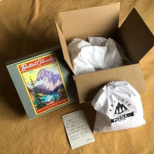
The puzzle arrived promptly and well packaged, using tissue paper rather than bubble-wrap for padding. It came with a hand-written note from Aaron. Inside the puzzle box the pieces were in an attractive cotton bag.
The puzzle box is made from thin but high-quality corrugated cardboard. Together with the cloth bag for the pieces it makes both a good impression and safe storage. I appreciate that there is a label with thumbnail pic on one end of the box, but for my storage situation I wish that it was on one of the sides.
[Digression: The plant in the background is of the above photo Sedum spathulifolium, more commonly known as Broadleaf Stonecrop or Pacific Stonecrop. It grows abundantly in the Salish Sea on dry upper beaches and especially on rocky outcrops where nothing else except lichen and moss grow.
Various types of stonecrop are found worldwide. Most of the ones you find in garden nurseries are hybrids from species found in Europe or Asia. But this one is native only to the northwest coast of North America. I wild-gathered this plant about forty years ago and it survived through many years of neglect in a pot in the garden. All stonecrops are succulents, meaning they store water in their waxy leaves and protect it from evaporation, so they are very drought tolerant. End of Digression.]
Enen before sorting I could see that the pieces of this puzzle are well printed with rich colours. The printing has a matte finish when seen straight on but a pleasing slight glistening effect when seen from an angle.
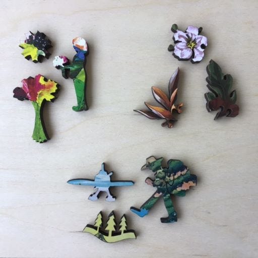
The above photo compares pieces from this puzzle (bottom) with ones from Stumpcraft (Bursting Blooms; upper left) and Puzzle Lab (lovebirds; upper right.)
This puzzle is printed directly onto 5 mm thick medium-density fibreboard (mdf) presumably using a UV printer. Both of the other two companies here are a more luxurious-feeling 6 mm (¼ inch) thick wood. They both also use UV printers. Like Puzzle Lab, Stumpcraft prints directly onto the mdf. I have done four Stumpcraft puzzles and enjoy that printing-on-wood gives it a slightly 3D effect that seems to bring life to the paintings’ brushwork. I don’t get that 3D effect from this puzzle but that might be because there is no brushwork in the original lithographic image.
Puzzle Lab prints their images on paper which is then securely affixed to the 5-ply birch plywood. The use of plywood for wood jigsaw puzzles is more traditional. In the early 20th century plywood generally replaced the use of thin hardwood sheets because that solid wood was sometimes subject to warping . Birch plywood has evolved to become the preferred wood for this purpose. However, high- and medium-density fibreboard seem to be less subject to chipping and breakage than birch plywood, and I get the impression that jigsaw puzzle-making may be in the midst of another transition.
Puzzle assembly
As usual, I wanted to assemble this puzzle without reference to the picture, either before or during assembly. Of course, I saw the image before I bought the puzzle, but I try to look at the cover picture on the box as little as possible after I receive it. Then I let it sit in storage for at least a few weeks so that my power of forgetfulness will enable me to have more challenge and thrill of discovery during assembly.
In this case I began assembly very soon after I received the puzzle, but my power of forgetfulness did not let me down. For example, I remembered that it was a vintage poster of a mountain scene but none of the details: I knew roughly what the text said but I couldn’t remember where it was in the picture.
I don’t consider myself to be an experienced wood puzzler yet, but this one makes 23 under my belt so I’m not really a beginner either. I’ll take you through my thought processes regarding how I assembled this one.
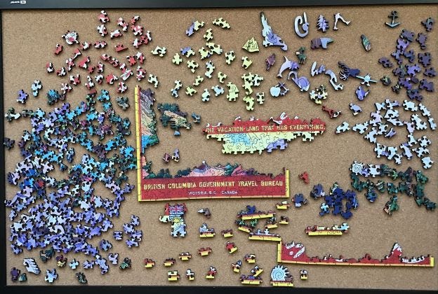
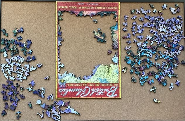
My initial sort was roughly by colour and I separated the edge pieces (along the bottom) and whimsies (top right.) I always separate out the whimsies (if the puzzle has them) because their odd shapes can often provide clues for finding adjacent pieces, and perhaps forming a little cluster (or island) of pieces.
Similarly, I always try to identify the edge pieces. Assembling the edge first has long been standard practice for jigsaw puzzles. Many designers now purposely design them to make it difficult to complete the edges. But there are always opportunities to build strands of three, four, five, or more pieces as linear islands. Also, sorting out the apparent edge pieces lets you know if there are inside false edges; that can be a clue that the designer has included line cutting (cutting along the colour-lines to make assembly more difficult) in the bag of tricks.
As always, I needed to consolidate pieces to give myself more working space on my 2’x3’ (20 x 90 mm) cork puzzle board. I began with targets of opportunity – pieces with very distinctive cuts or colours where I can easily find their match. Usually I can find a few of these when first sorting the pieces, and they keep springing to my attention while I am looking for something else.
Some of the bottom edge pieces included parts of the small sans-serif text “Victoria BC Canada”. That’s how I knew which side was the bottom. That led to being able to consolidate the yellow sans serif text above that, begin up the side edges, and consolidating the rest of the yellow sans serif text pieces. The yellow strip on the top edges was narrower than the sides, so that was next.
Writing it like this makes it sounds easier and faster than it was. While Aaron’s cutting design does not include the usual tricks for disguising the edge pieces that I have encountered, his cutting was creative and tricky enough to make this slow going.
Moving the top to the top, finishing the edges, and an orange-pieces target of opportunity gave me more working space.
My work table is up against a wall. I love the inexpensive cork bulletin-board that I use as a puzzle-board. Not only does it allow me to flip the puzzle over after it is done to see the back side, but during assembly I can rotate everything to make the part of the puzzle I am working on easier to see and reach.
As I was doing the large script “British Columbia” and continuing on the yellow sky I developed more and more appreciation for Aaron’s cutting design. It is mostly interlocking with wide variety of piece and connector shapes.
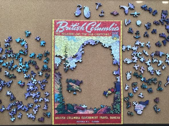
The next step after this stage was finishing up the automobile, then the lady sitting on the rock: I could recognize that was the leg of a man next to her and I wanted to finish him too.
It was about this point that my assembly slowed down and I began my image analysis and other research that I have already described. That change in direction certainly wasn’t because I was tiring of the puzzle. I was enjoying it very much and didn’t mind stretching out the assembly to make it last longer. And that car at the bottom of the image intrigued me. I recognized that it, and the woman’s clothes, might be clues to figuring out when this poster had been made.
My curiosity overrode my self-imposed rule about not beginning any research that might reveal the image to me until after assembly was completed. Even so, I did my research about the car, camera and woman’s clothes from studying the details in the puzzle, and at this stage avoided trying to find the poster itself online.
Now that there were fewer pieces and colours in play, the green trees, the turquoise lake and the dark purple mountain base proceeded pretty smoothly in parallel with my research and analysis.
The target of opportunity assemblages (islands) inside the puzzle and on the right are both pinkish in colour but I couldn’t yet see how they went together or attached to the puzzle that was growing from the outside in. In the case of the one that is inside the frame I didn’t even know which side should point up. That kind of bonus mystery is a part of doing jigsaw puzzles without looking at the picture that I enjoy.
For the most part, I saved the light purple and white mottled pieces for the end . . .
. . . because they were tricky. I continued to be impressed with Aaron’s cutting design, and felt like I had made an accomplishment each time I was able to click a piece into place.
Impressions, critique, and final thoughts
Unlike Puzzle Lab and especially Stumpcraft, who are both internationally highly regarded for the quality of their puzzles, Pacific Puzzle Co is still a relatively unknown puzzle maker. A few days ago, one of the experienced puzzlers posted a picture of one of their puzzles (Born to be Wild) that she had just finished in the Facebook Wooden Jigsaw Puzzle Club group. Another member posted a comment: “How did you like this brand? It looks interesting!” The reply was: “It was like doing a Liberty. Same quality so for me it was very nice.” Liberty Puzzles is one of America’s oldest and largest laser-cut jigsaw puzzle companies. They are also highly regarded by many fervent fans and are one of the most expensive brands. A comparison to them is high praise indeed.
I haven’t assembled a Liberty (they don’t currently ship to Canada) so I can’t say. But I can say that I think it is reasonable to put Pacific Puzzle Co’s presentation, images, printing, and cutting design in the same league as any of the best puzzles. I enjoyed assembling this puzzle, and admittedly was quite surprised to find that this small home workshop’s printing and cutting compared favourably with the highly-regarded laser-cut makers whose puzzles I have done, especially since its price is lower than almost all of the premium brands.
Although it is 460 pieces, this puzzle is not as challenging as that number suggests. Pacific Puzzle Co does not state a difficulty rating for their puzzles on either their website or on the box. I would estimate British Columbia Travel Puzzle as being equivalent to the those that Puzzle Lab and Stumpcraft give a 3 out of 5 difficulty rating.
For me, this puts it at the “fun” end of the fun-to-difficult challenge spectrum. I could tell that Aaron “pulled his punches” in trickiness, for example by having fully connected undisguised edge pieces, and by not using line-cutting or other sophisticated design tricks. I think I know why.
Based on the references to local places in the images on the puzzles in their current catalog, and the fact that they sell their wares at seasonal craft markets, I think Pacific Puzzle Co is aiming primarily to sell to regional residents and the tourist market. As you know, we wood puzzle aficionados are fairly rare compared to people who love 1000 piece cardboard puzzles. Aaron needs to hit just the right level of difficulty for them, not for us, if he wants to get them to come back to buy more.
Attractive, colourful images of local places, whimsies, and the rich tactile feel of wood should get cardboard puzzlers’ attention and respect, and hopefully make them willing to pay the higher price to try out one of these wood puzzles. Such people will find plenty of challenge and enjoyment in adjusting to the inherent differences from the cardboard grid-cut and random-cut cardboard puzzles they are familiar with. Pacific Puzzle Co does not want them to have that challenge turn into frustration by having the puzzle be too difficult for them.
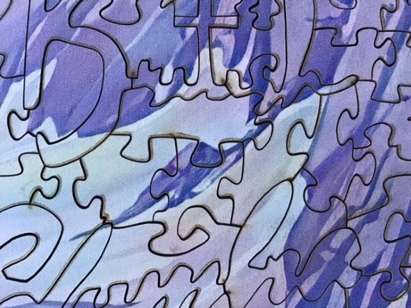
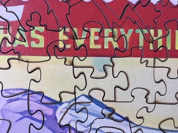
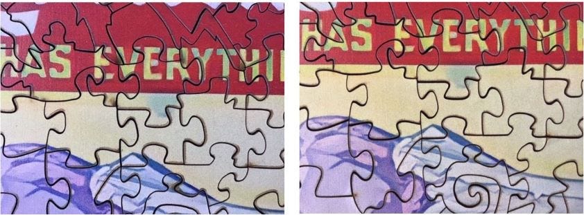
However, there is one issue that I haven’t mentioned yet. This is the first laser-cut puzzle to date where I have encountered brown discolouration next to the laser cuts on the image of the puzzle. I’ve gotten used to seeing scorching on the backs of wood puzzles, even from premium companies, but not on the image side.
Here are two close-up pictures of some of the worst areas to show what I mean:
I would estimate that this discolouration appears to a noticeable degree on about 10% of the pieces. It is especially apparent on the light-coloured yellow and white areas of the puzzle, and it dulls the vibrancy of bright red areas.
Because puzzle assembly inherently draws one’s attention to fine details like this of the image I found this discolourisation to be both unattractive and an intrusion into my enjoyment of the experience.
I had only assembled 17 laser-cut puzzles to date and had never seen this before, therefore I did not know whether this was a common problem that I had been lucky not to have experienced previously. Or is it a rare one that I should bring to Pacific Puzzle Co’s attention? For input I enquired about this (without identifying the puzzle’s brand) to the folks in Facebook’s Wooden Jigsaw Puzzle Club (a wonderful source of information and community!)
The consensus of the replies was that this is sometimes seen to a small degree even from high quality puzzle makers, and that whether to complain about it depends upon how bad the discolouration is and how much it detracted from my puzzling experience. I decided that my enjoyment of the puzzle outweighed this flaw, so I sent an email with some pictures to Pacific Puzzle Co informing them about it, but clarifying that “I am not complaining and asking for a refund or anything like that.”
Aaron replied: “Thanks for your message over the weekend. This is a small amount residue from the laser cutting process, created by the rotation of the laser. On lighter colour sections in the puzzle this becomes visible, however the print would smudge if cleaning this section off with acetone. In darker puzzles this is not noticeable at all.”
While writing this critique I had an idea. Through careful experimentation I found that most of the discolouration can be removed through gentle cleaning with a Q-tip and rubbing alcohol. Here are before and after pictures of my cleaning.
In conclusion, Aaron and Kat told me in correspondence that they began Pacific Puzzle Co two years ago “with little to no prior knowledge of puzzle making.” They have sure come a long way toward being among the best at this new craft! As you have read, despite the fact that they are making puzzles on a part-time basis out of a home workshop, they are capable of producing laser-cut puzzles that can withstand comparison to highly respected, well-established competitors. Perhaps living in a community with other artists and crafts-people on a small Salish Sea island is part of the reason that they can do this.
This wont be the only time that I assemble this puzzle, and this won’t be the last puzzle I buy from Pacific Puzzle Co.
Spoiler Alert
Below this are an image of my favourite whimsy from this puzzle, and a back view of the puzzle. These might be spoilers for people who have already decided to get this puzzle want to discover further things for themselves so I am hiding them at the end. Scroll down if you don’t mind seeing them.
keep going
Sometimes it is easier to see the cutting design of a wood puzzle by looking at its back side after assembly, without the distraction of the puzzle’s image. Occasionally you can discover multi-piece whimsies that you had not noticed during assembly, producing a further pleasant surprise. But sometimes, as with this one, scorching disguises the cutting pattern just as effectively as the image.
Not all laser-cut puzzles are scorched on the back, but most are, even among some of the most expensive brands. I would say that this degree of scorching is pretty typical or perhaps a bit worse than average. My impression is that most wood puzzle makers know that most people don’t think to look at the back after assembly.
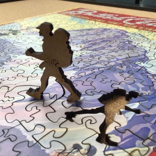
Here is my favourite whimsy from this puzzle. I really like the old fashioned hiking boots.









Thanks, Greg. The poster image inspired me to spend more time looking into its history than I ever expected. I have a lot of clues that I didn't cover because this write-up was already too long as it is. When I look at the generic cat in the poster/puzzle I still suspect that it is a '46 rather than a '47 because it doesn't have wrap-around bumpers that were all the rage by that year. One possibility is that the litho was made in '46 but, government being government, the advertising campaign was in 1947.
Wow. Your pursuit of the information you sought is impressive! I think posters promoting British Columbia are grand subjects for jigsaw puzzles. I'm pleased that you gave some recognition to the Salish Sea. Your photographs accompanying this essay are great. I think I'd like to own one of those DeSotos. Also, seeing today's puzzle in various stages of completion was fun.