14. A Different Glory: new from StumpCraft
Puzzle review and assembly walk-through; my impressions of a newly-released puzzle of a mountain landscape painted by Calgary artist Sharon Lynne Williams (about 3800 words; 26 photos)
laser-cut puzzle design by Jasen Robillard
acrylic painting by Sharon Lynn Williams UV printed on wood
550 pieces 12” x 19” (30 x 45.5 cm) average 2.5 cm/piece 6 mm mdf
My last post was an essay without a specific puzzle. This time I am posting a puzzle review and assembly walk-through but (mostly) without my usual digressions and rambling reports about research on related topics.
I am continuing with my new format of putting my assembly walk-through below the Spoiler Alert. I have decided to do that for all reviews of puzzles that are still in production.
I suppose that I should remember to include the following disclaimer with my puzzle reviews: Other than as a customer I have no affiliation with StumpCraft.
Expectations
In some ways, it seems unfair for me to review this puzzle. I was already a huge fan of Jasen Robillard’s cutting designs before I began assembling it, and have bought more StumpCraft puzzles than any other brand. Three that I have already assembled have been impressionist landscapes – Soft Maple in Autumn, Sunset Glow, and Morning – and they have been among my favourite puzzling experiences. This set me up with very high expectations for both the design and the artwork for this puzzle, and it puts me in a quandary as a reviewer.
There are some very highly-regarded brands of laser-cut jigsaw puzzles that I haven’t yet had a chance to assemble, including Liberty Puzzles, so I don’t have a basis for comparing this puzzle to them. I am left with using other StumpCrafts as my subjective assessment standard for this puzzle. But that has its own complications. I am continuing to gain experience, and I like to think that I am getting better at assembly. But how can I compare the difficulty of this 550 piece one which is my 39th wood puzzle, to the difficulty of the 409 piece Soft Maple which was only my fourth one? I’ll try to be as fair as I can.
Puzzle design
Because I was already familiar with Jasen’s puzzle design style I knew that some of the figurals would be multi-piece ones. I also knew from experience that I might not even recognize a multi-piece whimsy until after the puzzle was completed and I turned it over and discovered it on the back side.
Besides being a complement to good whimsy design that is also a tribute to the varied styles of cutting that Jasen does between his non-whimsy pieces. Some have graceful curves and others have finicky convolutions; some are zig-zaggy and others lumpy; and I knew that many of the cuts would follow the lines between colours in the painting or otherwise interact with the image in ways that disguise where pieces fit in. Sometimes his connectors double as a line-cut around an element in the painting, and often it isn’t clear whether a particularly intricate cut-line from him is going to interface with a whimsy or with another fill piece. Like I said, Jasen is a great puzzle designer.
As it turned out, this time I did identify all of the multi-piece whimsies while still doing the assembly, but it was a close call. A bear, in particular, had me fooled and I first recognized it only as a bear-shaped gap in my assembly. In fact, I was composing a message to Jasen in my head about there being a whimsy missing from my puzzle until after placing all of the other dark pieces I noticed that there were three small dark pieces left over that collectively were my missing bear.
As usual with Jasen’s cutting, some of the edge pieces in this puzzle were well-disguised, and none were recognizable as corner pieces. In fact, that is such a common characteristic of Jasen’s cutting that he warns you about it in an FAQ with tips for folks who are feeling stuck. The first tip is: “1. Ignore the edge: as you no doubt discovered, I often hide edge pieces and corners, and also include straight edges on the inside.”
Actually, I don’t really follow that advice. Out of habit I still separate the potential edge pieces as part of my initial sort, but I do keep Jasen’s advice in mind and don’t let myself get stuck trying to complete the edges before beginning to work on the interior.
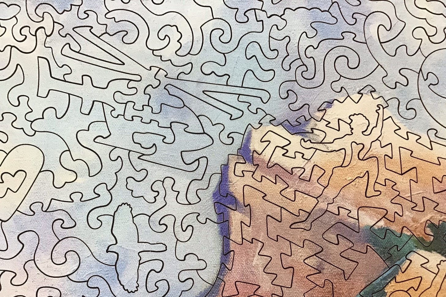
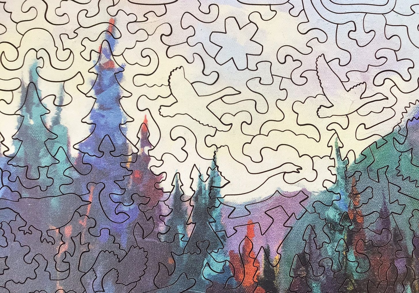
In this puzzle Jasen has included a few cutting features that I don’t recall having seen from him before. All of the figurals are upright in relation to the image, and there seems to be more logic as to where the whimsy pieces are placed. It is no coincidence, for example, that most of the flying bird figurals are sky blue, and the sitting songbirds are the colour of the tree foliage. The whimsies of rock climbers are placed on the steep mountainside in the image.
Also, the cutting of the fill pieces (i.e., non-whimsies) is different in different parts of the puzzle and their shape is appropriate for their context. For example, the cutting in the water areas of the image has a ripple-like effect:
I suppose that these features make the puzzle easier to assemble once you know about them, and I wanted and expected this puzzle to be challenging. But Jasen has such a large bag of tricks that I found that these cutting features enhanced the fun element while not taking too much away from the challenge aspect. In fact, I would say that this puzzle hit exactly the right place on the fun-challenge spectrum for me.
Printing
The UV printing of the image lived up to my very high expectations from Stumpcraft. In this case, the sky, water and the brown/beige areas, and some of the foliage areas, have a non-reflective matte finish, while the brighter/darker colours have a semi-gloss reflectivity that gives the image a 3D effect. It is as if I am seeing the artist’s brush-strokes. (I have tried many times but I cannot find a way to show this effect with a photograph.)
I have never seen this effect in a puzzle that is printed onto paper. StumpCraft achieves it by using a UV printer that places special ink directly onto the wood, and the ultravilolet light immediately cures it before it can soak in. While the smoothness of paper would work better for some types of images, for an impressionist painting such as this one I think that this printing method greatly enhances the puzzle.
I consider this kind of printing to be a premium feature but it is not restricted to high-end puzzles. Wentworth also now uses UV printing on wood, and I have even seen it on an inexpensive Chinese-made puzzle that I have reviewed here.
The painting
As to the image itself, I haven’t really warmed up to it as much as I expected to. I didn’t look at it carefully before I bought the puzzle - it looked like it was OK but nothing special, and I thought it would grow on me as I assembled the puzzle. That happens a lot for me.
The puzzle’s big attractions for me were that it has 550 pieces and the puzzle design is by Jasen Robillard. The growing-on-me think happened big-time with StumpCraft’s Morning puzzle (595 pieces), that I assembled before I began this newsletter/blog series. It has a contemporary landscape painting by Steve Coffey, I had been quite skeptical about the painting style when I bought the puzzle. But I found that I came to be really drawn into appreciating it during its assembly and as it remained assembled on my table for several days. I guess I expected that would happen for me with this puzzle too.
But it only halfway happened with this contemporary painting by Sharon Lynn Williams. It has been assembled for about a week now and is still on my board as I write this. I immediately fell in love with the foreground landscape scene in the lower half of the painting, but I haven’t really come to terms with the large clouded skyscape or the mountain in the upper half of the image. I can’t put my fingers on why not. Perhaps it is because the clouds and the geology just don’t ring true to me.
For the past few years part of my daily ritual has been to spend some time most evenings on my west-facing 4th floor balcony watching the sunset and the evening light. On many evenings I watch clouds as they first encounter Canada’s west coast after their long journey over the Pacific Ocean. Sometimes I try to identify their various types of formations and elevations, and if don’t recognize them I can look them up in one or more of the four reference books I have on the subject. But usually, instead of being analytical I just sit there and enjoy watching them.
But the clouds in this painting don’t look like a skyscape that is familiar to my eyes. The analytical part of my brain recognizes them as a low- to medium-elevation cumulus and stratus (called altostratocumulous) formation. But in the painting I don’t see the expected layering that usually comes from their being brighter on their tops and having a dark foundation where their bottoms receive less sunlight and give the overall effect of having the more distant clouds look darker. Also, the edges of the cumulous clouds are more whispy than I am used to seeing.
But then, I have never spent more than brief travelling time passing through the Rocky Mountains. I grew up under the big sky of the prairies and know how different the clouds there often looked from the ones that I see here, and I also know that mountain cloudscapes also look different than I am used to. So I am not suggesting that the cloudscape in this image is not an accurate representation of what the artist experienced there. Air currents moving past and above mountains, and the thermals that sunlight generates on bare rock faces, can create some unexpected effects.
However a more likely explanation may have been that the clouds’ appearance may have been an artistic choice that Sharon Lynn Williams made when she rendered this impression. According to both her website and Jasen’s Deep Dive essay, in recent years her passion has been making paintings “en plein aire.” In fact, painting outdoor subjects that way is a core principle of traditional impressionist painting.
In his Deep Dive, Jasen (who lives on the western slopes of the Rocky Mountain Range)explains the appeal of this painting for him very eloquently:
Sharon Lynn Williams has been passionately painting in diverse media and subjects for over 35 years. After a long studio career, Sharon Lynn’s passion shifted to ‘plein air’ painting where she could more aptly use all of her senses to absorb the full landscape of her experience. In returning to her experimentation with acrylics, she attempts to capture the visual landscape as well as the feel of the breeze, the smell of the earth and foliage, and the sounds of nature onto the canvas. Her new aesthetic focuses on a limited amount of very interesting shapes; strong decisive brush marks; inventive, pushed, and graded color; flattening of the picture plane; pattern, and strong value contrasts. All of which lend themselves well to puzzle media!
This is what Sharon Lynn Williams says about this painting on her website: “I have painted Mt Rundle from Vermillion Lakes on location many times. This is a studio interpretation where I tried to convey the solidity of the mountain against the fleeting clouds.” Perhaps that explains my lukewarm reaction to the clouds in her painting. She intended to highlight their transitory nature, and they are an element in a landscape. I am reacting to them as if this were a cloudscape.

The mountain depicted in the puzzle is Mount Rundle, known to the native Cree people as Waskahigan Watchi. It is near Banff in the Canadian Rockies. Here is a photograph of the mountain taken from what seems to be a similar perspective:

From my balcony, looking to the south I also get a long-distance view (about 70 km or 43 miles) of the Olympic Mountain Range in Washington State. Our coastal mountains are quite a bit younger than the Rockies. Those mountains were formed about 80 to 55 million years ago while the Olympics only began 34 million years ago, and they are still growing now. But the jagged, treeless ridge of Mount Rundle wouldn’t look out of place if it were to be magically transported to join its younger cousins out here on the coast.
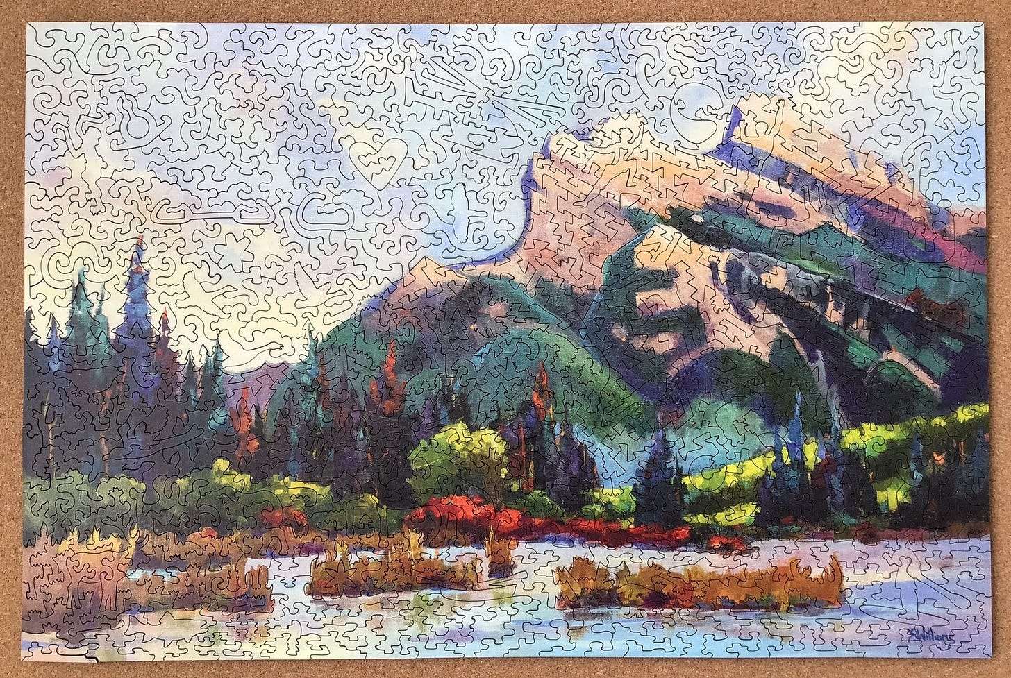
Here is a photo of Sharon Lynn Williams’ painting:
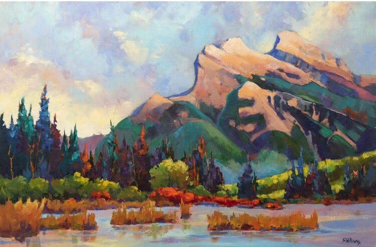
Maybe the fact that I haven’t been able to warm up to this painting of a mountain boils down to something as simple as that I am subconsciously thinking of this as a plein aire impressionist painting although (as told below) according to the artist this is actually a studio painting.
It might be that I have an unfair bias against studio painting of outdoor subjects. But a lot of impressionist artists went to all the inconvenience of hauling their painting gear to hard-to-access places because they felt a need to create their paintings in situ. They know a lot more about painting than I do, and according to Jasen’s write-up that is quoted above, in recent years plein aire painting has become Sharon’s favoured approach too. Perhaps the close attention to detail that I inherently am getting from assembly of puzzles with impressionist artwork is teaching me to appreciate the difference too.
Or perhaps it is just that my subconscious can’t reconcile the textures and variety in that lovely foreground with what looks to my eyes to be a wrong-coloured cliffs on a velvet-textured mountain. (But given how much of an improvement the size and quality of printing of the puzzle makes over the above photo of the painting, it is possible that I wouldn’t get the same lukewarm reaction if I was viewing the original 24”x36” (62x92 cm) acrylic painting as I get from viewing a jigsaw puzzle, no matter how well printed, about a quarter of its size.)
Please don’t get the impression that I don’t like this image. Remember, I do really like the foreground half of the painting, as well as the way the rich colours make for a very good assembly experience. It is just that I haven’t grown to love it as much as I did with my previous Stumpcraft landscape puzzles. This is where we come back to my opening comments about the unfairness of me reviewing a puzzle from StumpCraft and using my experience of those other puzzles as my standard for this review. My judgement has been warped by my expectations.
Review conclusion
As for the overall puzzle, I do love it and I will most certainly be assembling it again! I also highly recommend it to anyone else unless you haven’t done another StumpCraft puzzle yet. If that is the case, I would recommend that you choose whichever puzzle’s artwork most suits your own personal tastes. But by all means treat yourself to a StumpCraft puzzle! In all of them you get to experience Jasen Robillard’s creative cutting design and execution of the other aspects of puzzle-making (although this one being Jasen’s latest puzzle means that it benefits from the most from his now five years of experience at his craft and the high standards that he sets for himself.)
[Note: Other’s might well like the artwork of this puzzle better than I do. If so you might be pleased to her that this is among the original paintings that she has available for sale on her website The original 24”x36” acrylic painting of A Different Glory is $1,680 CAN. There she says: “I have painted Mt Rundle from Vermillion Lakes on location many times. This is a studio interpretation where I tried to convey the solidity of the mountain against the fleeting clouds.”]
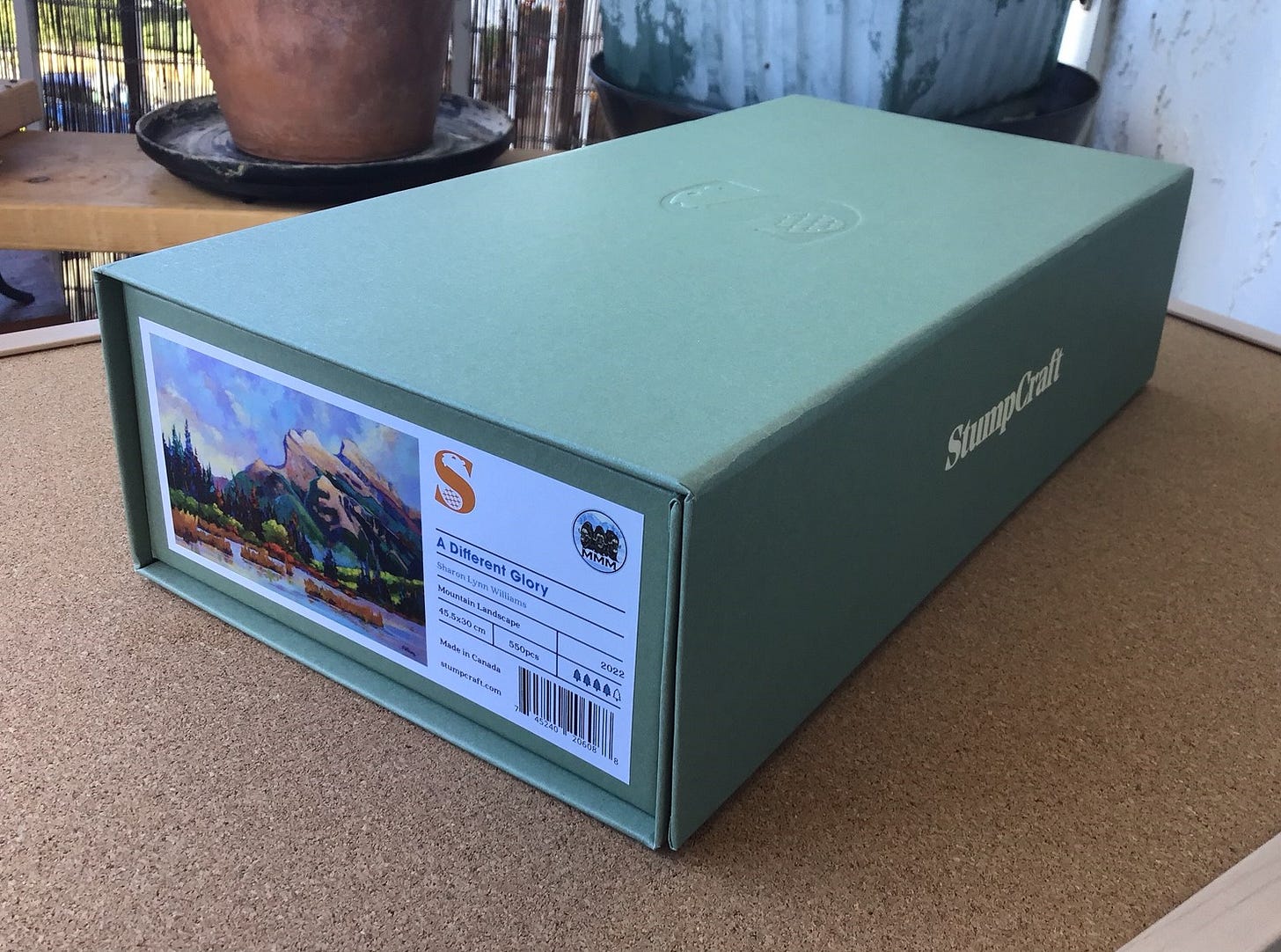
Back to finishing my puzzle review: If you are not already familiar with StumpCraft’s packaging I am very pleased that they offer two attractive choices. I chose the sturdy cardboard box that has magnetic closures. For $20 CAN buyers can get their puzzles in an even sturdier and very classy solid pine (not plywood) box similar to the type that Artifact uses for their larger puzzles. Both types of boxes have a small thumbnail photo of the puzzle’s image. Within the box is a larger image of the artwork, and Stumpcraft has a printable high-resolution image available from their website.
For more information about StumpCraft. and to buy their puzzles, their website is here. Also, Jasen has written a Deep Dive essay about this puzzle on his blog that includes design notes as well as more information about the charitable cause to which partial proceeds from sale of this puzzle are being donated, and a link to the high-resolution image.
Below is discussion and photos of the puzzle in process and completed. If, like me, you prefer to assemble puzzles with a limited knowledge of what the image will be, and if you already know you want to get this puzzle anyway, you may not want to see the rest of this post. For that matter, if that is the case I suggest that you also don’t look too carefully at the photos on the Stumpcraft website or in the Deep Dive essay.
Spoiler alert
.
.
.
.
.
.
First impressions and assembly
My first impressions of A Different Glory were formed about two months ago when Jasen Robillard posted an image of it on the Stumpcraft website as “Coming soon” in September. It was simply described it as an impressionist mountain landscape and said that it would be about 550 pieces. I didn’t need to look at the image carefully. I knew that I was going to buy it as soon as it was available.
When it was released on September 7 I was probably among the first people to place my order. Again, I avoided studying the image when I bought it, and when it arrived I remembered to avoid even glancing at the small reference image on the end of the box.
So as usual, when I began assembly I had very little memory of what the image would look like. I recalled that there was a mountain in the distance, set against a cloudy sky, but I couldn’t remember anything about the foreground. I also knew from reading Jasen’s blog entry teaser about the upcoming puzzle in August that many of the whimsies would about outdoor activities and wildlife.
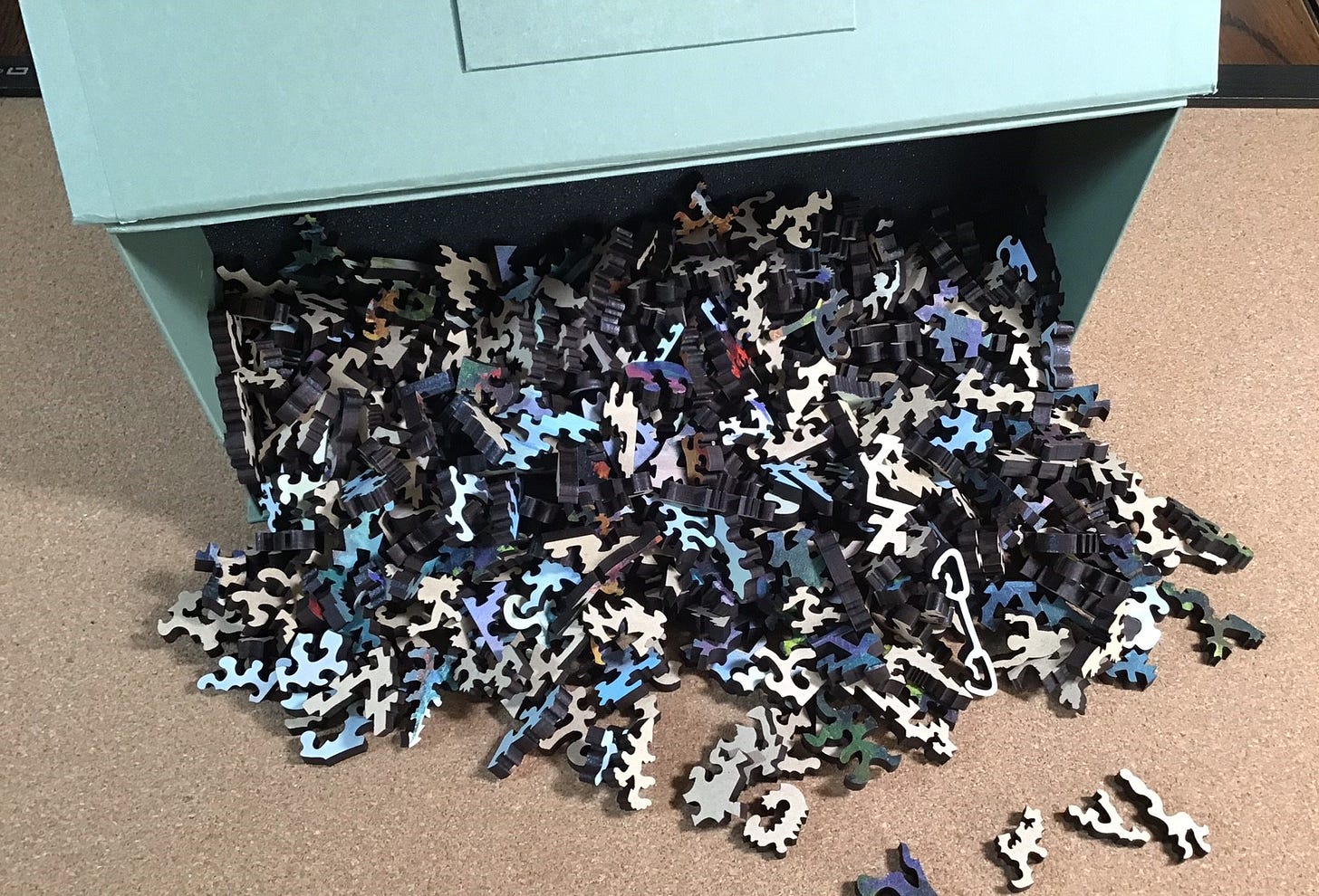
My first impression when I tumbled the pieces out of their box didn’t yield any surprises or any hints at what to expect other than that there seemed to be a pretty high proportion of sky-blue pieces.
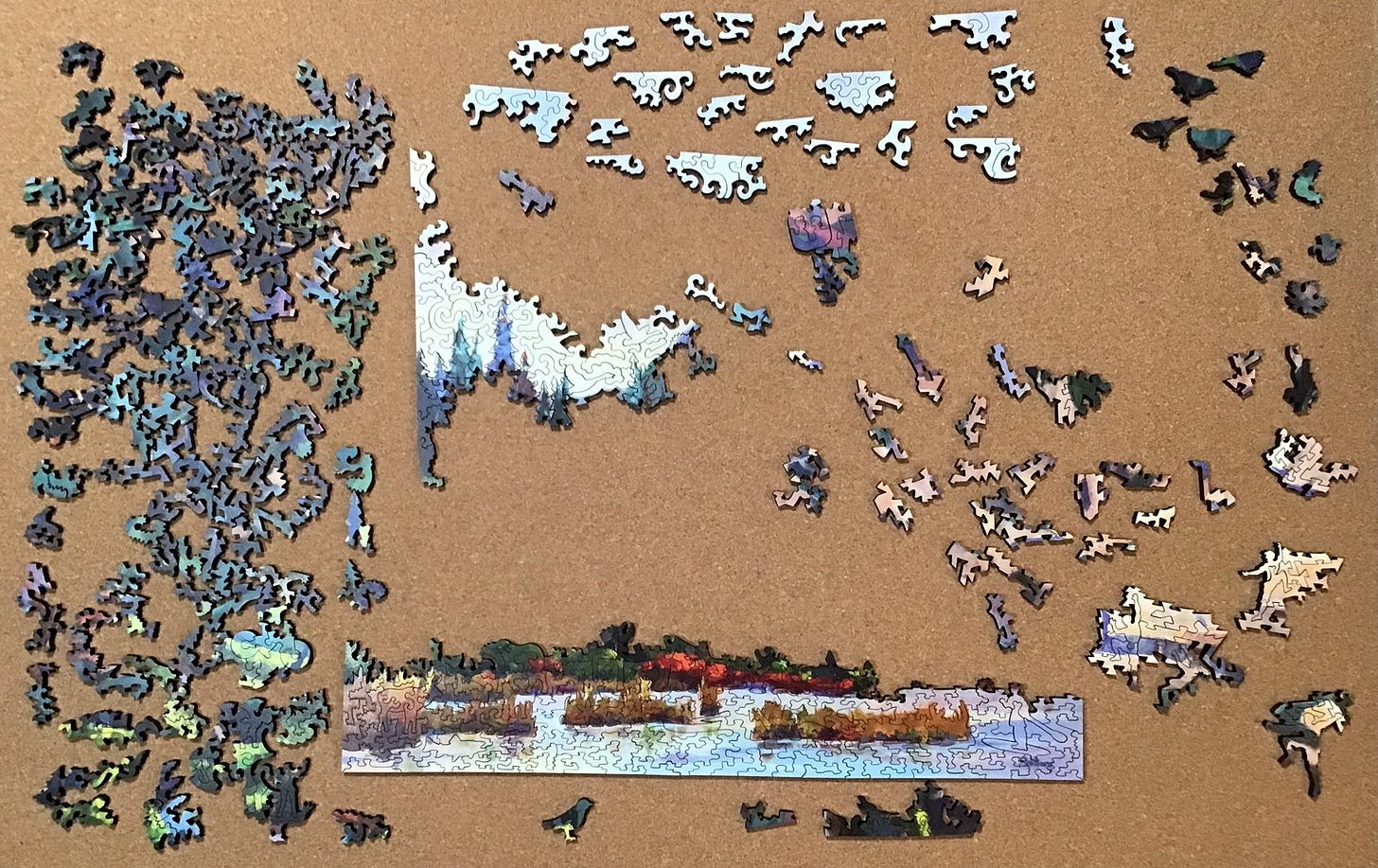
550 pieces is a lot to try to fit onto my puzzle-board and still have some working room, so I put the sky-blue pieces that were not potential edge pieces on my small board. I also put the pieces with a lot of red, pale green and brown near each other because there didn’t seem to be very many of them. In general, the non-edge dark ones are on the left and the lighter coloured ones are on the tight. The whimsies are upside down for now because for them often shape is more important than colour. Notice how few dark edge-looking pieces there are along the bottom.
It seemed unlikely that the artist would have written her signature upside-down in the sky, so many of my “sky pieces” must be water:
Besides edge pieces, early assembly mainly was based on colour, or the absence thereof. The lower part of the sky on the left-hand side of the painting is all white, rather than blue & white.
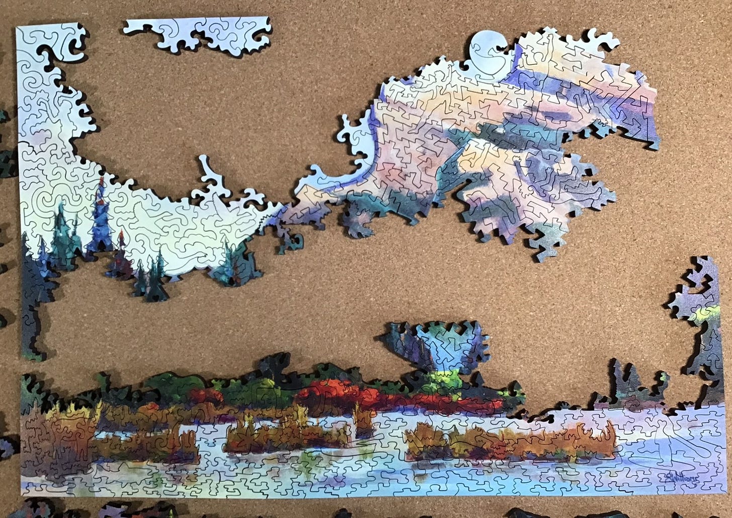
It is very satisfying when I can attach the islands onto the frame or each other. The bright red horizontal patch turned out to be a real eye-magnet throughout the rest of the assembly.
It was about here that I recognized that the figural pieces in this puzzle were all going in right-side up, and that most of them were in logical locations in the image. This is the first puzzle that I have done where this has been the case. It helped a lot to be able to orient the islands in the right direction, and I soon guessed that the climber figural pieces that were light brown would be the upper slopes of the mountain.
Back to trying to place the edge pieces. The bottom and left edges had not been very tricky but the top and right ones had a lot of disguised pieces.
By this time I had enough working space that I could move all of the sky pieces from the small supplemental overflow board onto the main one.
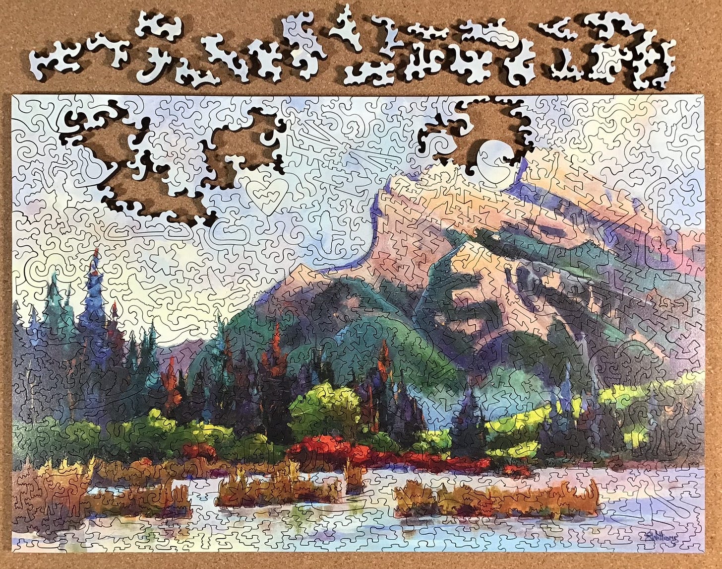
As usual, the sky part of the puzzle was difficult so I went back to working on the foreground forest section of the image:
Until there was nothing left but sky …
… so I began looking for the really subtle potential edge pieces.
Progress was still slow and it came in spurts, but to use an over-used and totally unrelated metaphor, I could see the light at the end of the tunnel.
The very last piece I put into place was an edge piece. I have never done that before.
And it was done:
Super-spoilers
.
.
.
.
.
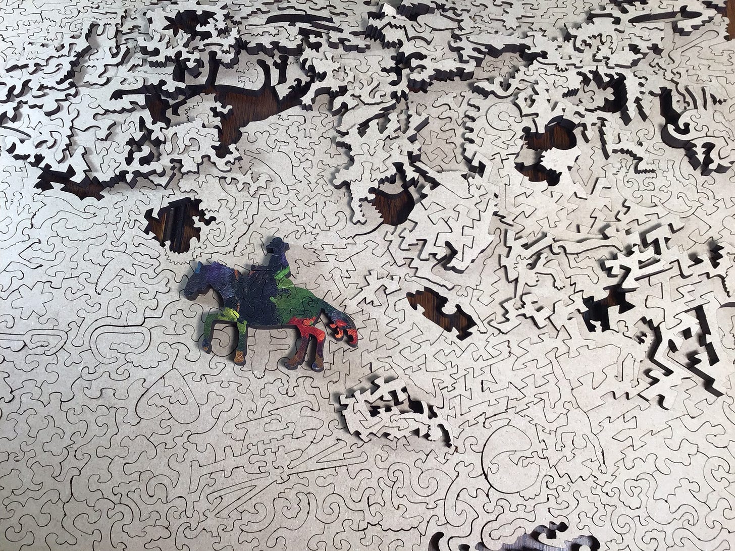
You might wonder why the puzzle is now on my table rather than on the small puzzle-board that I use for flipping. Well, I tried to take an artsy photo that involved leaning the big board against the wall at a near-vertical angle. This is what happened:
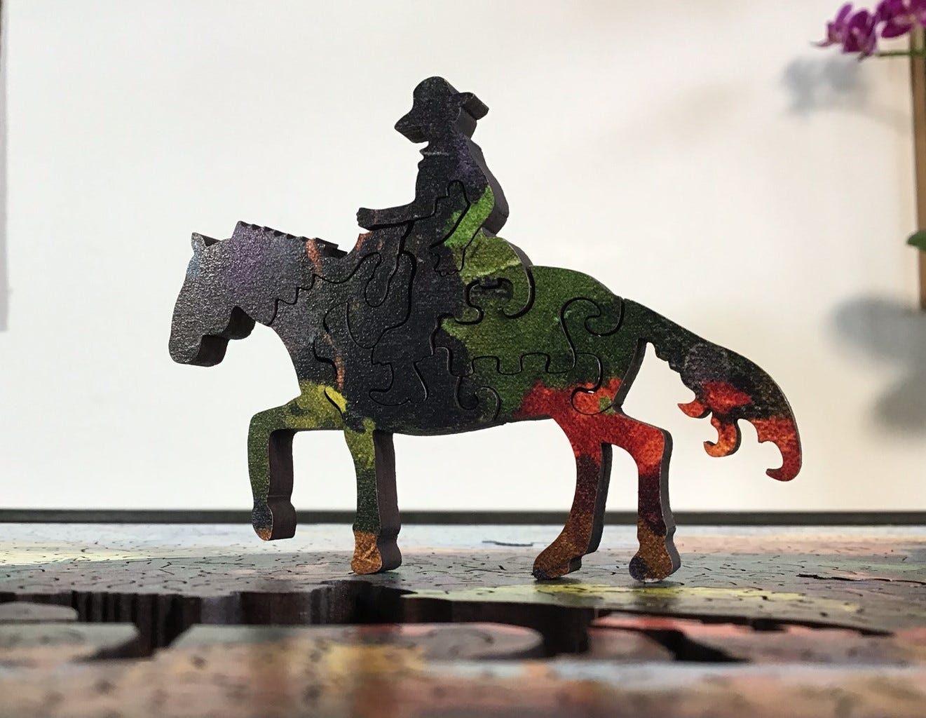
Here is that whimsy without the artsy background:
There are quite a few images of the figural pieces on the Stumpcraft website so I will only include a few in-context ones here to show how the placement of them is integrated with the puzzle’s image.
There are many coniferous tree shapes used in the cutting of this puzzle, both as connectors and, like here, as a relaxed type of colour-line trickiness. I put the left part of this close-up together quite early during my assembly and it was a recurring source of smiles right to the end. In fact, I’m smiling while I write this.








I like the Sharon Lynn Williams acrylic painting. It's one I wouldn't mind owning and hanging on my wall, though my actually purchasing it at this time isn't likely. Besides its impressionistic quality, I like the fact that the mountain is a recognizable facsimile of Mount Rundle as shown in the photograph later in your posting from a slightly different perspective.
I also like the illustration you have provided of a lenticular cloud.
By the way, I am not surprised that you admire what StumpCraft and Jasen Robillard produce.
Also by the way, I am not bothered by spoiler alerts, nor do I particularly feel I need them when I read your essays, though I'd surely feel differently if you were reviewing novels. Of course, it is a good idea that you include the spoiler alerts; some readers of your essays might care very much that you do.
The way you show us step-by-step your progress with your assembly of "A Different Glory" makes me wonder if the order in which the artist worked on the original painting paralleled at all the order of puzzle assembly—probably not, but the idea intrigues me.
Thank you for your work, Bill.