19. Inaugural puzzles from Victory 2.0: Part 2
Assembly walkthroughs, information about the artists, and miscellaneous digressions about the four puzzles that I reviewed in Part 1. (about 6500 words; 55 photos)
Spoiler alert
Below are many photos of assembling the puzzles. This might give you more information than you want to know if you intend to buy these puzzles.
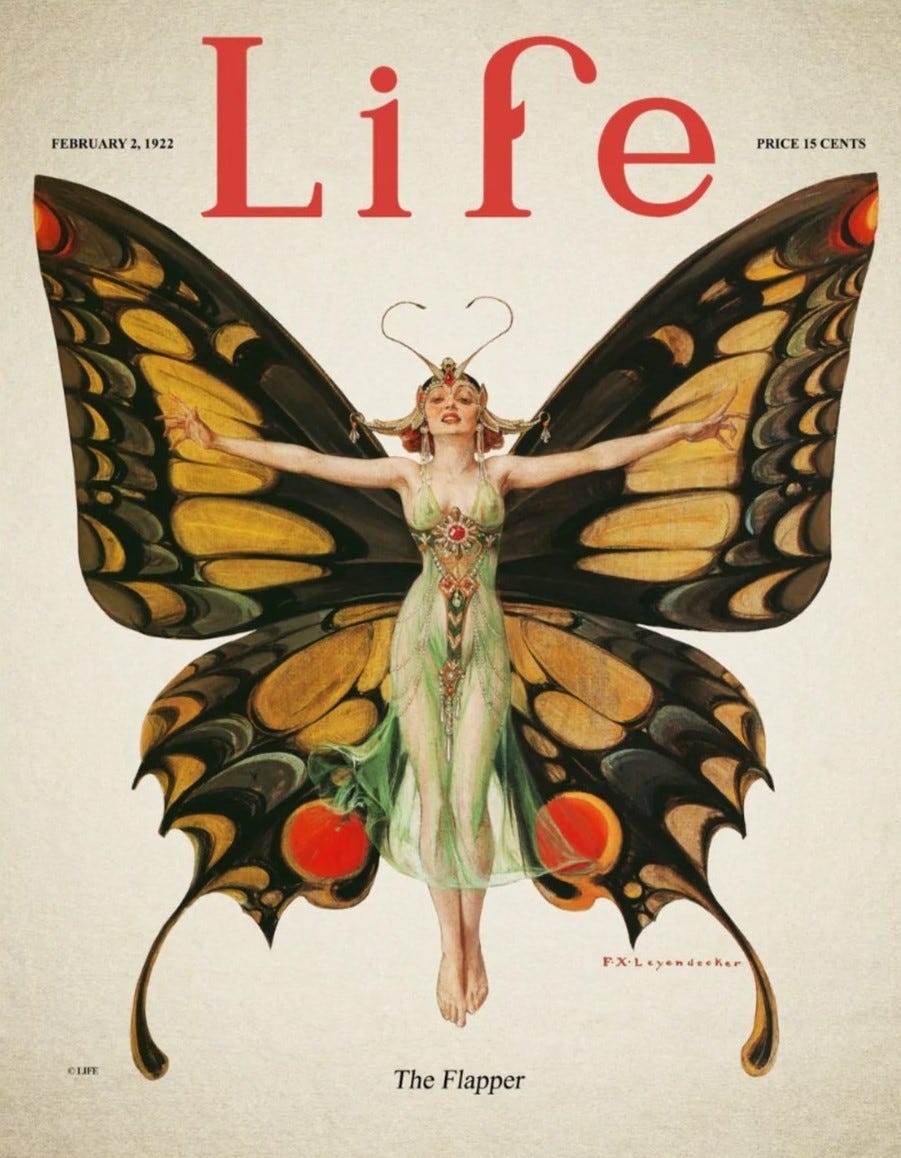
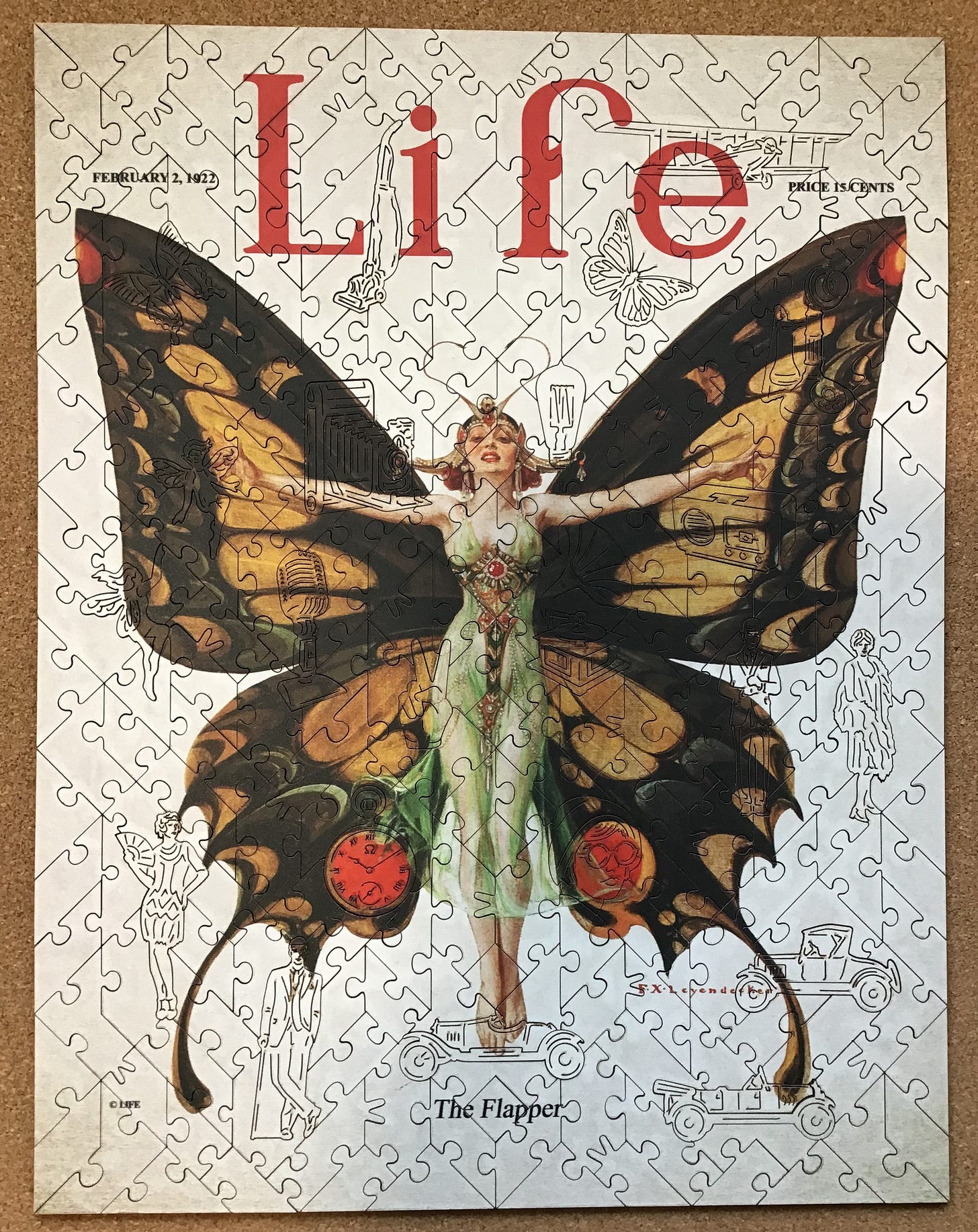
The Flapper – Life, 1922
Made in 1922 by Victory Wooden Puzzles cutting designer Aidan Knowles
laser-cut 3 mm MDF (medium-density fibreboard)
about 250 pieces 36 x 28 cm (14” x 11”) about 4.0cm²/piece
art deco matrix cutting; some hidden edges; knob and V-for-Victory connectors
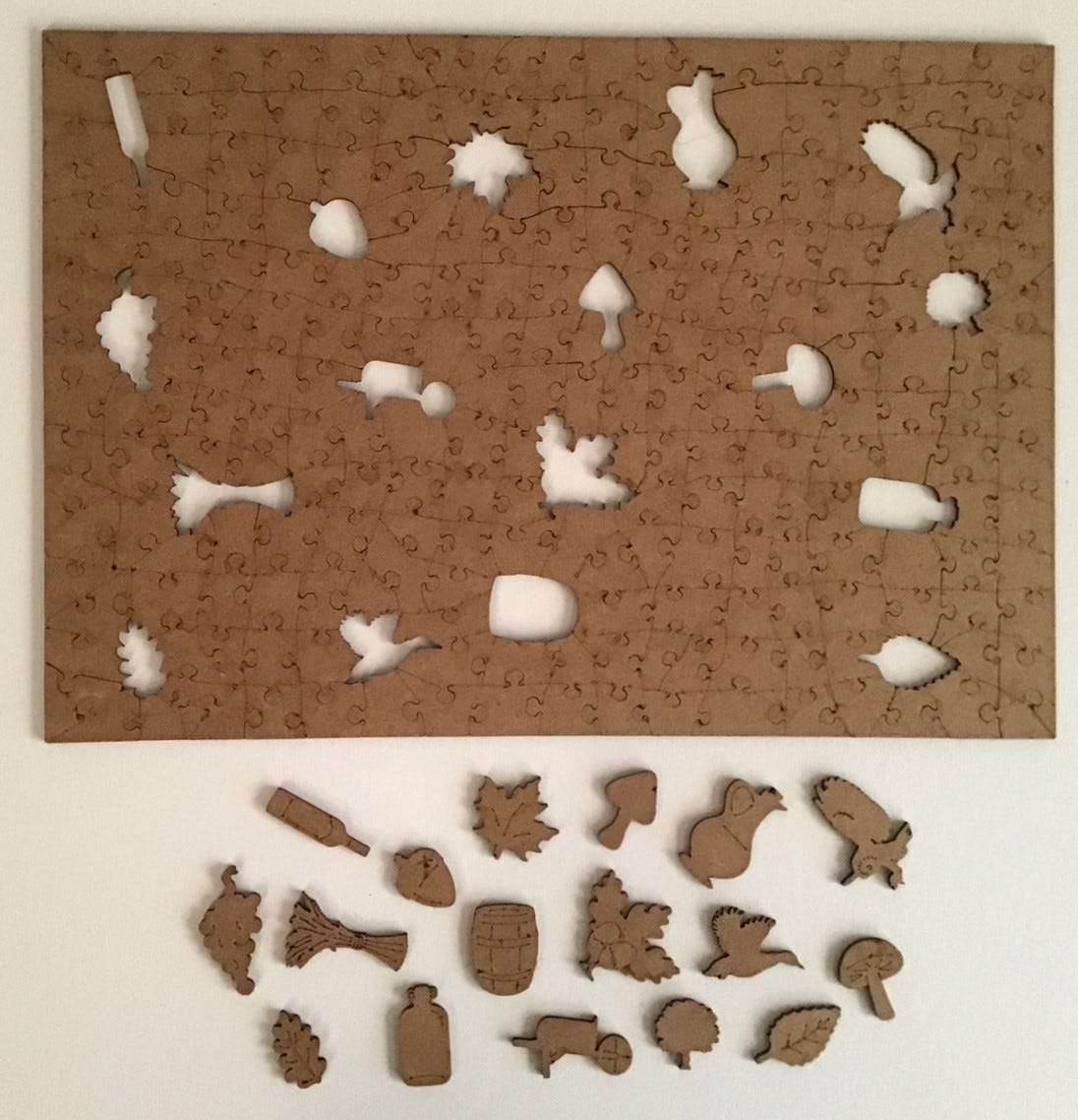
22 thematic whimsies (8 of which are multi-piece)
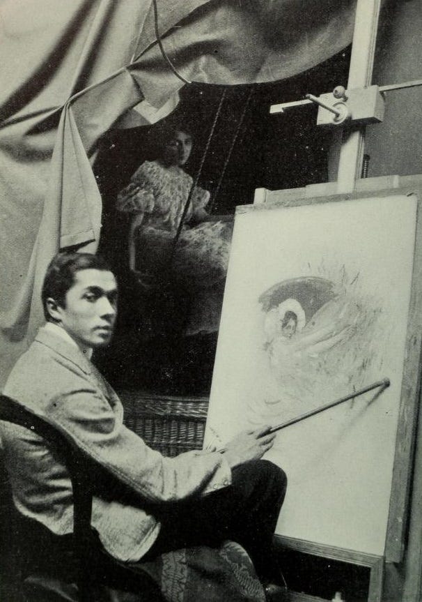
Had he lived longer than his 47 years, F.X. (Frank) Leyendecker would possibly be more famous than his older brother who was also an illustrator, the renowned and prolific J.C. (Joseph Christian; Joe) Leyendecker. For most of their adult lives the two artists shared a studio and a brotherly competitive nature. According to this article:
… FX paved the way for JC in almost every periodical and in every style that JC would master. Dozens of pieces show he was every bit as colorful, creative, entertaining and flamboyant as his older brother, with an impressive catalog including posters, cover art, book plates, advertising, and more. His covers for Vanity Fair, the humor Life, and Vogue are stand-outs.
For more examples of Frank’s illustrations see here, here or here.
Both brothers, the youngest of five children, had been born in Germany but their family moved to Chicago when they were still young. Both studied at the Chicago Art Institute, and then later together for a year at the Académie Julian in Paris. Paris was the heart of the international art world at that time and both brothers were influenced by the Art Nouveau movement that was then in vogue. While in Paris, according to art blogger according to art blogger Donald Pittenger: "J.C. studied diligently while F.X. tended to focus more on drinking, drugs and carousing with the other art students."
Upon their return to the US, the brothers, who were both gay, lived with their parents and their sister and shared an art studio together for most of their lives. They began their careers working as professional illustrators in Chicago, but the commissions they could find there were mostly for advertisements. Unfortunately, also while there Frank returned with addiction problems, which would plague him for the rest of his life.
The family prospered from the proceeds of their two rising artists. In 1900 they decided to move to New York, where the prospects were better for the brothers to get better-paying and more prestigious commissions making covers for national magazines (and, I suspect, where the brothers’ homosexuality would be more socially acceptable.)
Frank, in particular, longed to be accepted as an artist rather than as an illustrator, and he was the first one to get the higher-profile commissions, snagging covers for Collier’s magazine, Life (when it was a humour and general-interest publication, before it turned to the photo-journalism weekly), Vanity Fair and the Saturday Evening Post. He also was the more adventurous brother when it came to experimenting with new artistic styles and creative composition. For a while, J.C. was following in his footsteps, adopting and mastering techniques and styles pioneered by his brother. It wasn’t long before the family was able to move into a mansion in the fashionable suburb of New Rochelle, not far from the home of Norman Rockwell.
According to this website, in his 1960 autobiography Rockwell describes an episode from those early days when the brothers came over to dinner at his house: “They were quite short and walked in step with real military precision. They wore white flannels, double-breasted blue blazers with shiny brass buttons, and stiff straw hats.” The turkey that had been prepared crashed to the floor and rolled under the dining room table shortly after their arrival. The incident broke the ice and did not dampen their spirits. “When that turkey bounced under the table we all of a sudden became friends. We remained friends for over twenty-five years.”
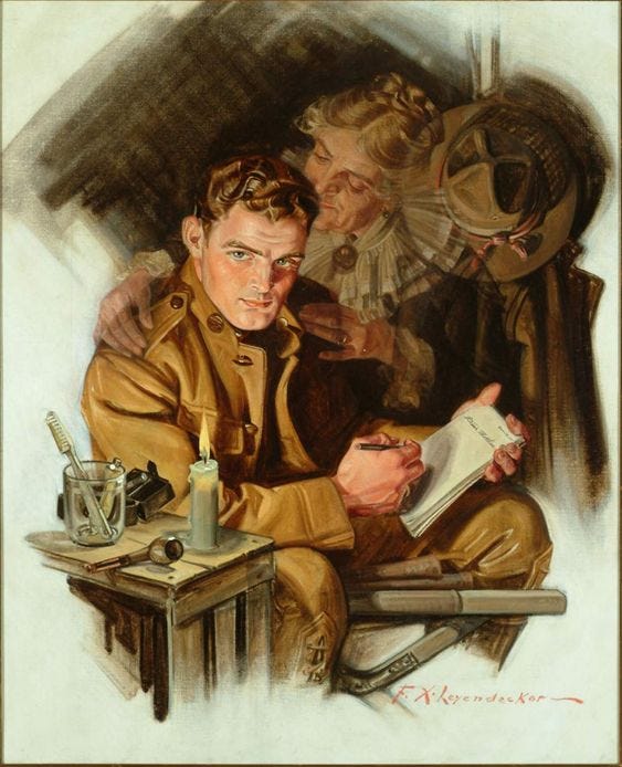
Over time, it was J.C. that began getting more of the attention, and Frank found that he was unable to bridge into being accepted in New York artistic circles as an artist rather than “just an illustrator.” That lack of respect for his work greatly affected him and Frank fell into a downward spiral into a life of debauchery and drugs. While his brother had a long-term stable relationship with male-model Charles Beech, I could find no online evidence that Frank had anything closer than fleeting sexual relationships.

Although he was still getting commissions (see above photo) in the last year of his life Frank got into feuds with his family, possibly due to jealousy over his older brother’s fame and his own growing reputation as “the lesser Leyendecker.” In 1923, suffering from both depression and poor physical health, he moved out of his wing in the family mansion and into Norman Rockwell’s garage. It was not long after that that he died from of a morphine overdose.
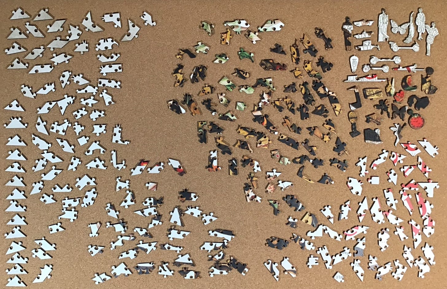
I had been intrigued by the very striking image and cutting pattern of this puzzle from when I first saw it on the company’s website. I recognized that its art deco cutting pattern with many disguised edge pieces would make it unsuitable for beginning with the outside perimeter. Therefore, instead of my usual habit of lining up the potential edge pieces along the bottom of my puzzle-board I put them on the left side, and put the other all-white pieces near them.
I put the pieces with the red magazine title lettering and other text pieces together on the other side of the board to aid in assembling islands.
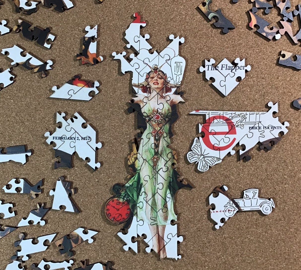
My starting point was to be the prominent woman/butterfly image with its easily-recognizable dark pieces. I began with the face and hair, and the dress which used the only green pieces.
I worked out from there, and also assembled the text, including the large red letters of the magazine’s name. The magazine’s title went together fairly easily, and I did some searching through the all-white pieces to link that sub-assembly to the woman.
The smudging along the sides of cut-lines (discussed in the Part 1 review) became quite apparent at this stage. I knew that with so much white it would detract from the appearance of the puzzle while I was assembling it, as well as the completed puzzle, but I also knew from previous puzzles that it was an easy DIY fix. I began to take occasional breaks from assembly to clean off the smudging. It was only the light-coloured areas that really needed cleaning, but as I got into the task I got fussier and fussier and ended up cleaning most of the puzzle.
[Digression: It looked to me like this woman’s clothing did not match my image of Roaring Twenties’ flappers’ style of above-the-knees dresses and the quintessential bobbed hairdo. Parallel to assembly I began doing research into flappers and learned that it was more of a youth-oriented women’s empowerment movement than just a fashion fad. Actually, I ended up spending quite a bit of time doing research about them and the fashions associated with that era.
The movement began in the US as a teenage-rebellion trend right about the time of the end of The Great War. Some attribute it to a fatalism brought on by the widespread reports of death from the War and the Spanish Flu, and the returning social strictures as the country tried to both return to a post-war normality and implement prohibition of alcohol and bring about high standards of moral rectitude.
In response to this, many young women adopted a style of dressing and behaviour that was exactly the opposite of what their parents wanted from them. They expressed a “live fast; die young” philosophy of life, adopting lifestyles that were dangerous and a style of dress that seemed to redefine feminine as “boyish”. The style caught on very quickly and it went international. It was given momentum by lots of coverage in general-interest magazines at the time, and when pre-Hays-Code movies portrayed flapper life as exciting and fashionable.
About 1920, two American magazines were established specifically aimed at flappers. Besides fashion, they promoted women getting jobs so that they could be more independent, and encouraged participation in sports and other activities (like aviation) that had previously been solely done by men. But as far as I can tell, there was no counterpart rebellious movement among young males at that time.
At the end of the 1920s the flapper lifestyle and styles of fashion went out of style just as quickly as they had come on. It is not clear why it ended so abruptly since it doesn’t appear to have been replaced by a different fad for young women. The Great Depression may have brought a different mood to the country, or maybe the flappers came to realize that other than in fashion it iconic images of independence were more aspirational than realistically attainable for most young women at the time.
But I was correct that the costume in this image, other than the is headband and ornate jewelry, is not really consistent with the stereotypical flapper style. That seemed odd considering that Frank Leyendecker lived in fashion capitol of New York City amidst many real flappers. In fact, the lines in this painting show considerable Art Nouveau influence even though that style had begun to go out of fashion about 10 years earlier. He must have known that, and so did the art director for Life magazine. It wasn’t until a few hours of assembly later that I twigged onto the pun in this puzzle’s title. It isn’t about a flapper as a stylish young lady, but a flapper as an elegant butterfly. End of digression]
On the puzzle I worked outward from the torso beginning with the flesh-coloured arm pieces, and also began making sub-assemblies around the figural pieces with their distinctive edges.
I began to be able to attach my dark-piece sub-assemblies to the wings. They were only places where the tiny chipping was apparent (also discussed in the review.) This proved to be another easy DIY fix, but most of the touch-ups I did for that were near the end of the assembly.
Up to about this point I had been thinking of the inevitable dark edges and accent lines as detracting from the blankness that Leyendeker had chosen as the background for his artwork. But as that background became more complete I changed my mind. This is a puzzle, not a magazine cover. Besides highlighting the butterfly/woman figure, the whiteness also serves to accentuate the beautiful figural puzzle pieces.
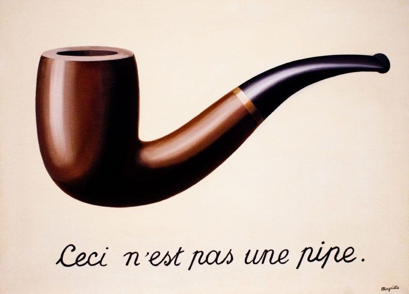
Now I think that the black lines from the laser cutting are the equivalent of the notation that Belgian surrealist artist René Magritte wrote on his famous painting The Treachery of Images – "Ceci n'est pas une pipe" (This is not a pipe) A jigsaw puzzle is not an art print. Especially when the cutting design and figural pieces are of this quality, it turns paintings and illustrations into an entirely different kind of work of art.
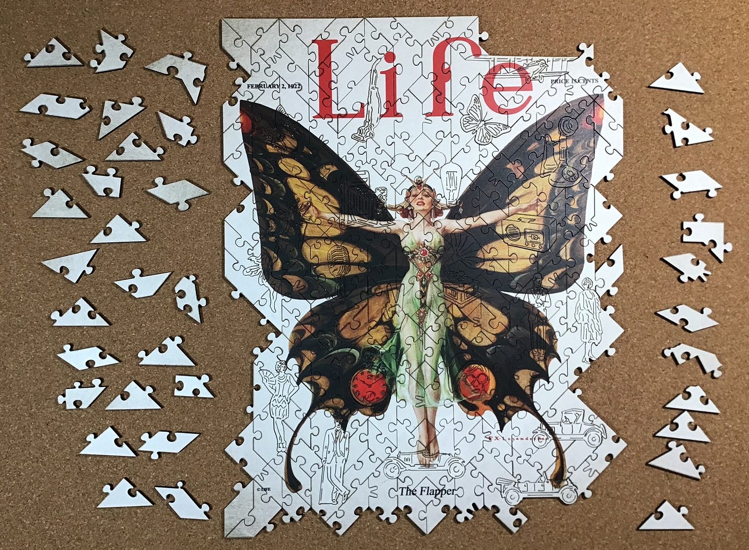
This cutting pattern is indeed rather tricky. From here until the end, assembly was largely trial and error. That is not a complaint. Each placement felt like a triumph.
Assembly was aided by the fact that the background is not all white; there is darkening near the corners. Also, I eventually realized that because the puzzle is fully interlocking the straight-sided pieces must be part of the outside edge. Finally, as usual, trial-and-error assembly got a lot easier when I got down to the last few pieces.
As you can see below, all of the figural pieces are upright in the puzzle. And eight of the figurals are comprised of two pieces.
The Red Vineyard at Arles (for comparison purposes)
Made ca. 2021 by the Wentworth Wooden Jigsaw Company designer unknown
3 mm medium-density fibreboard
about 250 pieces 25 x 36 cm (10” x 14”) about 3.6cm²/piece
standard Wentworth squarish matrix; rounded knob connectors
17 whimsies (all singles); semi-thematic
This is the second puzzle that I assembled as part of this series. While assembling The Flapper – Life, 2022 I realized that it was Wentworth puzzles that should be my standard for assessing those of the new Victory company, and that I should update my own experience with one. Fortuantely I had this 250 piece one with an image by Vincent Van Gogh.
I had bought this puzzle in January along with three other new Wentworths in an initial binge of puzzle buying after I first became interested in (obsessed with?) wooden jigsaw puzzles. I assembled the other three in February and March but didn’t assemble this one then because I began exploring the diversity of new wooden puzzles made by other companies, as well as vintage puzzles.
I like to think that my puzzling skills, and knowing what to look for in them, have improved since those early days. I did assemble and review a Wentworth puzzle since beginning this Bill’s Wooden Jigsaw Puzzles series, but it was a vintage one with materials and a cutting design that is not typical of the company’s recent products.
This puzzle, however, was recently designed and made by them and is still available from the company. That makes it perfect for refreshing my memory of what contemporary Wentworth puzzles are like. [Note: Wentworth is currently in transition to making their puzzles 4mm thick rather than 3 mm. But when I assembled this their previously-issued puzzles, possibly including this one, were still being shipped in the 3mm thickness if they were made before the transition.]
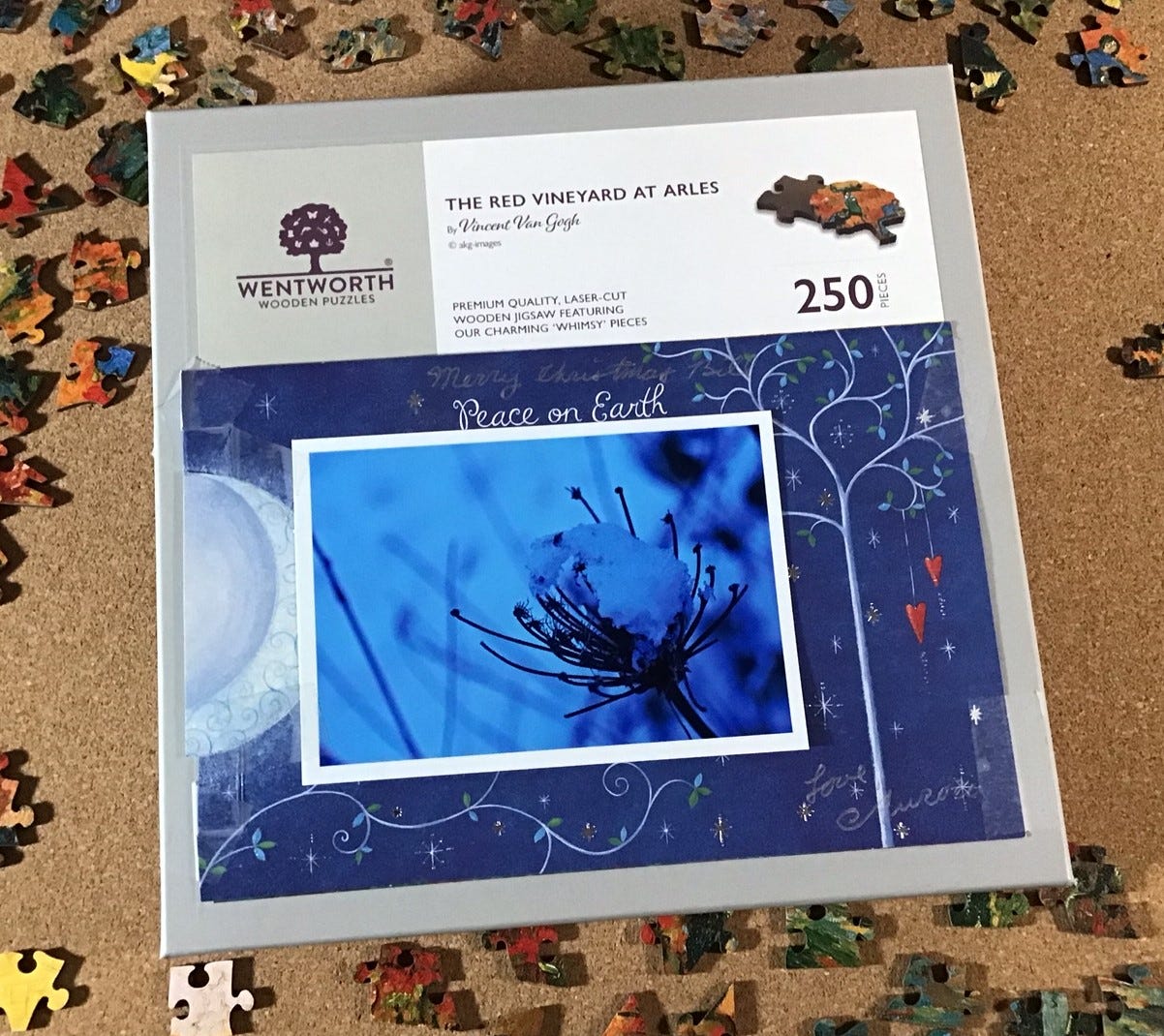
Of course, this isn’t what the box cover actually looks like. Several weeks ago I decided to tape Christmas cards to cover up the pictures on the boxes of puzzles I had not yet assembled. That adds to the challenge of assembly, and helps approximate the original approach to jigsaw puzzles for adults. It works! In this case I did not remember what this lesser-known Van Gogh’s painting looked like .
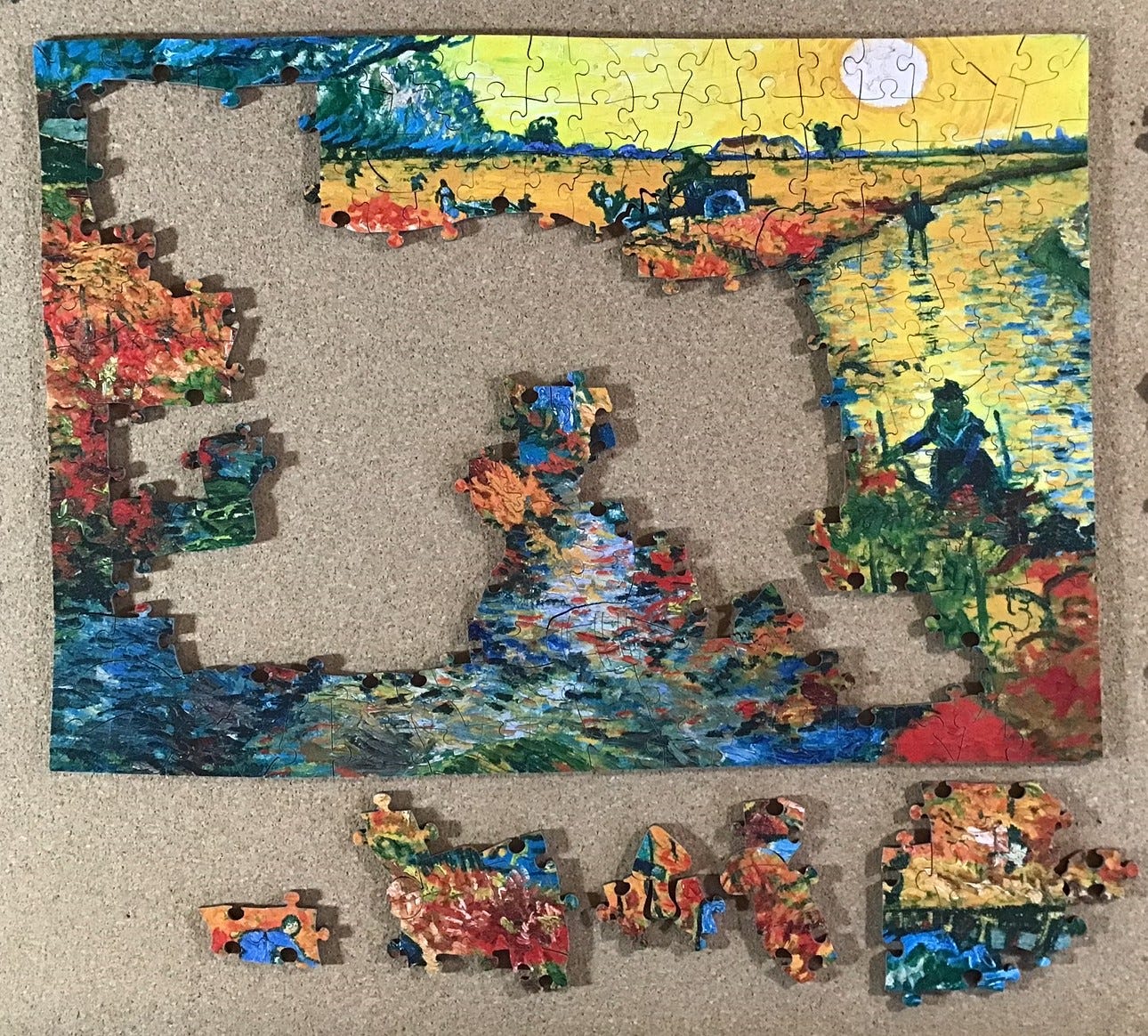
After emptying the bag onto my puzzle board I began flipping and sorting. I put the figural pieces in the upper right corner, face down to accentuate their silhouettes. Many the pieces had bright yellow or reddish-orange, in contrast with the others that were mostly fairly dark. I began separating them from the others, orange on the left and yellow on the right. I put the pieces that I recognized as potential edges in lines along the bottom of the board edge side facing me. All of the other pieces were scattered willy-nilly along the upper part of the board.
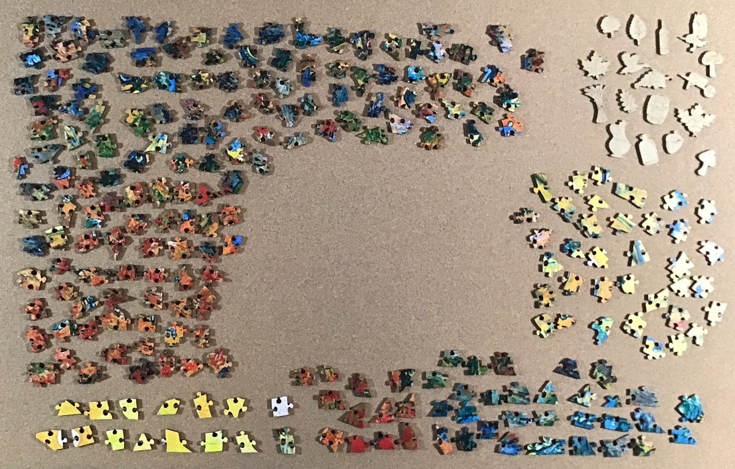
I began assembly with the yellow edge pieces, making lines in the centre working space. The cutting design included some disguising of the edge pieces but I was able to find the missing yellow ones fairly easily hiding among the other yellow pieces. There were no obvious corner pieces among the potential edge pieces but they turned up when I looked for edge pieces with an oblique angle on one side. At that point, all of my yellow assembly had the edge on the bottom. I should have taken a photo at that stage but I forgot.
[Digression: It seemed obvious that the white circle must be the sun in a yellow sky. Personally, I have never seen a yellow sky in real life, but this painting is by Van Gogh, not by Monet. As a founding Impressionist, Monet was committed to documenting as the colours that he actually saw under various lighting and weather conditions. Van Gogh was a Post-Impressionist. He was influenced by the Impressionists use of loose brushwork to quickly capture the moment in everyday scenes, but he was not with them with regard to veracity of colours.
Van Gogh was well-educated in colour theory and its insight into how colours affect each other. As the artist said in an 1885 letter to his brother Theo: “Colour expresses something in itself. … What looks beautiful, really beautiful – is also right.” Van Gogh’s aim was to capture how his emotions responded to what he saw, not to document what he saw. So for him, a background sky could be yellow if it should be yellow to portray the emotional impact he felt from the scene.
With regard to this image, according to the Wentworth website:
. . . Puzzlers will love the bright colours which perfectly capture some of the concepts of Post-Impressionism.
'The Red Vineyard at Arles' is an especially significant painting to Van Gogh as it was the only one of his works that he sold himself while still alive. It was bought for 400 francs which would equate to around $2000 in today's value. Nowadays this same painting could sell for millions.
Van Gogh painted this from his memory at the Yellow House.
The Yellow House is where Van Gogh lived in Arles. You can see it in this painting, in the distance. At the time Vincent lived there with his friend and fellow Post-Impressionist Paul Gauguin. The time that they lived together with dreams of setting up an artists’ colony at Arles, was artistically a very productive for both artists. but it was also tumultuous and brief – just 63 days. Neither of those volatile artists was temperamentally suited to a communal lifestyle. End of digression.]
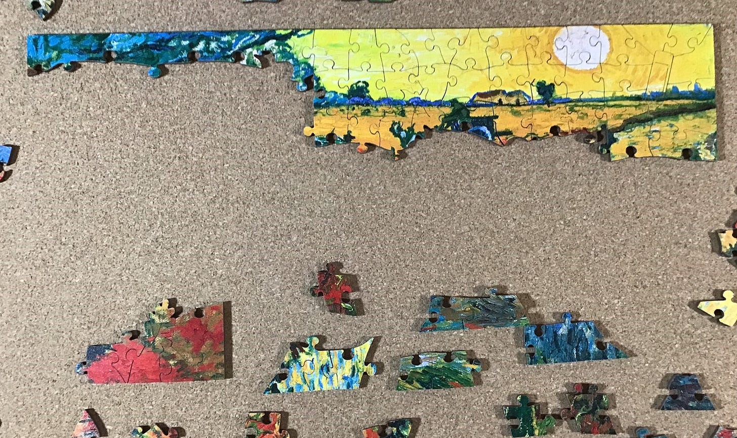
But back to the puzzle. The evidence was sufficiently clear that my yellow edge-assembly was indeed a yellow sky. I turned it around and placed it at along the top of my expanding working space in the middle of the puzzle-board. The other edge pieces without bright colours proved harder to assemble (since I had missed a lot of them in my initial quick sorting) so I turned my attention to installing yellow, orange and red pieces adjacent to the edges.
Next I pretty well finished up all of the pieces that were predominantly bright colours and went back to trying to construct the edges. Also, the sides of non-whimsy pieces that were adjacent to other non-whimsy pieces were very easy to recognize in this puzzle. Their “regular” sides were always fairly straight with a round connector. I began to look for pieces with oddly-shaped sides and tried to fit them together with their matching whimsies.
Completing the outside edge was a milestone that I celebrated with a photograph. Many of the edge pieces, both obvious ones and those with tiny flat tips, had been hiding in the scattering of multi-coloured loose pieces. While looking for those I came across several pieces that were obviously adjacent to whimsies so I was making progress on island-building too.
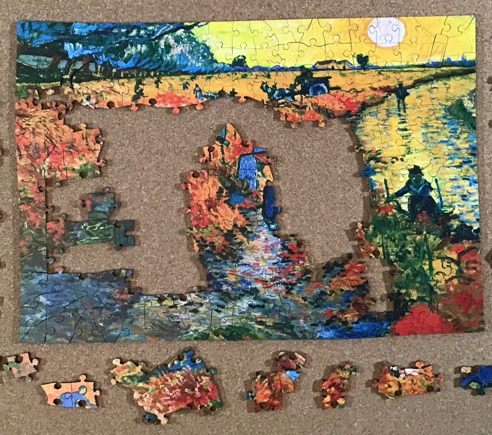
Building islands of pieces around whimsies was starting to pay off. It is very satisfying when four or five pieces can be put in place one right after the other! But I still had some whimsy pieces with very distinctive edges and I was mystified as to why I couldn’t easily find the adjoining loose pieces for them. I had a bunch of loose pieces (off camera, to the right) that have fragments of edges that looked whimsy-adjacent, but I couldn’t figure out where they went even with the colour-clues they gave. I suppose that that is why this hobby is called puzzling.
More progress, but now my trial and error colour and shape matching was going more slowly. I had a feeling that a big breakthrough was imminent if I could just figure out where to put my one remaining large whimsy-island/cluster.
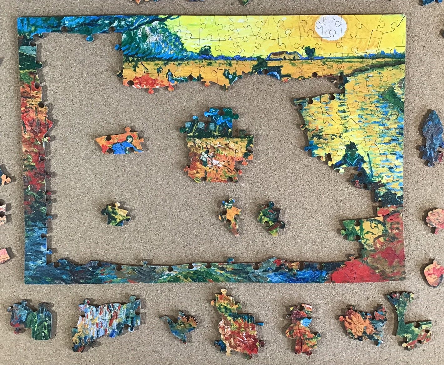
My hunch was right! It was only a few minutes later that I was able to take this next picture. Placement of the large island had been hindered by it having what I suspect was an accidental colour-line cut on the one place where it interfaced with the rest of my assembly. Placing it exposed lots of opportunities to slot pieces into voids that interfaced with two or three sides.
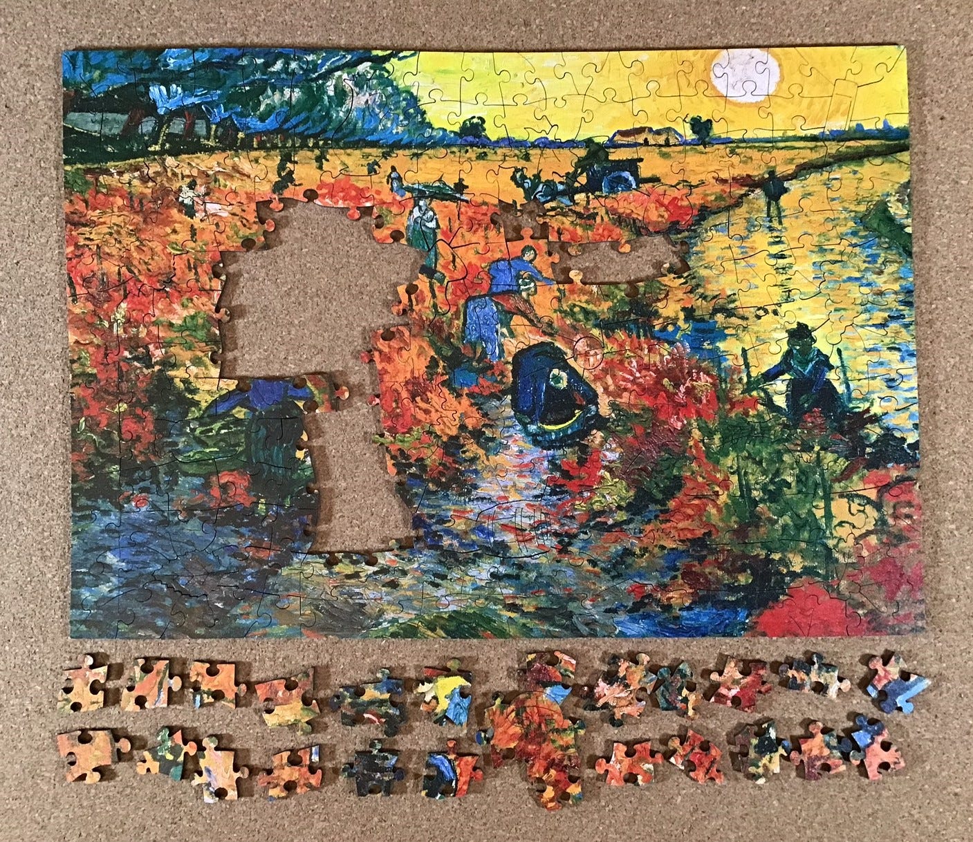
The following photo shows all of the remaining pieces.
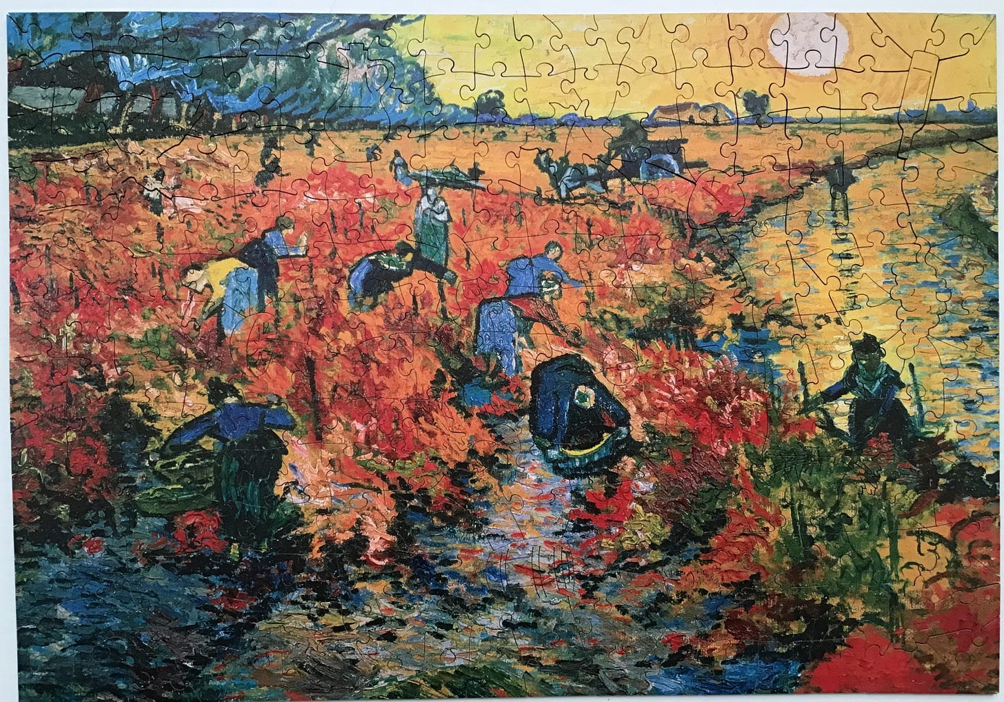
I found myself slowing down, but not because the puzzle was difficult. I finally have enough pieces in place to enjoy studying this rural scene. I wonder why this painting came to be called The Red Vineyard at Arles. I see the red, but it doesn’t look like a vineyard; at least, not yet. Where are the grape vines? Perhaps the many workers who are stooped over, from the large ones in the foreground to the tiny ones in the distance, are planting young grapevine cuttings that will grow to make this scene into a mature vineyard someday.
Getting close to completion, my attention continued to switch from this being a puzzle to it being a dissected art print. This is Van Gogh’s snapshot of life in the rural 19th century countryside. I enjoyed seeing this glimpse into what was probably a common rural November scene in Provençe. I tried to find vintage photographs online of this kind of autumn planting scene but couldn’t come up with any. Photographers of the day took plenty of photographs of the grape harvest but apparently didn’t consider this aspect of viniculture to be interesting enough to document. Van Gogh knew otherwise.
As you can see from the following backside photo, Wentworth’s cutting pattern for this painting, like many of their other puzzles, would be much like the standard grid-like cutting pattern of most die-cut cardboard jigsaw puzzles except that it gets interrupted by the inclusion of the 17 figural pieces.
Café Terrace at Night
Made in 2022 by Victory Wooden Puzzles cutting designer Aidan Knowles
laser-cut 3 mm medium-density fibreboard
about 250 pieces 36 x 29 cm (14” x 11½”) 4.1cm²/piece
triangular wave background matrix; hidden edges; round knob and V connectors
22 thematic whimsies (9 of which are multi-piece) and a 3D easel w. painting
Café Terrace at Night is another work that Vincent Van Gogh painted while living in Arles. He painted it en plaine air under an oil lamp on a September evening in 1888, about two months before he painted The Red Vineyard at Arles, and shortly before he invited Paul Gauguin to live with him there. The composition and colouring of the painting show the influence that Japanese prints were having on Van Gogh.
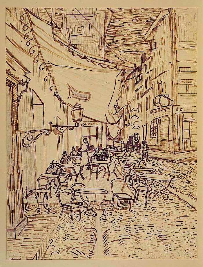
The artwork for this puzzle, which goes by many names, is one of Vincent Van Gogh’s most famous and important paintings. Although it is not signed its creation is well-documented in letters by the artist including this one that he wrote to his sister Wilhelmina the same day:
I was interrupted precisely by the work that a new painting of the outside of a café in the evening has been giving me these past few days. On the terrace, there are little figures of people drinking. A huge yellow lantern lights the terrace, the façade, the pavement, and even projects light over the cobblestones of the street, which takes on a violet-pink tinge. The gables of the houses on a street that leads away under the blue sky studded with stars are dark blue or violet, with a green tree. Now there’s a painting of night without black. With nothing but beautiful blue, violet and green, and in these surroundings the lighted square is coloured pale sulphur, lemon green. I enormously enjoy painting on the spot at night. In the past they used to draw, and paint the picture from the drawing in the daytime. But I find that it suits me to paint the thing straightaway. It’s quite true that I may take a blue for a green in the dark, a blue lilac for a pink lilac, since you can’t make out the nature of the tone clearly. But it’s the only way of getting away from the conventional black night with a poor, pallid and whitish light, while in fact a mere candle by itself gives us the richest yellows and oranges.
. . . You never told me if you had read Guy de Maupassant’s Bel-ami, and what you now think of his talent in general. I say this because the beginning of Bel-ami is precisely the description of a starry night in Paris, with the lighted cafés of the boulevard, and it’s something like the same subject that I’ve painted just now.
In the same letter he also wrote:
I definitely want to paint a starry sky now. It often seems to me that the night is even more richly coloured than the day, coloured in the most intense violets, blues and greens.
If you look carefully you’ll see that some stars are lemony, others have a pink, green, forget-me-not blue glow. And without labouring the point, it’s clear that to paint a starry sky it’s not nearly enough to put white spots on blue-black.
This discovery of the beauty of nighttime colours did indeed lead Van Gogh to further explorations of nighttime landscapes and skyscapes, including what is probably his most famous and beloved painting, The Starry Night.

That and this puzzle are probably among the most frequent images by any painter that are used in jigsaw puzzles. Every large puzzle-maker who includes Old Masters paintings among their artwork art seems to offer both images in their puzzles. This is partly because of the popularity of Van Gogh but also for two contrasting reasons: The swirling skyscape of The Starry Night adds to assembly challenge, while the large patches of distinctively-textured bright colours in this one greatly aid in assembly, making it one of the very best puzzles to introduce newbies to our hobby.
Although I took my usual precautions to avoid seeing the picture on the cover of the box I began this puzzle with a general idea of what the famous Café Terrace at Night looks like. From my experience with The Flapper I suspected that assembling the edge first might not be possible, so I expected to begin by assembling large colour islands and working outwards from there.
When I poured the pieces of onto my puzzle-board and began flipping them their colours confirmed that would be a good way to begin. Most of the pieces fit clearly into either distinguishable colours or textures. I also noted that the non-whimsy pieces were geometrical and fully interlocking like in The Flapper, confirming that many of the edge pieces would probably be well disguised and among the last pieces I would be placing.
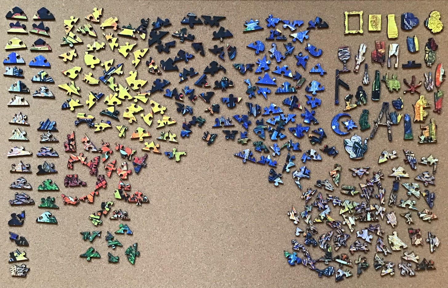
So I organized the potential edge pieces along the left side of my board again instead of their customary place along the bottom, and I segregated the whimsy pieces in their usual place in the upper right corner. That had had worked well in the previous Victory puzzle. My colour groupings, in ascending order of quantity, were pieces that were predominantly green, red, black, blue, yellow, and a distinctive texture of multi-colour. So far, so good.
I began with red, then green, then the red led into variegated multi-colour pieces.
When I seemed to have used up the red and green I moved all the rest of the textured multi-colour ones to put them within easy reach, keeping the potential triangular edge pieces separate on the left.
Assembly was going very quickly. I had been wrong in expecting the edge pieces to be among the last placements. I had forgotten that in The Flapper white was the sole colour along the entire outside of the image. Not so with van Gogh, whose colour patches went right to the edges.
The following photo is about the same level of progress as in the previous one except that I moved the connected tree-branch edge to the left side of the image where it appeared to belong, and I moved all of pieces with the next colour that I would be focusing on (yellow) to within easy reach in the working space. This is the first time that I have done assembly that methodically and it really did speed things up
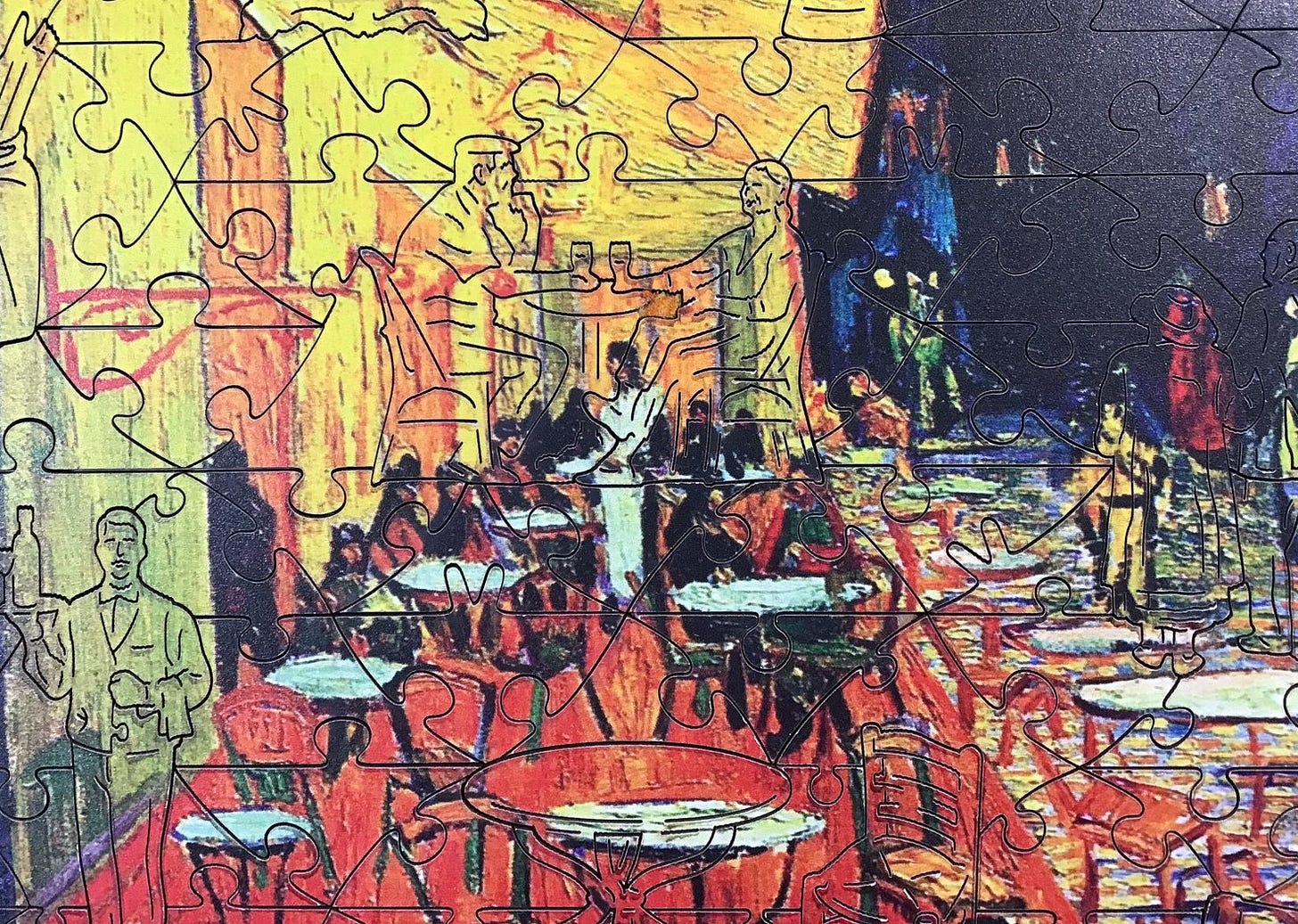
Since there weren’t really that many of them, I was able to find places for the yellow pieces fairly quickly. As I have mentioned before, having figurals makes puzzle assembly easier by enabling creation of clusters around them. That was especially true with the very distinctive edges of the vase of sunflowers and the Vincent self-portrait multi-piece figurals.
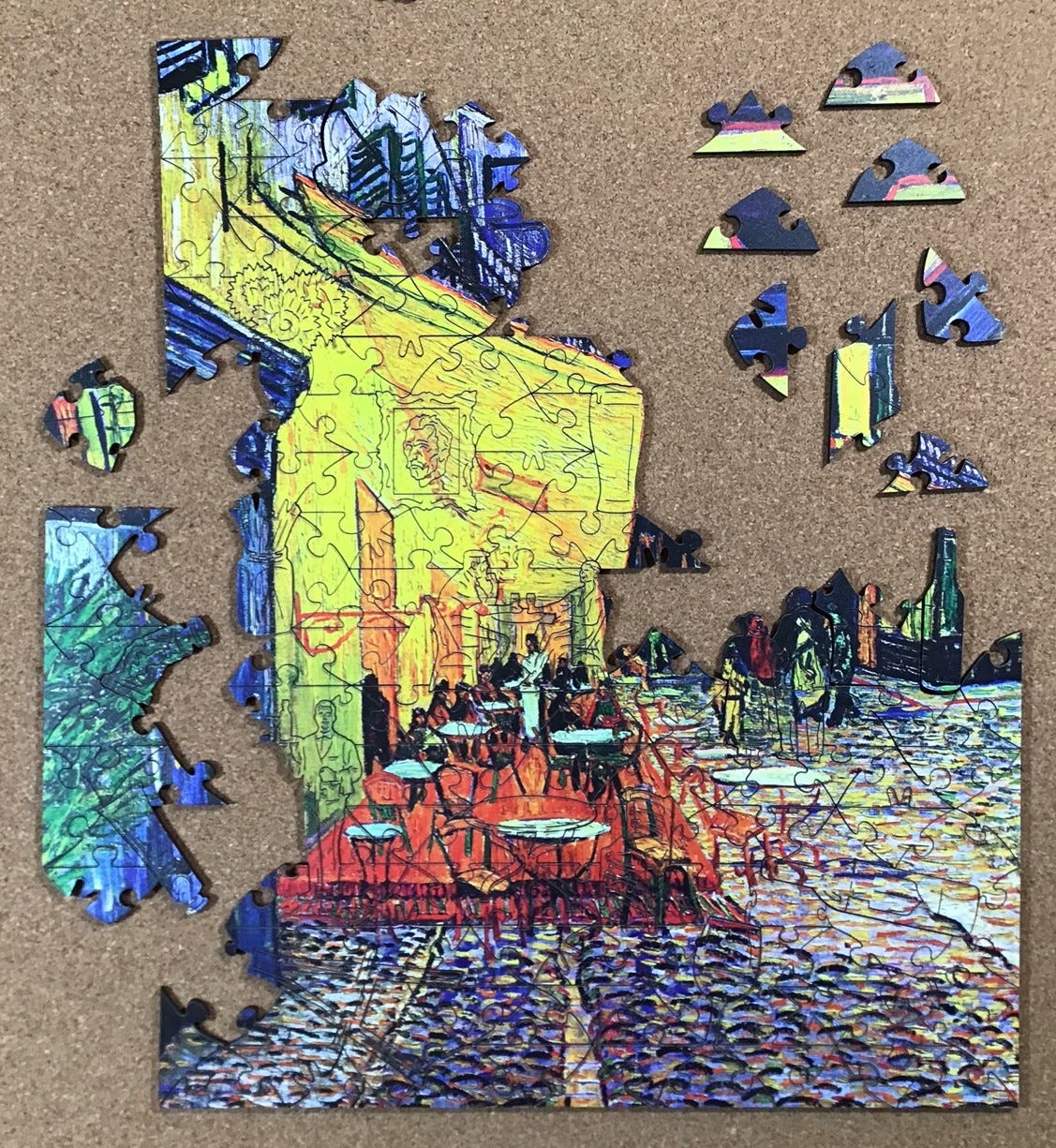
After I got stuck with only a few yellow pieces remaining it seemed like a good place to take a photo. It includes the only the only yellow pieces that were left: The rest of them are primarily either very dark or sky blue.
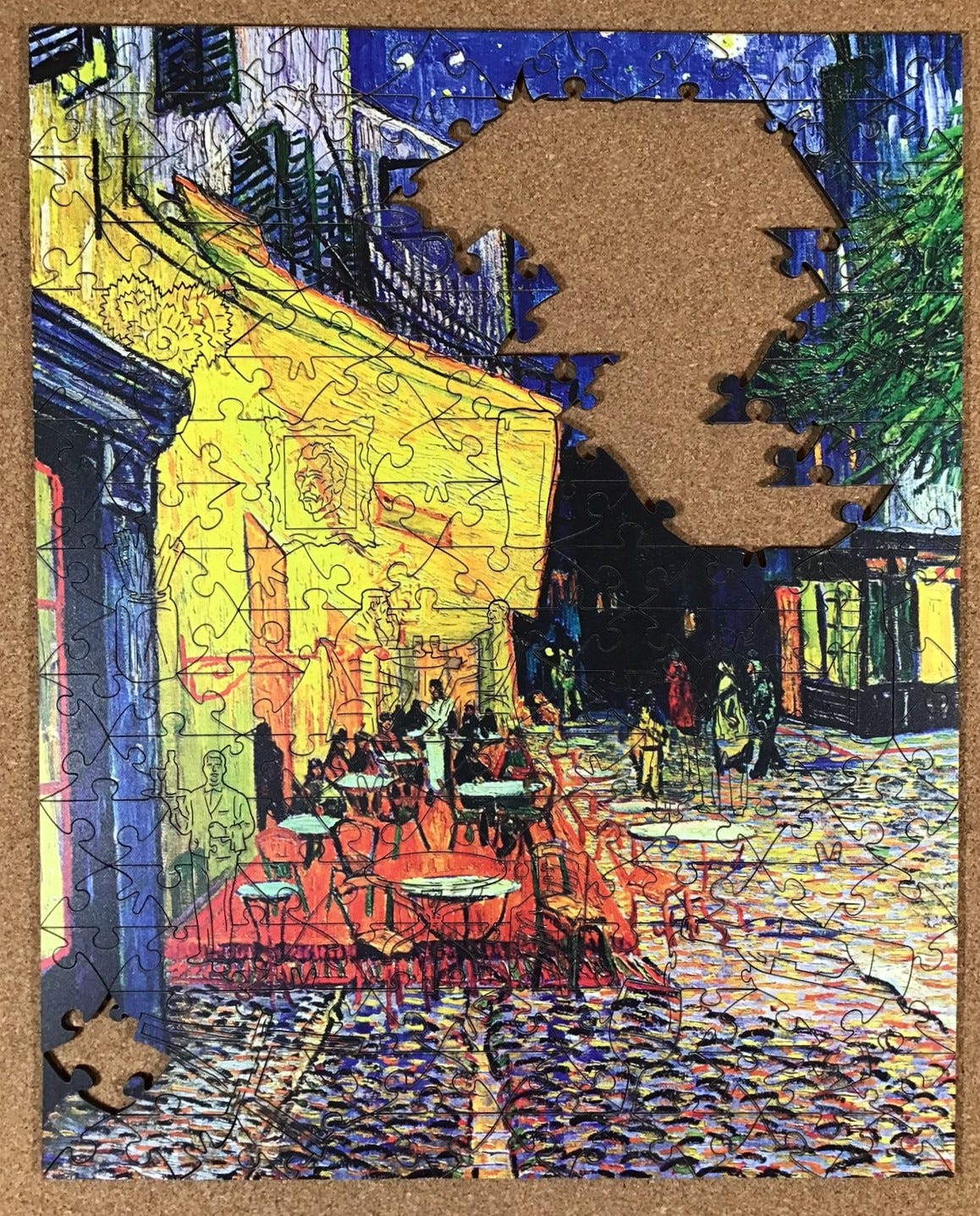
But while preparing to take that photo I noticed that this puzzle too had lines of smoke smudge paralleling the cut-lines in the bright yellow area. Once I was aware of that, I also noticed that there was smudging along the cut-lines in the lighter parts of the cobblestones. There probably was also smudging in the dark areas of the puzzle too but it was really only noticeable against light colours, as in Vincent’s face in the portrait whimsy.
So before taking this photo I got to work removing the smudges with cotton swabs dampened with rubbing alcohol. It didn’t take long and the cleaning itself was rather fun and satisfying. (I sure wish that I felt the same way about house-cleaning!) Compared to most puzzles at this stage I still felt like progress was zooming along.
Also at this stage I had some locations of my assembly that I just could not find a match for even though it seemed obvious what kind of shape I should be looking for. I was getting that familiar “there must be a missing piece” feeling. I think that I have never assembled a puzzle in which I didn’t get that feeling at some stage (and only once did it turn out to be true.) But my houseguest Andrea had completed this puzzle a few weeks earlier and I hadn’t found any loose piece in my semi-tidy apartment. Still, I double-checked the storage bag just in case.
I continued with the few remaining yellow pieces, which included some edges, and moved the black and the blue pieces to within easier reach. But instead of focussing on them I switched my attention to extending my edges. I soon recognized that it was obvious that the tree branches edge sub-assembly was never going to fit on the left side of the puzzle so I moved them to the right side. I soon found the piece that would connect them to the lower assembled part of the puzzle.
Completing the edge always feels like an accomplishment that is worth a photo:
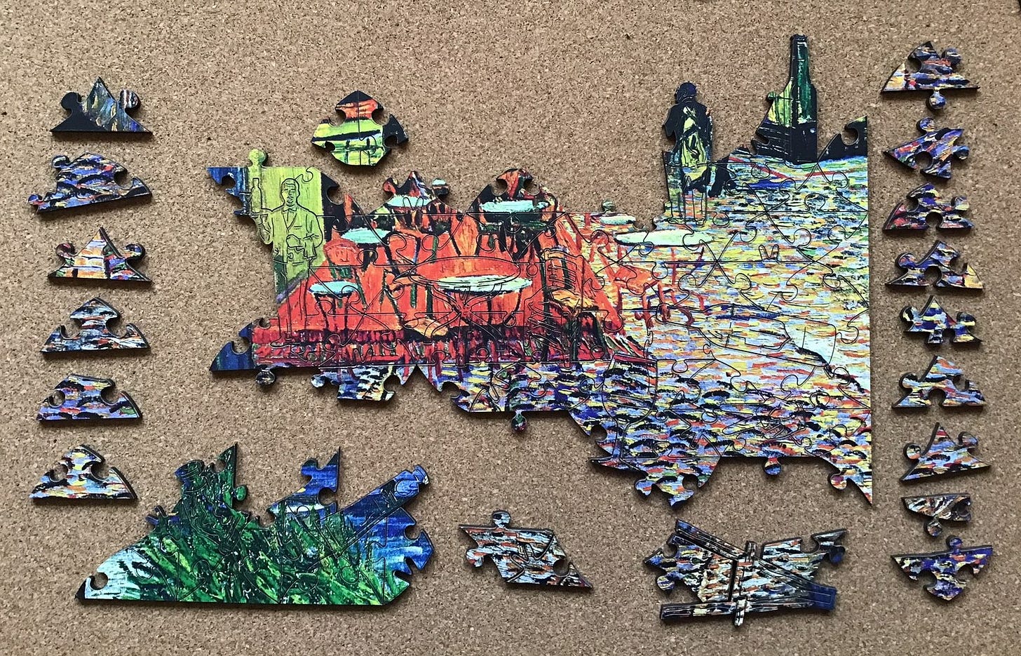
Assembly was continuing to move along very quickly, as I had expected with this image. (It is nice to at least occasionally get things right!) The only remaining loose pieces were either predominantly black or predominantly blue. I began with black:
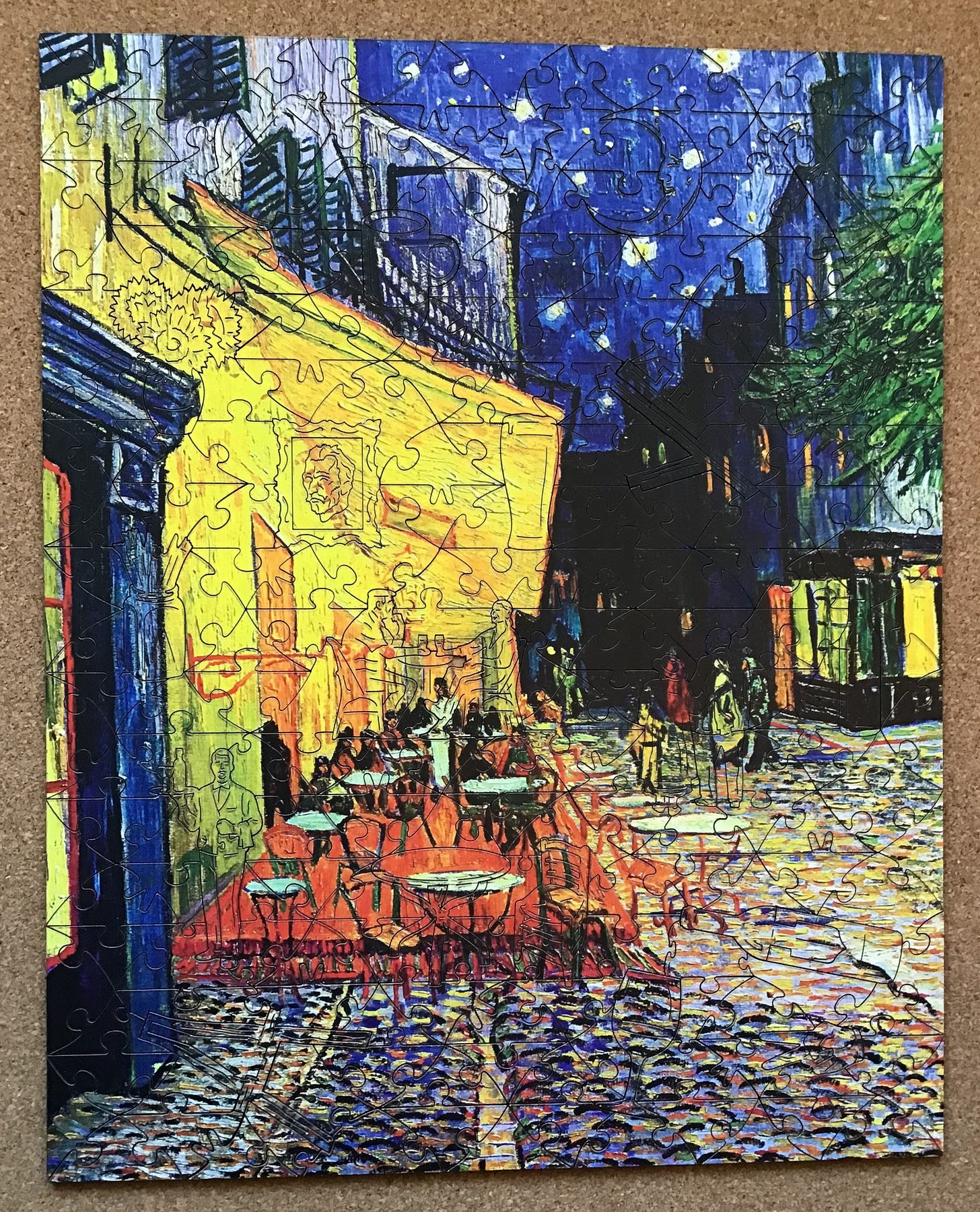
Et voilà!
The final step was to finish cleaning off the “teething problem” smudging from the laser burning and use my coloured pencils to lessen the visual impact of the chipped off top layer from one of the connectors (visible above and to the right of the standing waiter’s head in the above photo.)
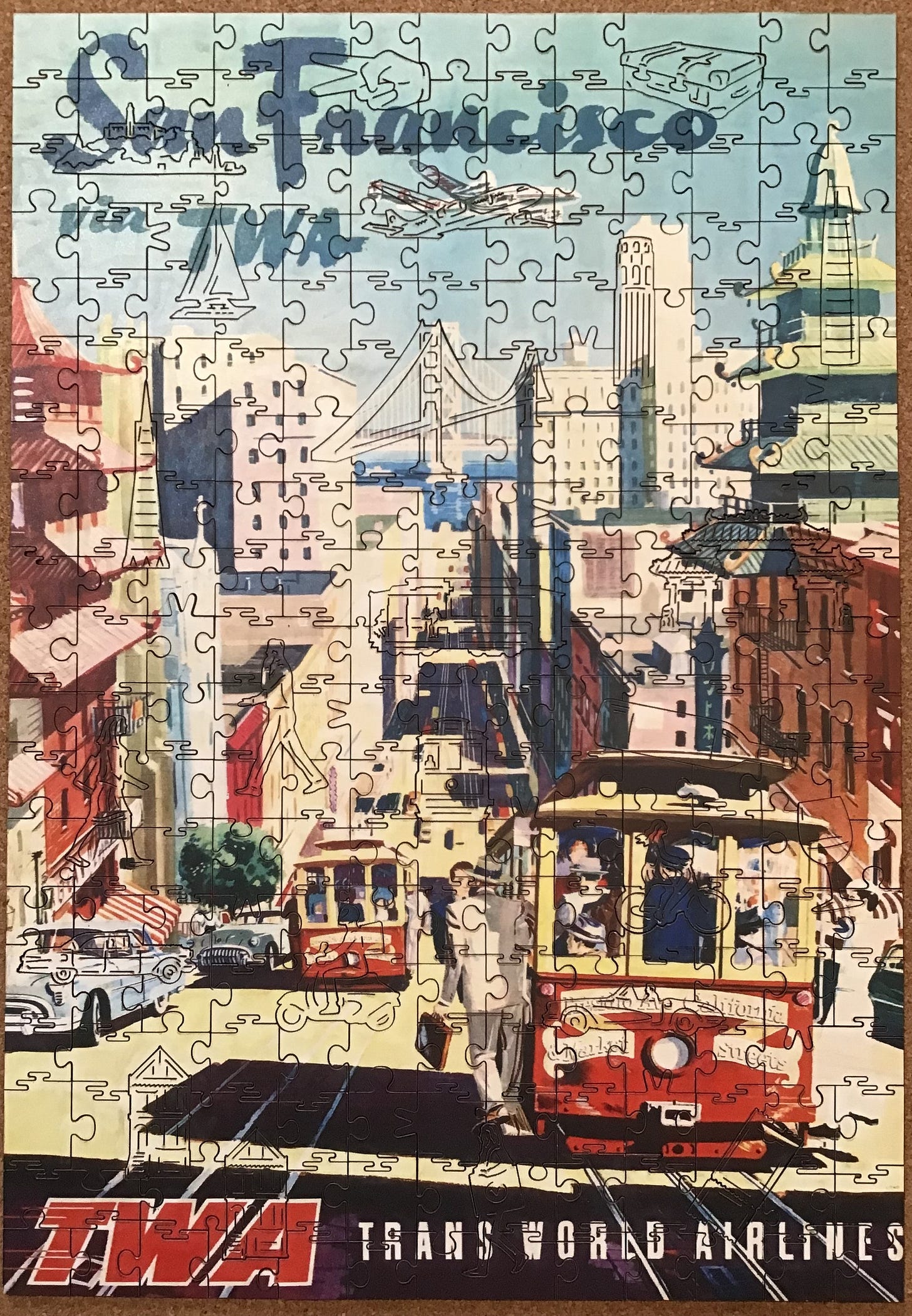
Vintage Poster San Francisco
Made in 2022 by Victory Wooden Puzzles cutting designer Aidan Knowles
laser-cut 3 mm medium-density fibreboard
about 250 pieces 36 x 25 cm (14” x 10”) 3.6 cm/piece
square geometric matrix cutting; knob, cloud-bank and V connectors
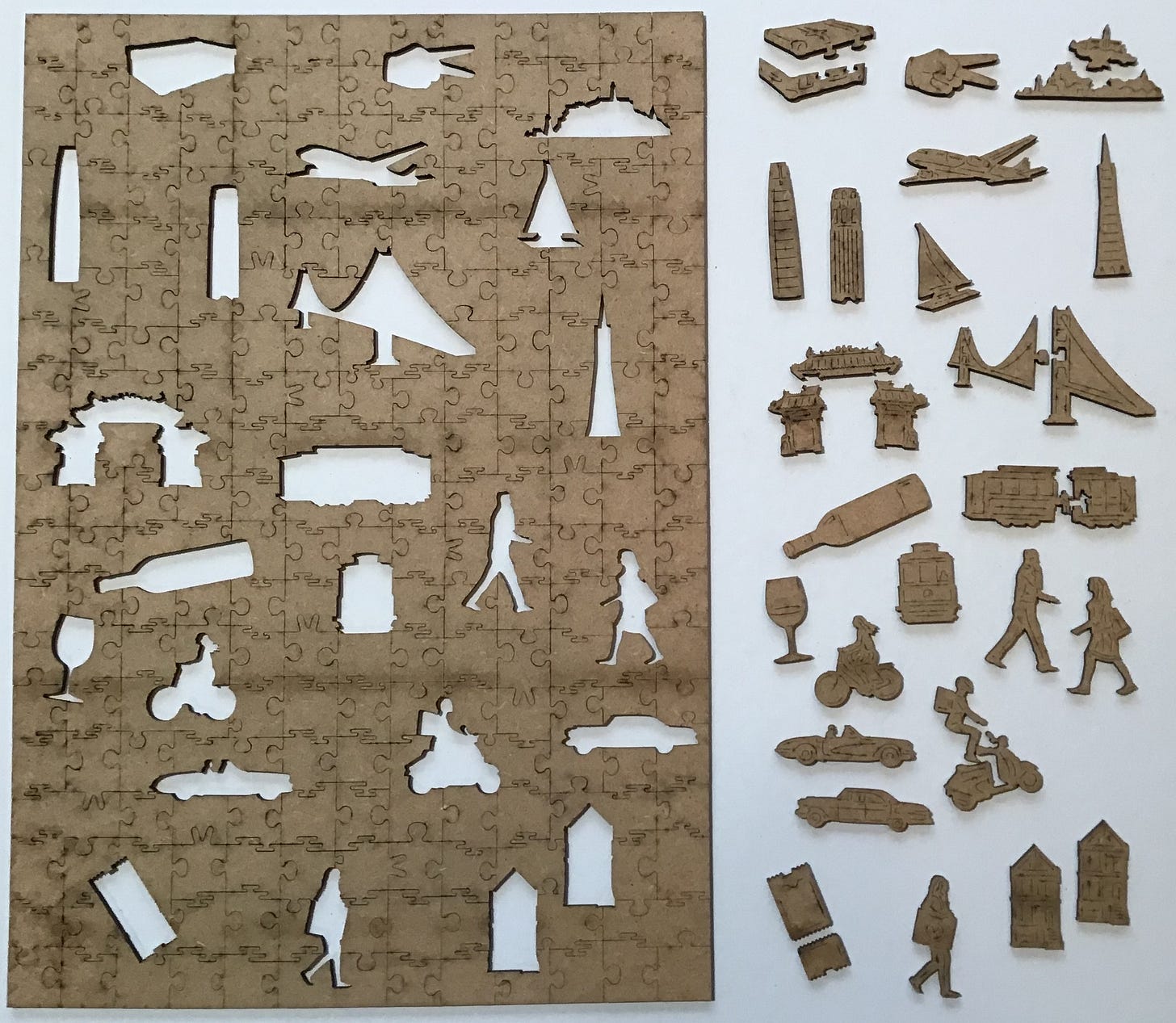
24 thematic whimsies, of which 7 are multi-piece
This is the puzzle that Andrew sent to me in lieu of a replacement piece for the broken one with the missing tip in Café Terrace at Night. I found that reproductions of this poster are available from many online companies. They identify it as being from the 1950s. None named the artist and I don’t think they got the date approximation from any source; it is apparent from the vehicles in the picture. My research revealed that the image was painted by David Klein (1918-2005.) He began making posters for TWA in 1955 and my guess, based on the early ‘50s vintage of vehicles, is that that this image would date from about that time.
David Klein’s artistic training was from the Art Center College of Design in Los Angeles. When America entered World War II he joined the Army and was made an official war artist and assigned to the Army Air Corps (which, by the way, was the Branch that my father served in during the tag end of the war right after he graduated from high school.) After the war Klein became a commercial artist, initially making posters and lobby cards for Hollywood movies.
He developed a good reputation and in 1947 moved to New York to become an art director at Clifford Strohl Associates, a theatrical advertising agency. There he was the illustrator for advertisements, posters and window cards for such shows as Death of a Salesman, Brigadoon, Most Happy Fella, The Music Man, and Cat on a Hot Tin Roof.

But Klein is best remembered for the many advertising posters that he made for TWA in the 1950s and ‘60s, including the artwork for this puzzle. His most famous from that series is one of Times Square that he painted in 1956, and which in 1957 was collected by the Museum of Modern Art for its permanent collection. One of the original posters was recently sold by the Christie’s auction house for almost $10,000.
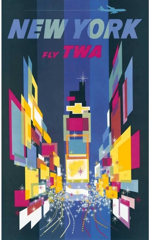
Trans World Airlines had been founded in 1930 as Transcontinental & Western Air, and in 1939 Howard Hughes acquired of the company. Hughes’ intention was to turn it into an international rather domestic air carrier, but World War II delayed that ambition. But after war Hughes did just that, establishing routes to Europe, the Middle East and Asia, and renaming the company Trans World Airlines.
TWA became America’s second largest international carrier (after Pan American; aka Pan Am.) But by the early 1990s both of those companies had gone bankrupt and their assets absorbed into Delta Airlines in the case of Pan Am, and American airlines in the case of TWA. For TWA, part of the reason for its downfall was that during the 1950s Hughes milked money from the company through lucrative contracts to develop planes to be designed and made by his Hughes Aircraft Company, a branch of Hughes Tool.
Unfortunately, even with that cash infusion as an aircraft-maker Hughes could not compete with the other aircraft companies that had prospered during WWII. Boeing, Martin, Lockheed, McDonnell, and Douglas companies all used continuing “Cold War” military contracts to help finance their development of commercial aircraft. If that wing of Hughes’ corporate empire had been as successful as the drilling equipment arm of Hughes Tool this poster would look different: Instead of a Lockheed Super-Constellation in TWA livery flying above this cityscape we would see a much larger Hughes H4 Hercules, more commonly known as the Spruce Goose.
I began the puzzle with little recollection of what the image or the cutting pattern of this puzzle would be. I did remember that it was a hodge-podge of iconic San Francisco scenes and landmarks, and that as you would expect with a travel poster, there was text at the top and bottom of the image.
As soon as I began flipping and sorting it was clear that unlike the other two Victory puzzles I had just assembled with geometric non-whimsy pieces primarily cut on an angle, in this one they are basically squares, many of which had one flat side. The puzzle therefore looked like a good candidate for assembling the edge first. So I organized the potential edge pieces in their usual spot along the bottom of my puzzle-board; flat side facing me. But after my sorting was complete it seemed like there were too few of them, but then I usually miss many of the edge pieces in my initial sorting.
As usual, I put the whimsy pieces at the upper-right corner of the board, but this time face-side up. With the previous puzzles I began with them upside-down, to better be able to recognize their shapes, but I usually ended up turning them over anyway because I found myself doing more colour-matching than shape-matching.
Because it worked out so well with Café Terrace at Night I spent more time organizing the colours in this initial sorting than has been my usual practice.
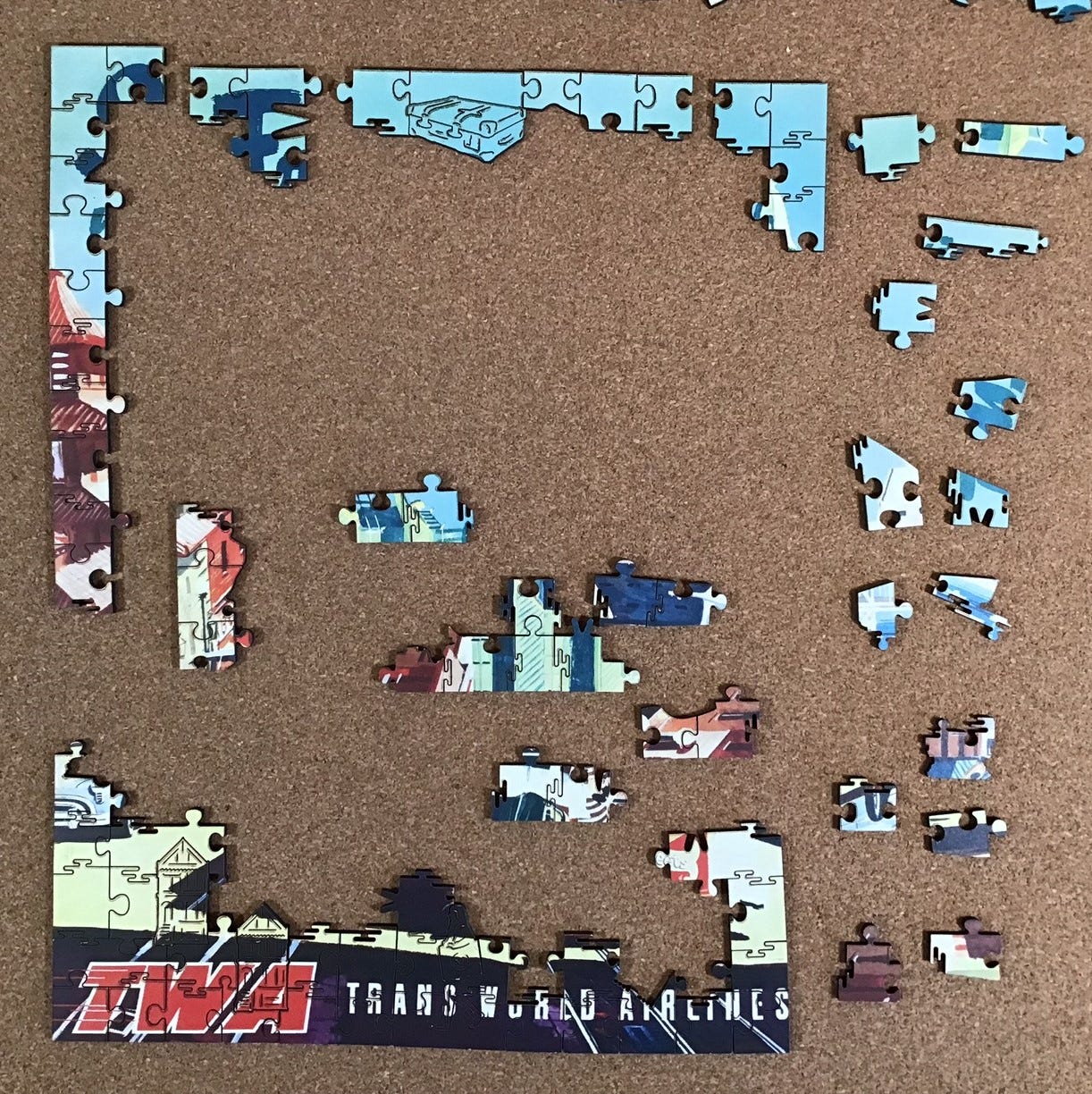
I made considerable progress with the edges and then got stuck. I looked more carefully through the other loose pieces and found some more potential edges but got stuck again. I gave up looking for the missing edge pieces and began looking for pieces with text and other targets of opportunity.
Back to working on the edges:
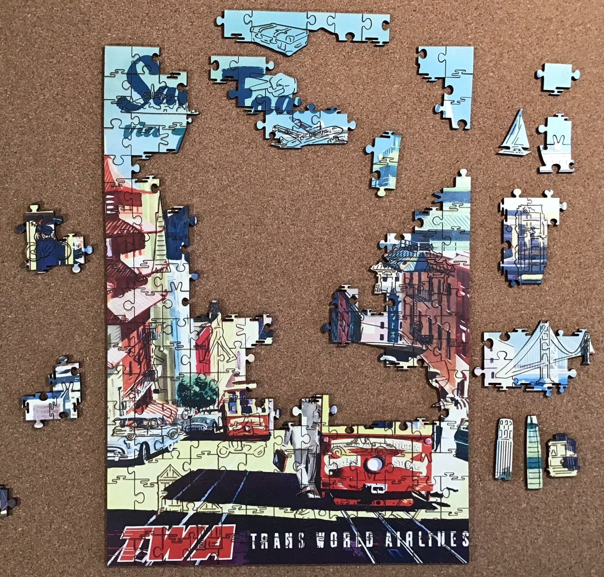
After working on the edges for a while I got stuck again so I tried to focus on the dark blue script at the top that I thought would say San Francisco. But that didn’t make any progress either so I began focusing on building in from the bottom edges and building out from whimsies. The puzzle seemed to be getting very tall and narrow. And where were all those the missing edge pieces?
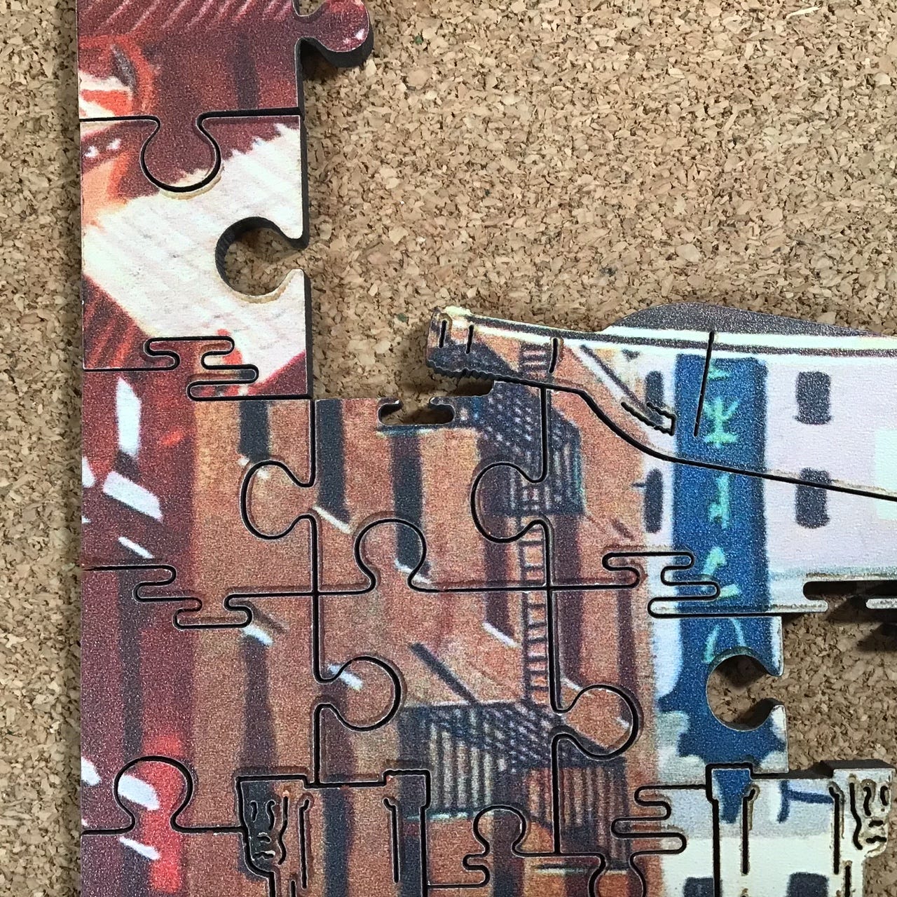
Oop! I figured out what was wrong. I have a false fit. I should have recognized it earlier because the multi-piece Chinese gate whimsy I had installed near the left edge was upside down, and the wine glass on the right edge wasn’t near the wine bottle. I should have trusted my observation in the other two Victory puzzles about properly-oriented figural pieces being part of Aidan’s design style.
Taking that close-up photo drew my attention to the smudging (which shows that this is another puzzle that had been made before the company’s launch, since the smudging issue has since been resolved.) Like the other inaugural puzzles, smudging is only really noticeable against the light colours. This puzzle also had a few tiny chips along the cut-lines that show up only where the image is dark. I touched up the chips as I went along because I found that it is easier to do that before the adjoining piece is in place, but decided to defer the smudge cleaning until near the end because I found that it is easier and quicker to do that after the pieces are assembled.
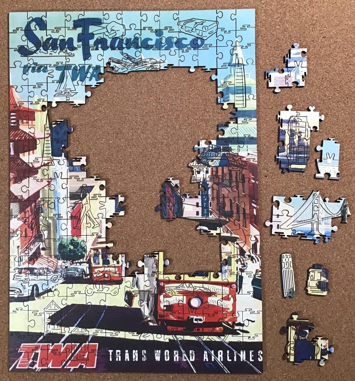
Fixing the false fit made a big difference!
Continued gradual progress.
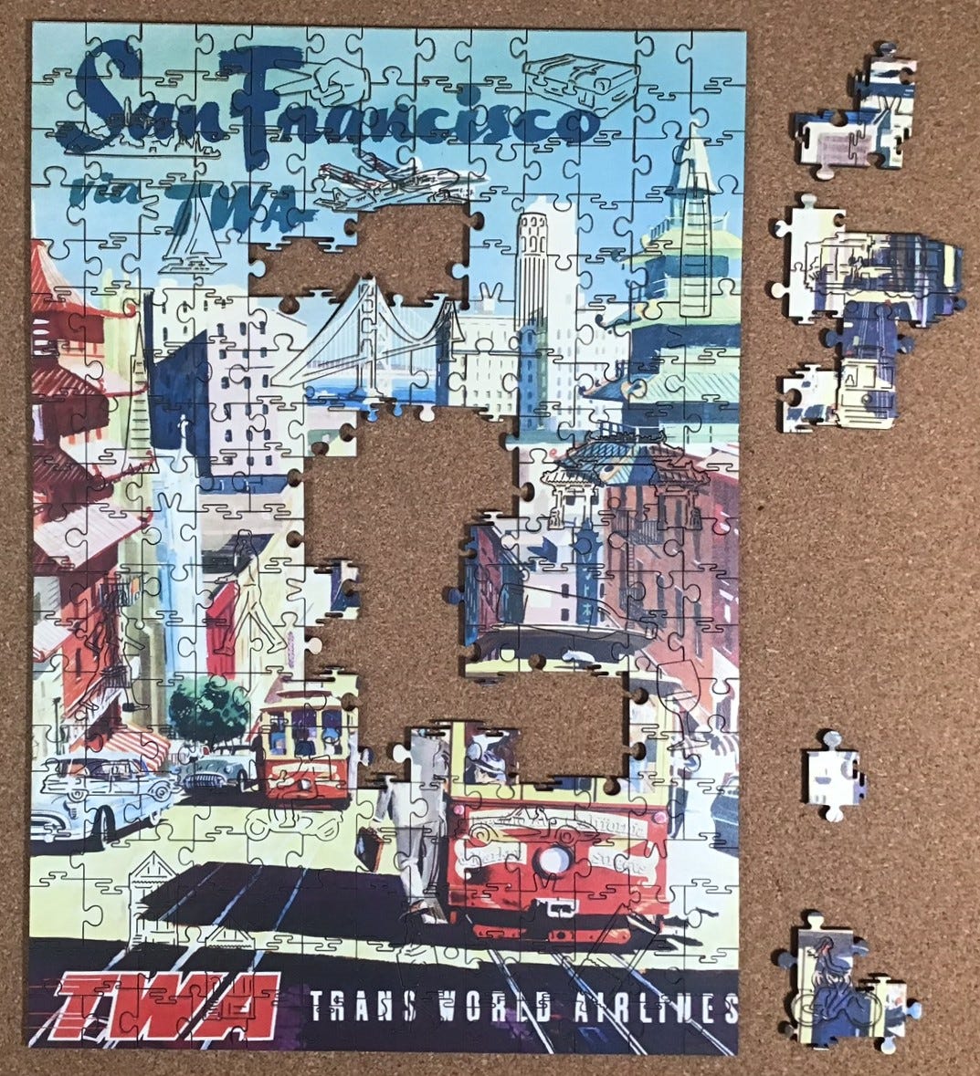
After fixing another false fit I was finally able to have the top edge make sense. That led to a burst of progress along the top . . .
. . . that continued, reaching a crescendo when I was able to put the bridge multi-piece whimsy into its place, and . . .
. . . kept going until the puzzle was completed.


















Thank you for this comprehensive posting, Bill. By the way, your inclusion of a "spoiler alert" may well matter to some folks, but I'm not personally worried about anything like that. Unless this were one of the "murder mystery" puzzles, I would not care what details you shared with me before myself buying or otherwise getting to assemble one of the the puzzles under discussion.
I do not remember seeing the Life magazine cover with "The Flapper" before, though I do remember seeing the cover with "A Modern Witch." That latter image is the one I personally prefer.
I found the story of the Leyendecker brothers interesting, and I also looked up Frank Leyendecker via Google. I felt oddly pleased to know they'd worked in Chicago, my erstwhile hometown, plus that they'd palled around with Norman Rockwell, one of my favourite illustrators. I was very sorry to learn, though, that Frank Leyendecker's life seemed tragic and too short.
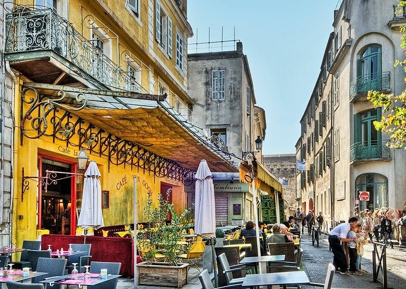
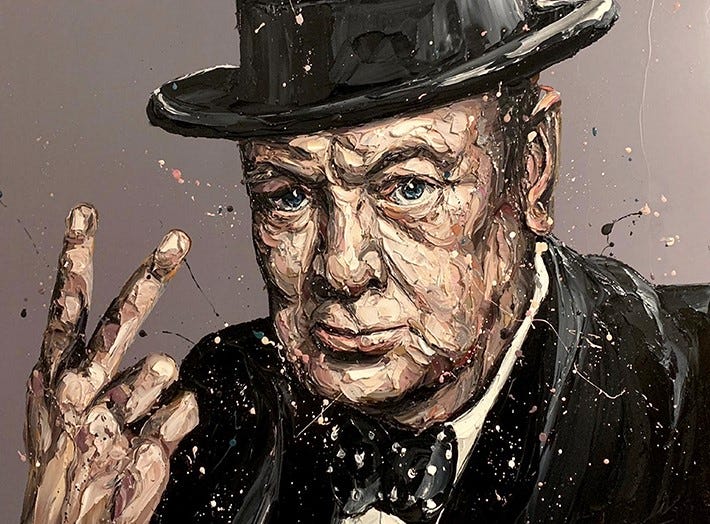
I really liked seeing a fairly recent photo of the street scene pictured in Van Gogh's "Café Terrace at Night." I didn't personally care, though, for the image of Winston Churchill shown at the end of your current essay. It's not your fault, of course, and it may seem like a dumb thing for me to say about a posthumous depiction, but I don't feel it looks "alive" enough. Churchill has always fascinated me, and I've often thought of him as epitomizing strong life force.
Thanks once again, for sharing your hobby with us.
Sincerely, Greg Skala